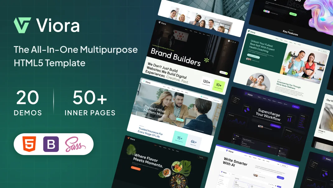


Why Responsive Design is Essential for WordPress Themes

In today’s mobile-first digital landscape, responsive WordPress themes have become absolutely essential for any serious website owner. With over 65% of global web traffic originating from mobile devices, your website’s foundation must adapt flawlessly across all screen sizes. But this isn’t merely about aesthetics—responsive design directly influences your Google rankings, user behavior, bounce rates, and ultimately your revenue.
Why Responsive WordPress Themes Matter for Modern Websites
A responsive WordPress theme automatically adjusts layouts, images, text sizes, and navigation menus based on the device being used. Instead of maintaining separate desktop and mobile versions of your site, a single responsive codebase serves all users perfectly. This approach delivers three critical advantages: it saves you significant development time and money, it eliminates maintenance headaches, and most importantly, it provides your visitors with the seamless experience they demand.
Mobile User Experience: The Foundation of Engagement
Mobile users have zero patience for poorly designed websites. They expect fast-loading pages, readable text without zooming, accessible buttons, and smooth navigation. When your responsive WordPress theme functions flawlessly on smartphones and tablets, visitors naturally spend more time on your site, exploring content and moving deeper into your conversion funnels. ViThemes’ responsive themes are built with mobile-first principles, meaning every design element—from buttons to forms to images—works beautifully on screens as small as 320 pixels wide. This responsive approach directly correlates with lower bounce rates and higher customer lifetime value.
SEO Rankings: How Responsive Design Boosts Visibility
Google explicitly recommends responsive design as the optimal approach for mobile SEO. Here’s why responsive WordPress themes outrank non-responsive competitors:
- Single unified URL: Search engines view responsive sites as one website, not multiple versions. Your backlinks and domain authority concentrate on a single URL, amplifying your SEO power.
- Faster page speed: Responsive designs typically load 30-40% faster than separate mobile sites. Since Google uses Core Web Vitals as a ranking factor, pages loading under 2 seconds receive significant ranking advantages.
- Reduced crawl waste: Google’s crawl budget focuses on one version of your site, not duplicate content across desktop and mobile versions. This means more pages indexed and ranked.
Real Business Benefits of Responsive WordPress Themes
Cost Efficiency and Maintenance Savings
Building and maintaining two separate websites—desktop and mobile versions—typically costs 2-3 times more than maintaining a single responsive site. You’ll need separate hosting, duplicate content updates, twice the testing, and double the technical support. A quality responsive WordPress theme reduces monthly maintenance from 20+ hours to just 5-10 hours. Premium responsive themes range from $35 to $150, delivering measurable ROI within 4-8 weeks through improved conversions alone. When you factor in reduced hosting costs and development hours, the payback period becomes even shorter.
Conversion Rate Improvement
Statistics reveal that 88% of users won’t return to a website after experiencing poor mobile performance. Conversely, seamless responsive design builds trust and confidence. Visitors are significantly more likely to complete purchases, submit contact forms, download resources, and share your content when the experience feels professional and frictionless. Industry data shows responsive design implementations typically increase conversion rates by 15-35%, depending on your industry and traffic quality.
Essential Features of Professional Responsive Themes
- Mobile-first design approach from the ground up (not desktop retrofitted)
- Fast loading speeds achieving under 3 seconds fully loaded
- Flexible grid layouts adapting to any screen size from 320px to 4K displays
- Touch-optimized navigation, buttons, and form fields for mobile devices
- Lazy-loading image optimization reducing bandwidth by 40-50%
- Built-in accessibility features (WCAG compliance) for inclusive user experience
- Active developer support and regular security updates
How to Select the Right Responsive Theme
When choosing responsive WordPress themes, prioritize these criteria: verify mobile performance through real user reviews, test thoroughly on actual devices (not just browser emulation), check that the developer provides active support within 24 hours, and review demo sites on mobile devices firsthand. ViThemes provides a carefully curated collection of responsive WordPress themes, each tested rigorously for mobile performance, SEO optimization, page speed, and user experience. Our themes range from simple blog layouts to complex e-commerce solutions, all built on responsive frameworks that prioritize your visitors’ mobile experience.
Implementing responsive WordPress themes isn’t optional anymore—it’s a fundamental requirement for digital success. With mobile traffic representing two-thirds of all web usage, with Google’s mobile-first indexing algorithm, and with user expectations for seamless experiences higher than ever, responsive design ensures your website thrives today and remains future-proof tomorrow.