
This is probably the simplest way for most users. Here are the steps you need to take:
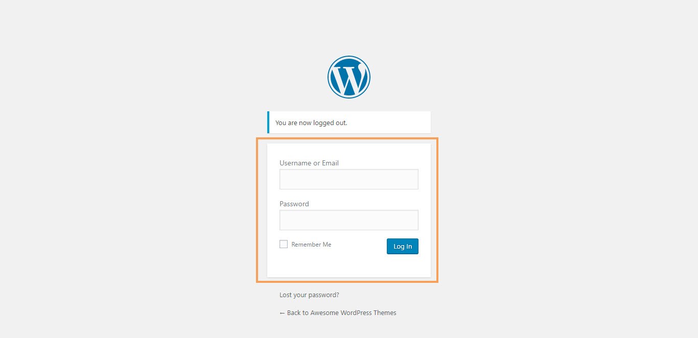
- Step 1 – Login to your WordPress Dashboard.

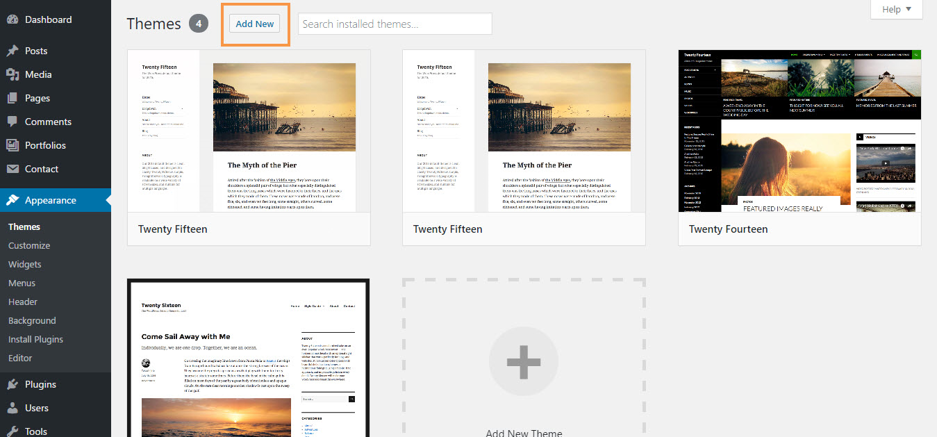
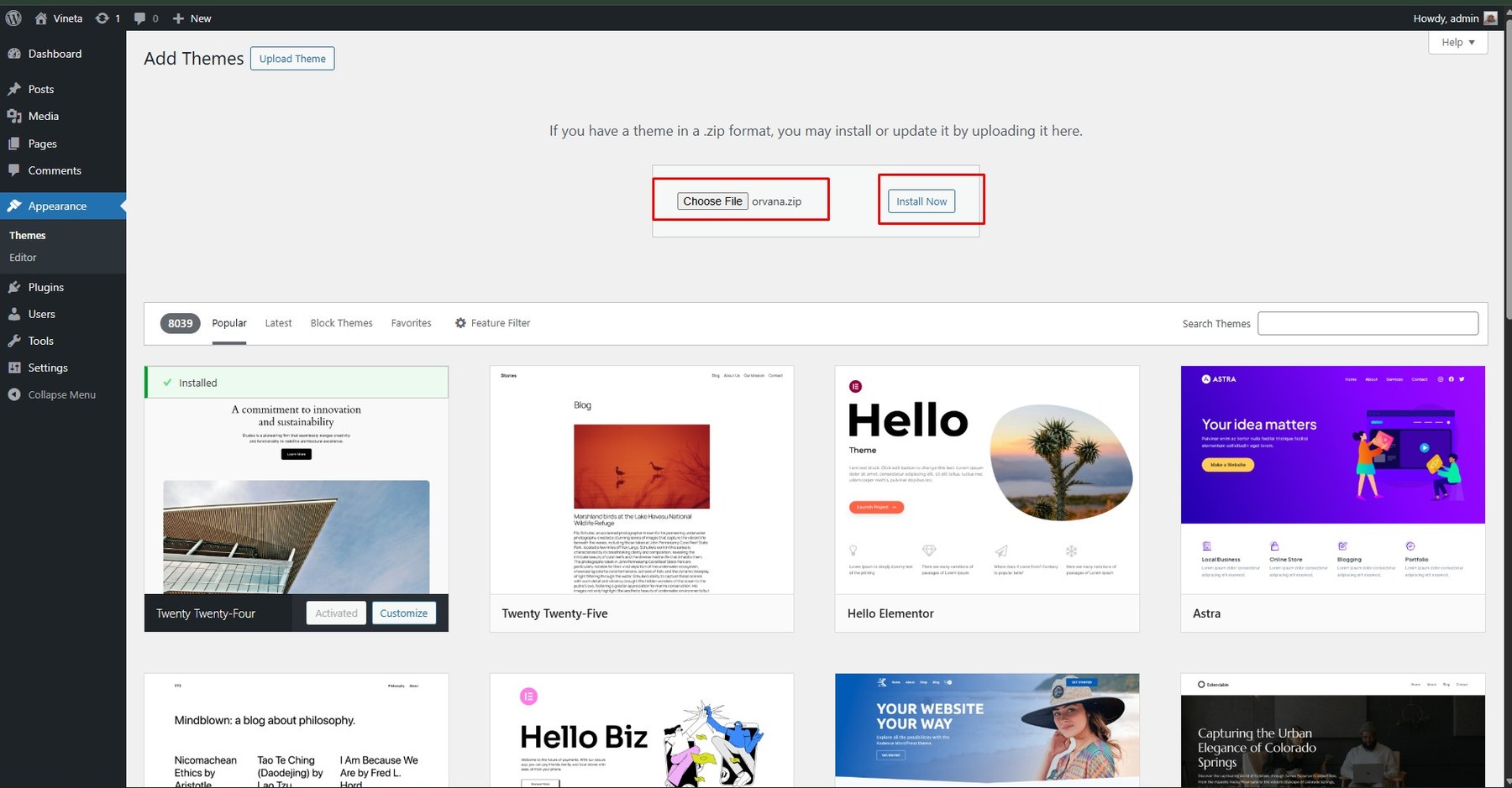
- Step 2 – Go to Appearance > Themes. Then click Add New button at the top of the screen.

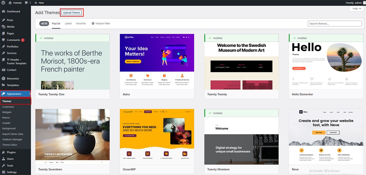
- Step 3 – Click on the Upload button at the top.

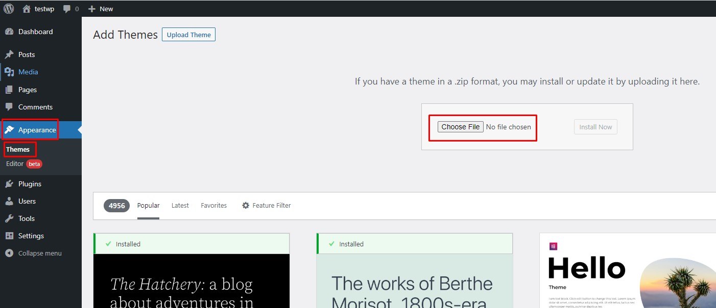
- Step 4 – Click Choose File and select the
themename.zipfile.
- Step 5 – Click Install and wait a moment.

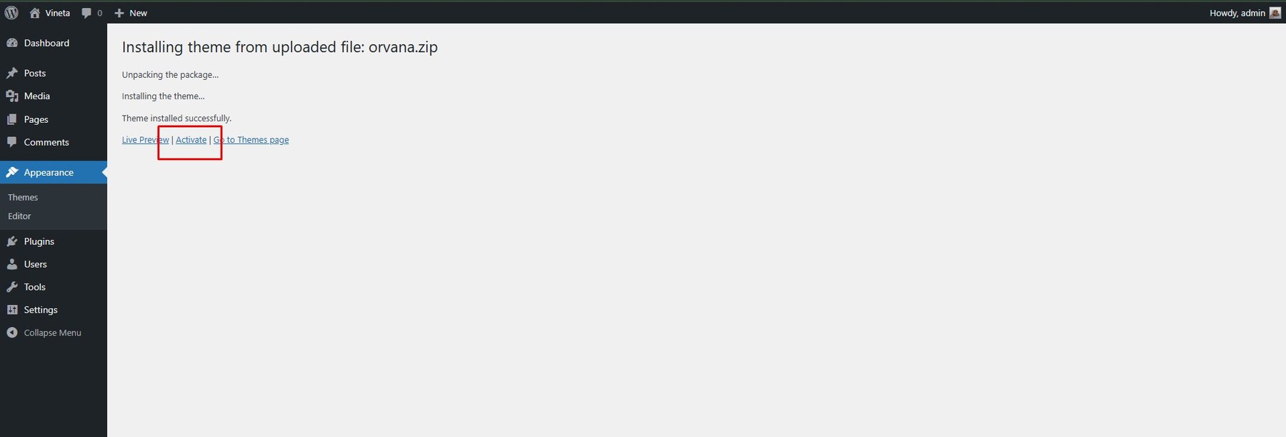
- Step 6 – Once installed, click Activate to enable the theme.

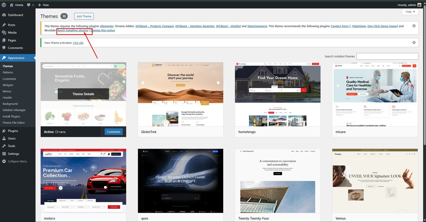
- Step 7 – A notice will appear at the top of the dashboard. Click Begin installing plugins.
The theme requires these plugins: Contact Form 7, Elementor, Theme Addon, WooCommerce, One Click Demo Import, MC4WP: Mailchimp for WordPress, WCBoost – Products Compare, WCBoost – Variation Swatches, WCBoost – Wishlist.
Recommended: WPML, FOX – Currency Switcher Professional for WooCommerce.
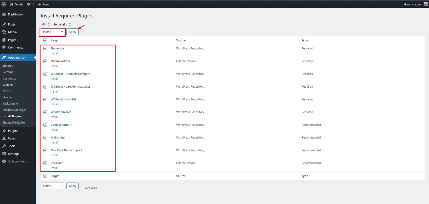
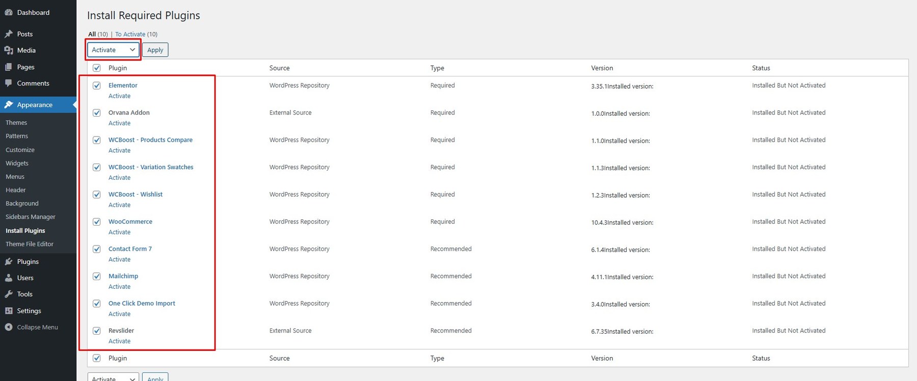
- Step 8 – Go to Dashboard > Appearance > Install Plugins. Check all required plugins and activate them.


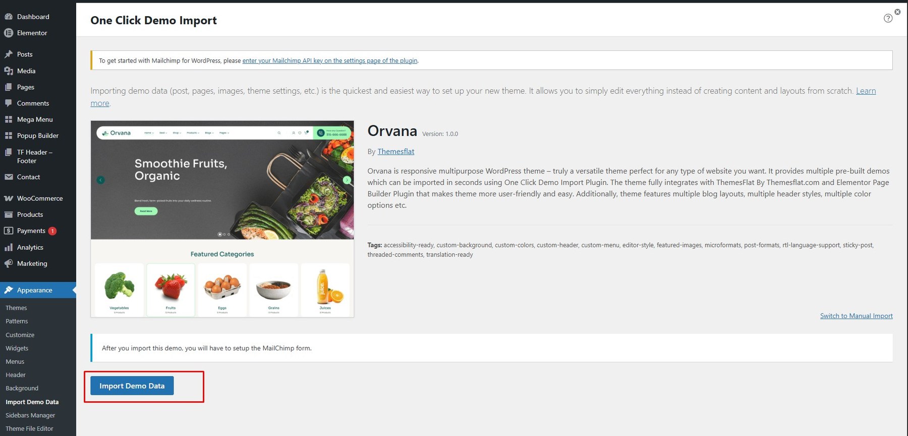
- Go to Appearance > Import Demo Data
 <strong>Select demo import</strong> <div class=”screenshot-item”><img src=”assets/images/install/import_07.jpg” width=”1350px”></div>
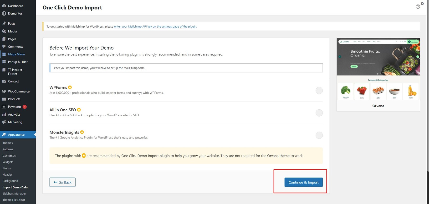
- Click Continue & Import
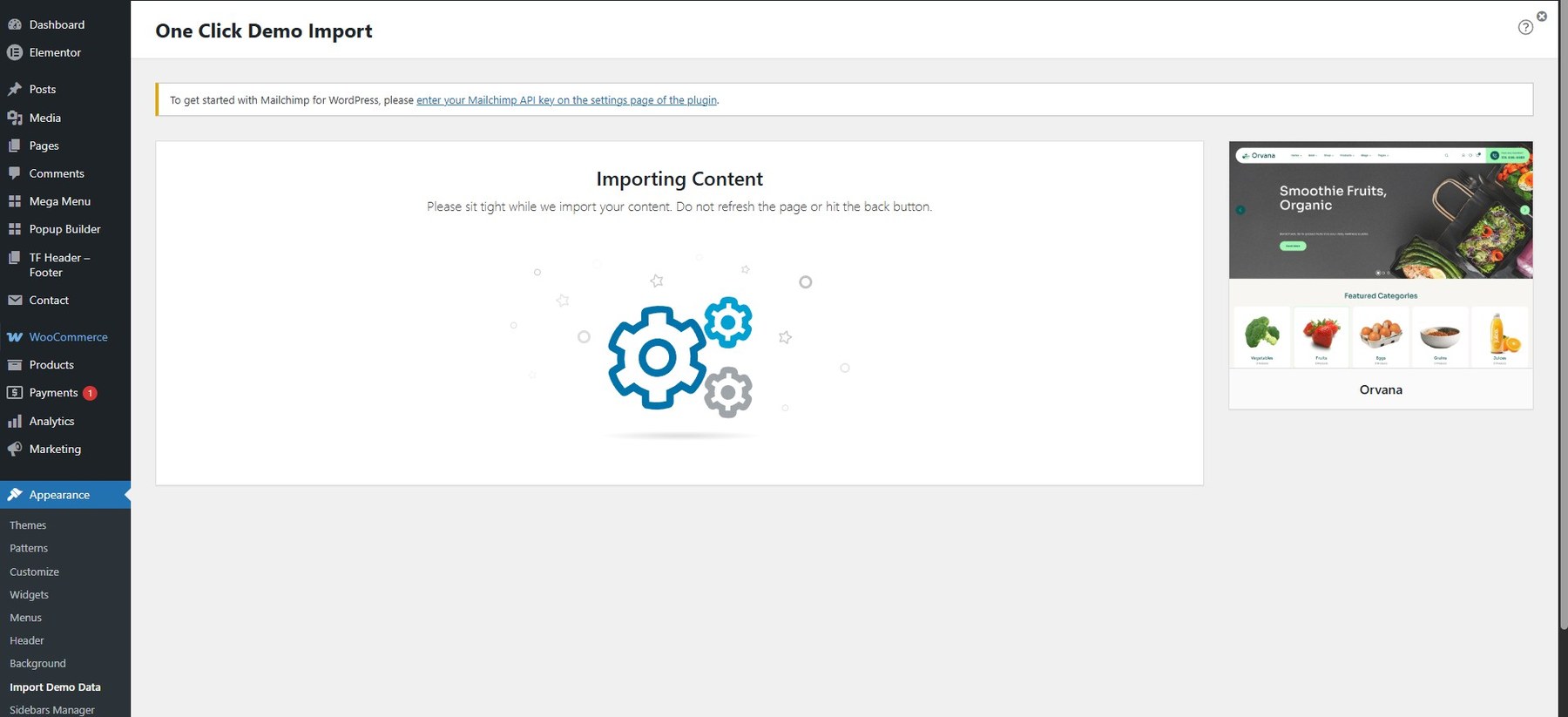
 And Wait

Note:
After installing the Main theme, if you want to use the Child theme, please install it the same way as above.
 <strong>Select demo import</strong> <div class=”screenshot-item”><img src=”assets/images/install/import_07.jpg” width=”1350px”></div>
 And Wait
To start customizing the theme, in the Admin page please go to Dashboard > Appearance > Customize.
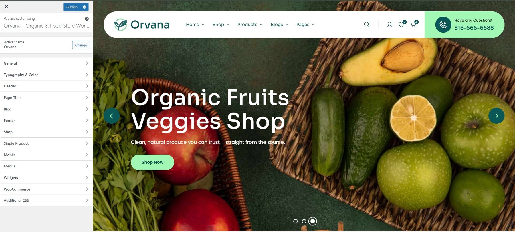
Please remember to click Save & Publish after customizing to save changes.
These are global settings, so they affect the entire site. However, they can be overridden per post or page.
- Site Information
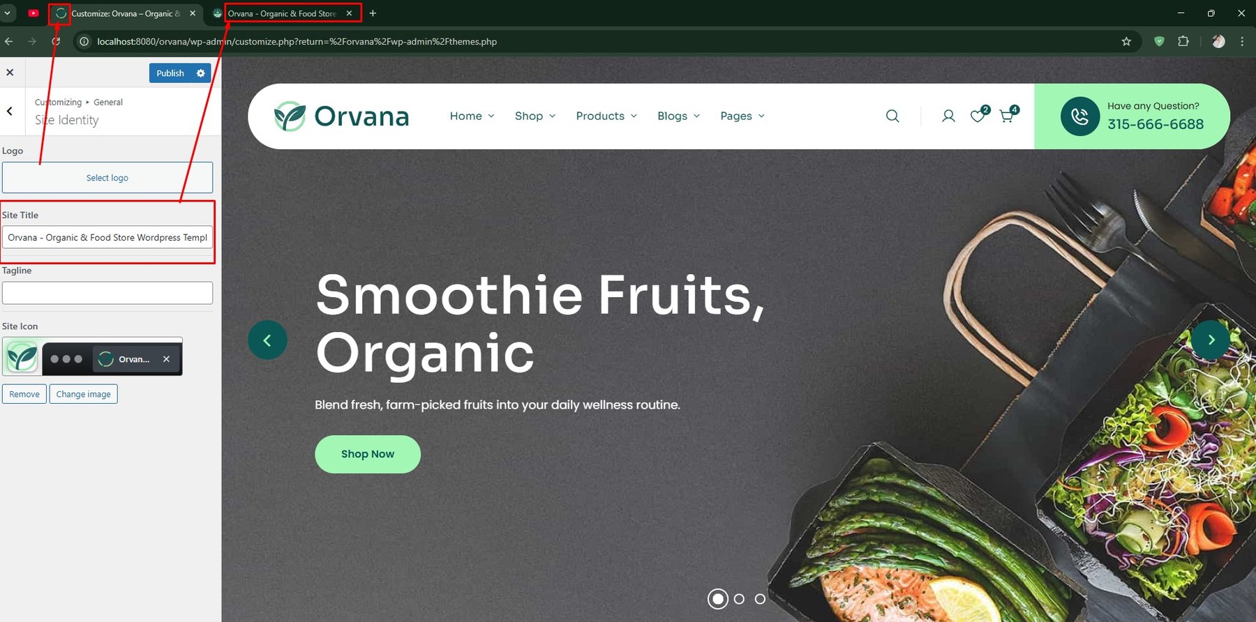
To customize the theme, navigate to: Dashboard → Appearance → Customize → General → Site Identity
- Site Title: Set or update your website’s title.
- Tagline: A short description that summarizes your site.
- Site Icon: The icon that appears in browser tabs, bookmarks, and WordPress mobile apps.

- Site Display
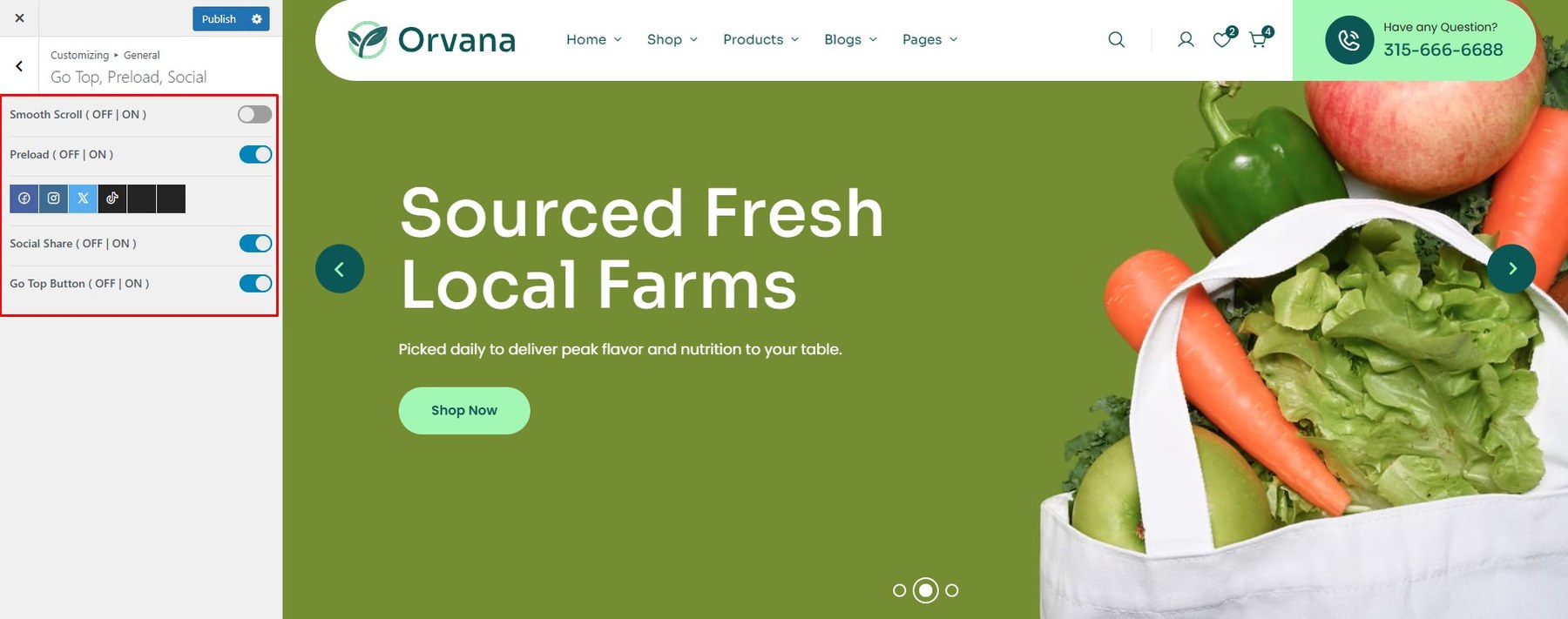
To customize the theme, navigate to: Dashboard → Appearance → Customize → General → Go Top, Preload, Social
- Enable Smooth Scroll: Toggle smooth scrolling on or off.
- Enable Preload: Show a preloader while navigating between pages.
- Go To Top Button: Enable or disable the “Back to Top” button for user convenience.
 <li> <h5>Template Builder:</h5> <p> To turn on Template Builder (Shop), navigate to: <strong>Dashboard → Appearance → Customize → General → Template Builder</strong> </p> <ul> <li><strong>Enable Smooth Scroll:</strong> Toggle smooth scrolling on or off.</li> <li><strong>Enable Preload:</strong> Show a preloader while navigating between pages.</li> <li><strong>Go To Top Button:</strong> Enable or disable the “Back to Top” button for user convenience.</li> </ul> <div class=”screenshot-item”>? <img src=”assets/images/theme/theme_03.jpg” alt=”Template Builder Screenshot” width=”1350″ /> </div> </li>
- Login:
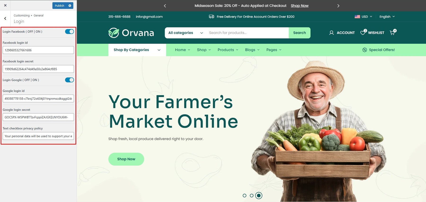
To customize the theme, navigate to: Dashboard → Appearance → Customize → General → Login
- Login Facebook: Enable login via Facebook.
- Login Google: Enable login via Google.
- Text: Customize your setting on register form.

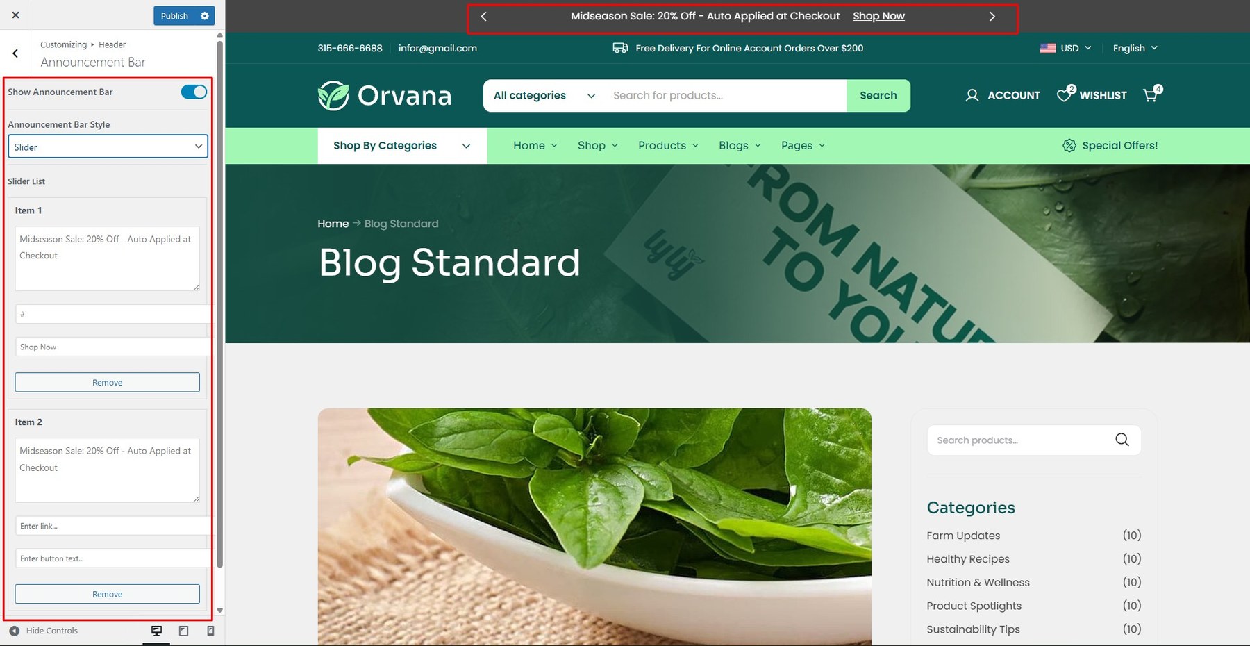
Announcement Bar: Enable or disable the announcement bar.
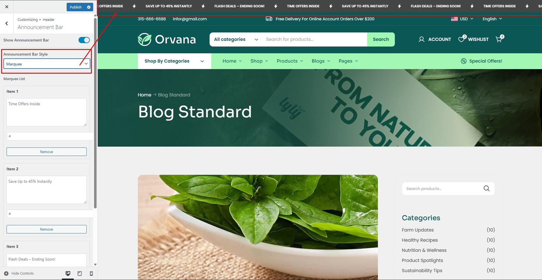
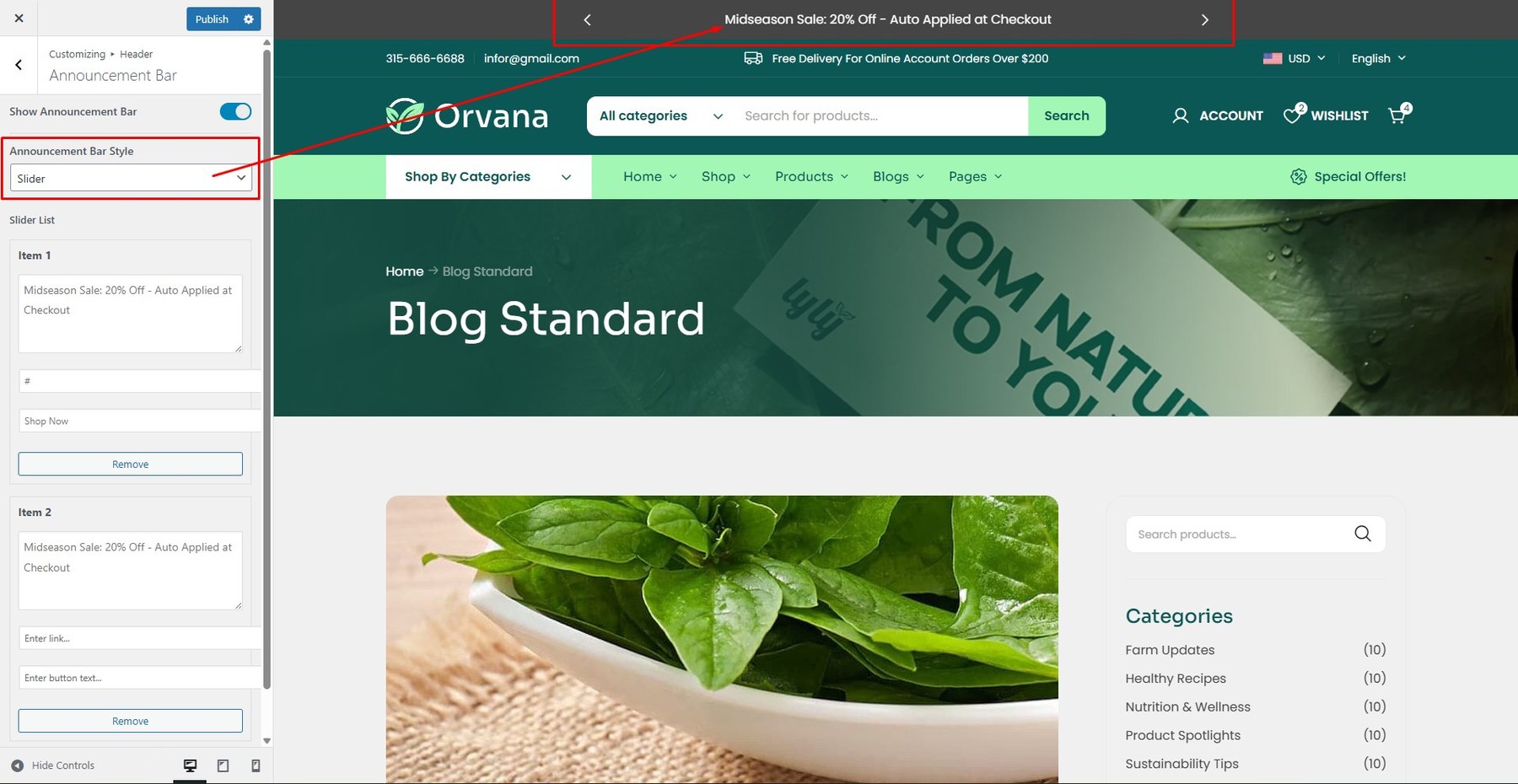
Style:Choose style off announcement( Marquee or Slider).
- Marquee Style

- Slider Style

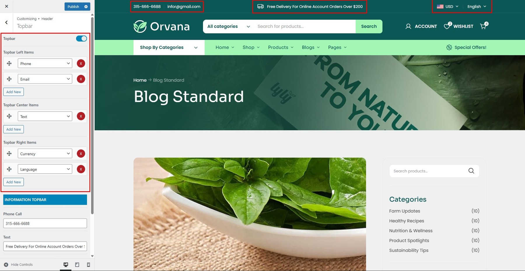
Top bar: Enable or disable the top bar.
<p><strong>Top bar Full Width:</strong> Enable full-width in case you want the it to be wider and extend beyond the grid.</p>
Left Items: Select the items you want to display on the left side of the screen.
Center Items: Select the items you want to display on the center of the screen.
Right Items: Select the items you want to display on the right side of the screen.
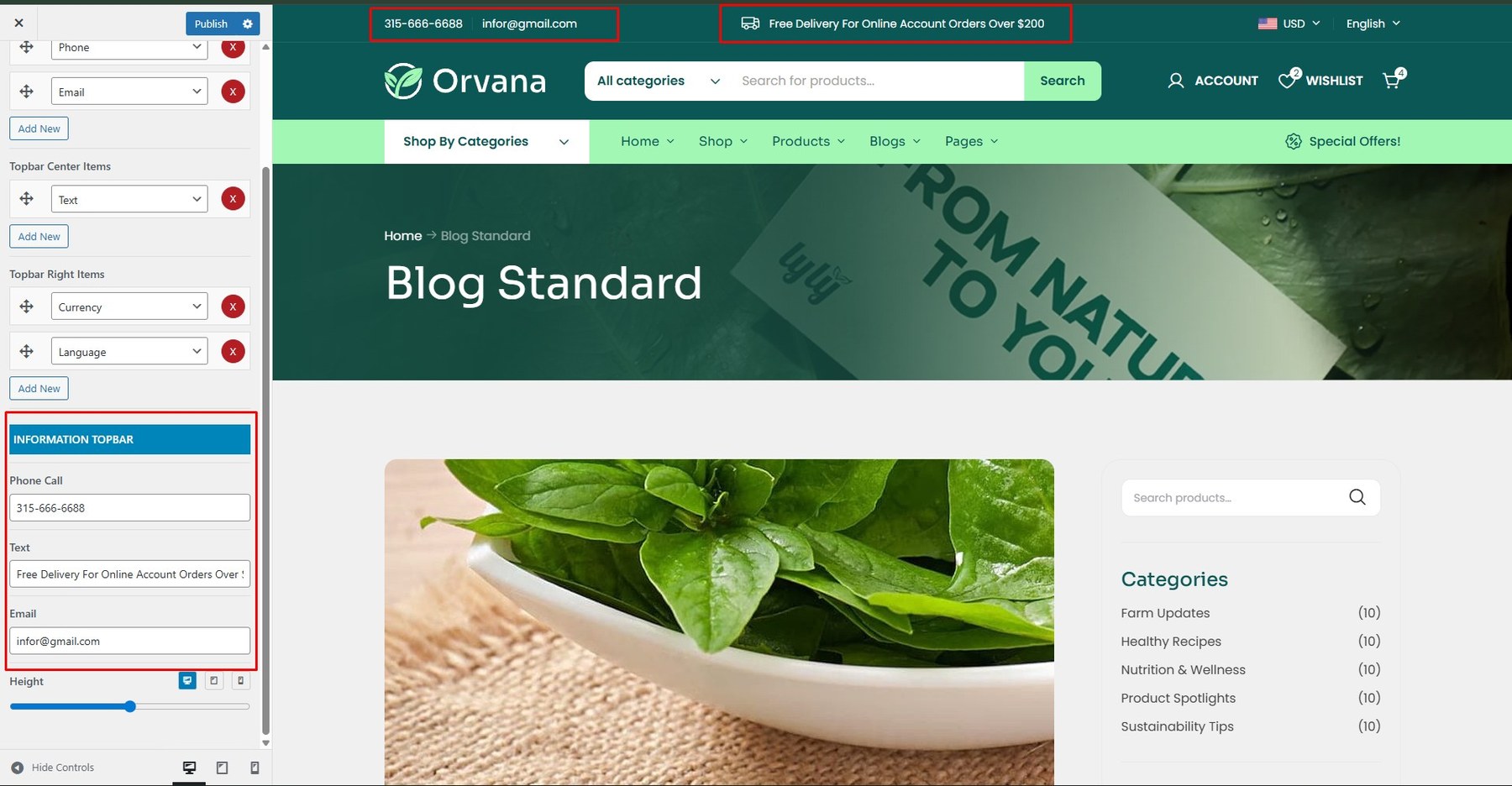
The place where you enter information for the items in the top bar: address, phone, email, etc.
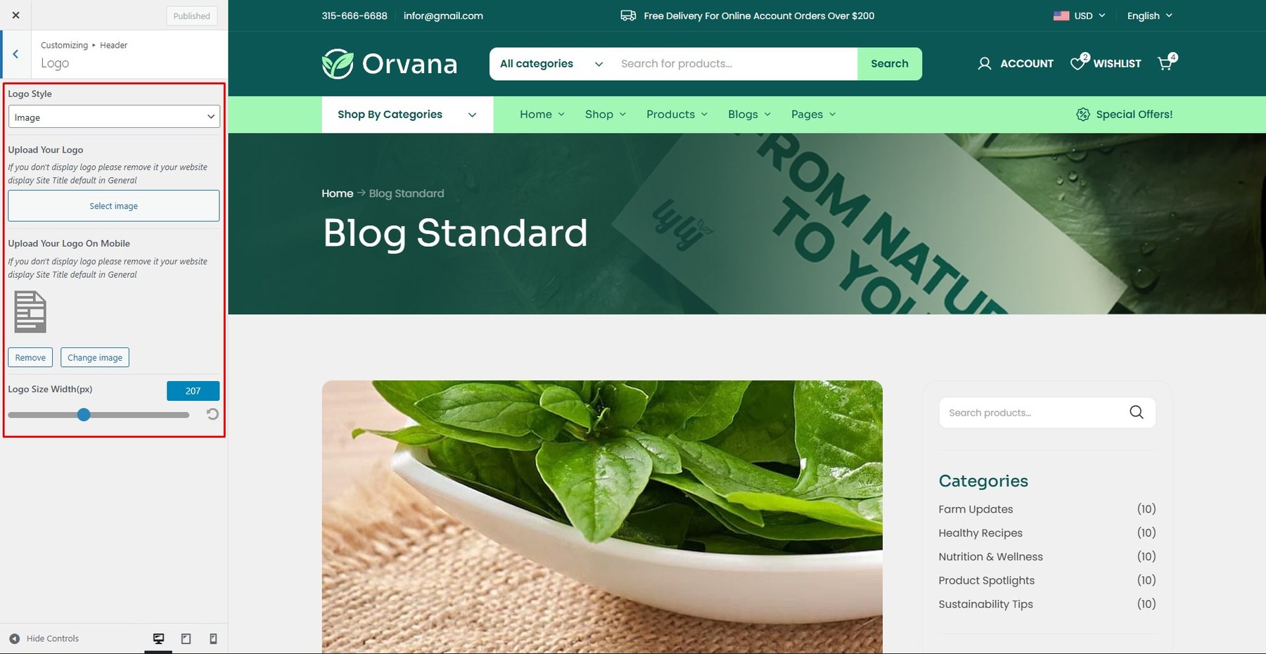
Upload Your Logo: Drag or select your new logo.
Upload Logo for Mobile: Drag or select your new mobile logo.
Logo Size: Choose the desired logo size.
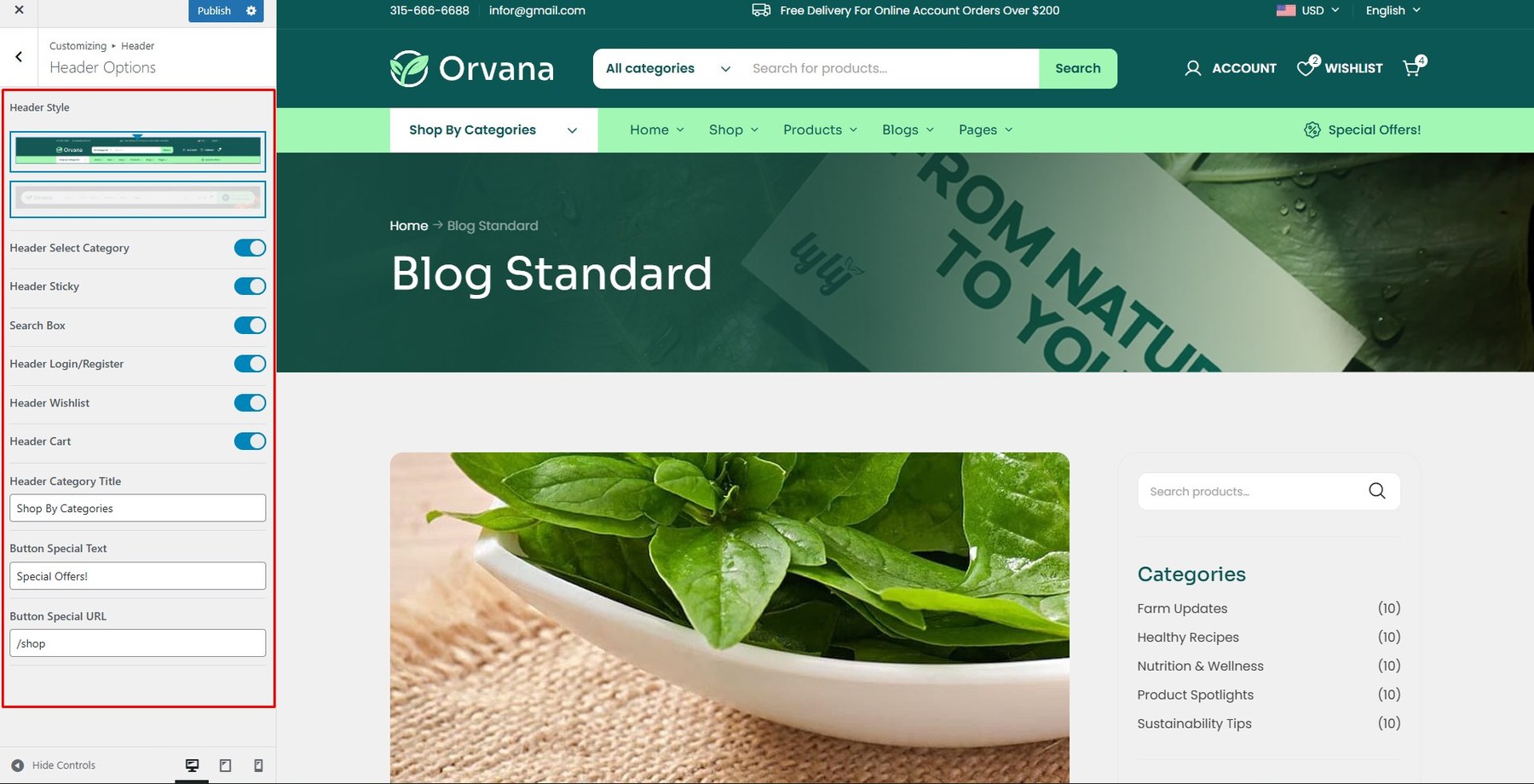
Header Style: Select a default header style.
Header Absolute: Enable or disable absolute positioning.
Header Sticky: Enable or disable sticky behavior for the header.
Search Box: Show or hide the search box in the header.
Header Login/Register: Enable or disable login/register links.
Header Wishlist: Enable or disable the wishlist icon.
Header Cart: Enable or disable the shopping cart icon.
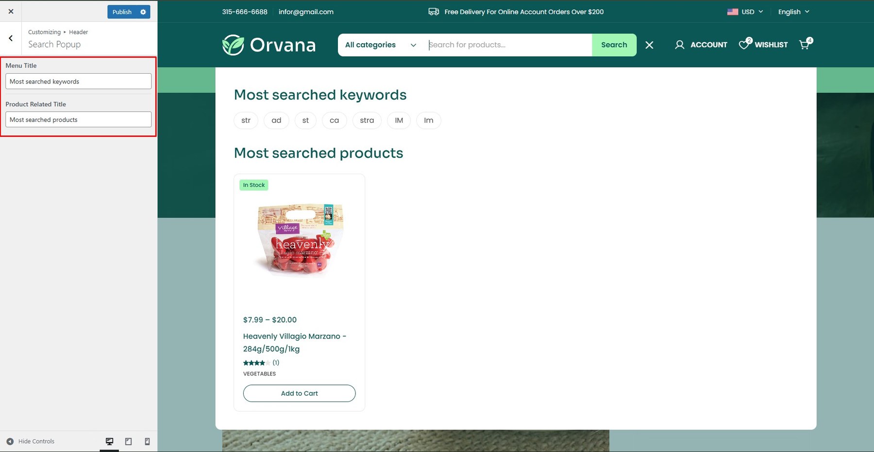
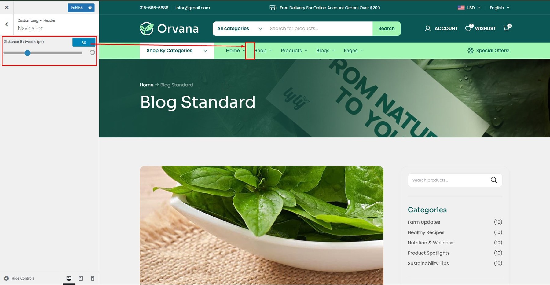
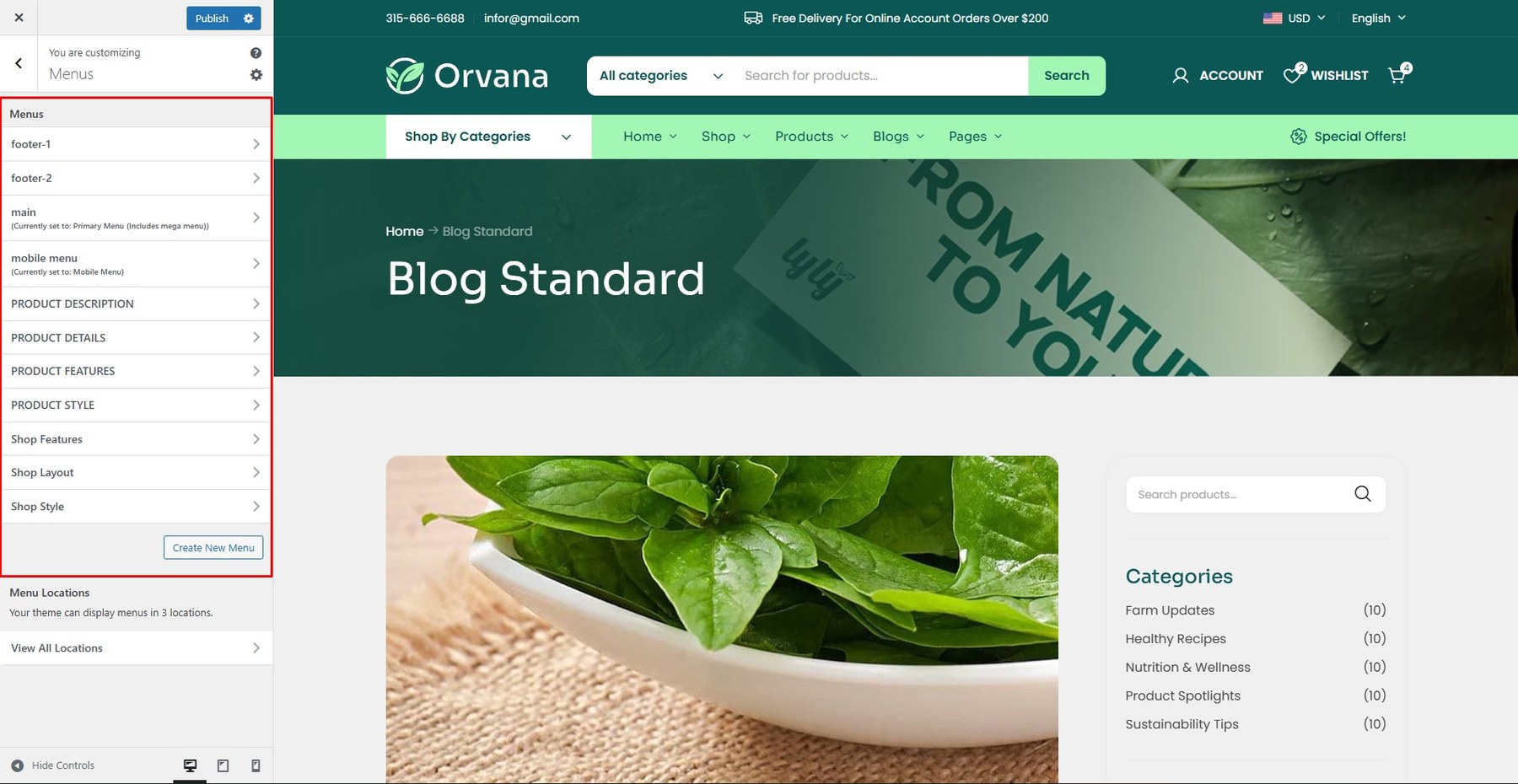
To create or customize a menu layout, go to Dashboard → Appearance → Customize → Menus.
Select an existing menu to edit or create a new one.
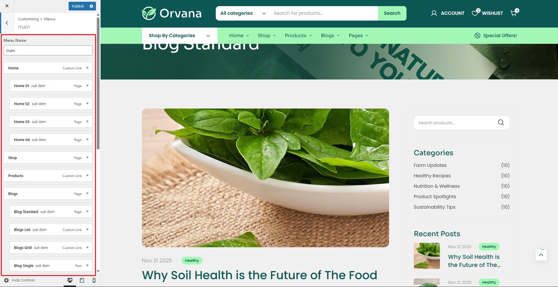
Drag and drop menu items to reorder.
To customize the page title layout, go to Dashboard → Appearance → Customize → Page Title → Page Title.
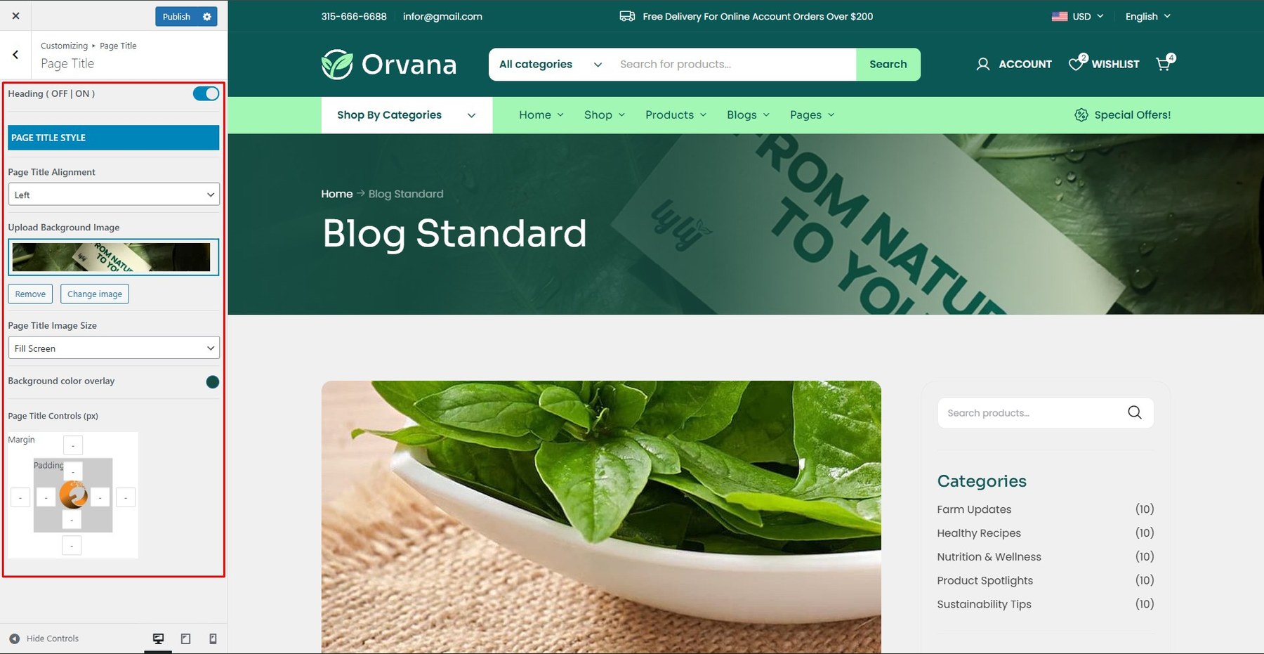
Use the available settings to adjust the page title style
Enable Breadcrumbs: Show or hide breadcrumb navigation.
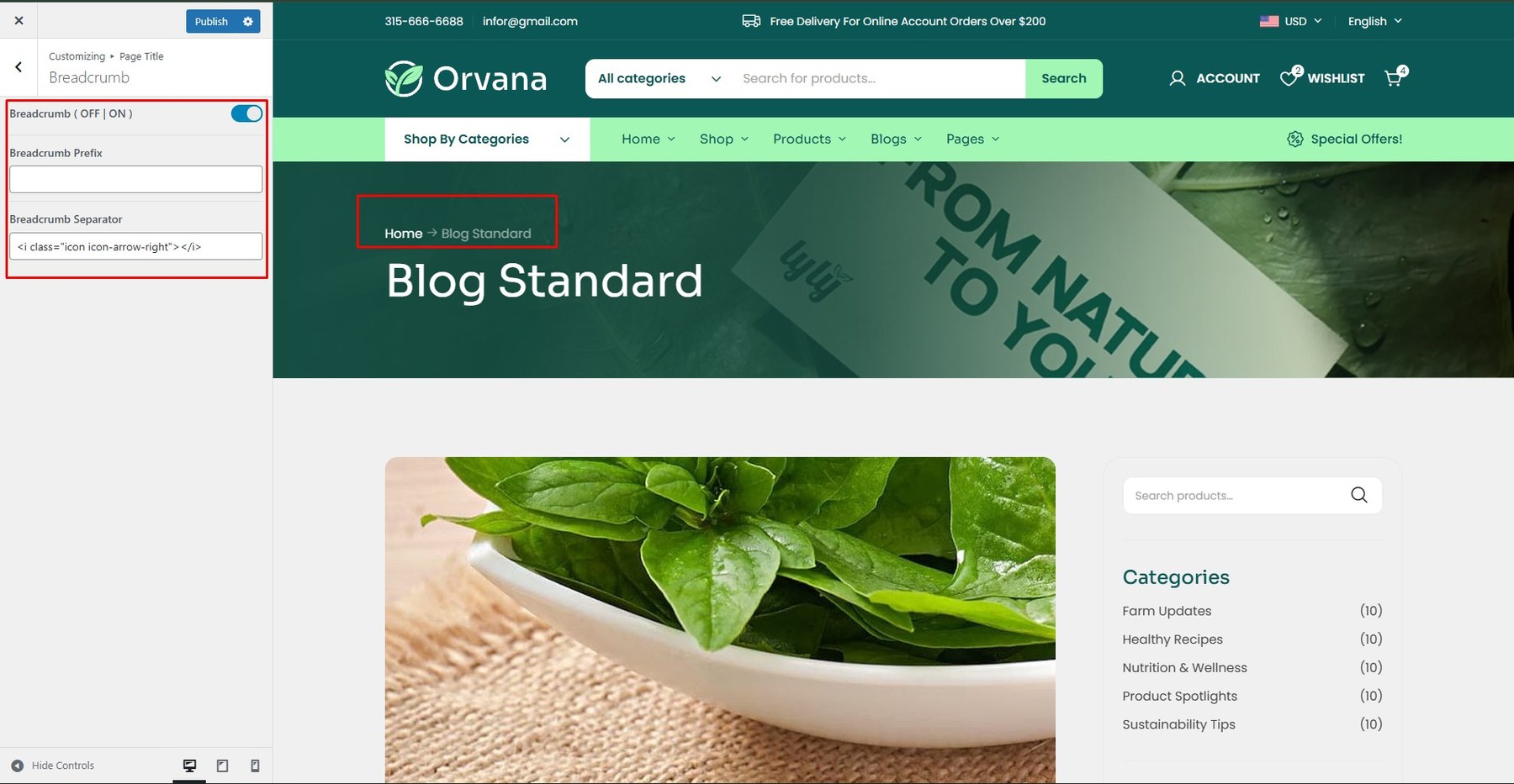
Breadcrumb Prefix: Text displayed before the breadcrumb trail.
Breadcrumb Separator: Character used to separate breadcrumb items.
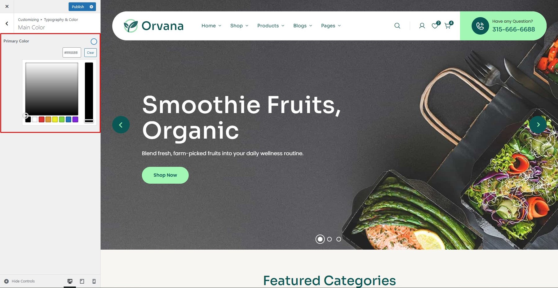
To customize the page title style layout, please navigate to Dashboard → Appearance → Customize → Typography & Color → Main Color.
<div> <h5>Announcement Bar</h5> <p>Customize the color background, font family, size, weight, and color for announcement bar.</p> <div class=”screenshot-item”> <img src=”assets/images/theme/theme_19.jpg” alt=”Body Font Settings” width=”1350″> </div> </div>
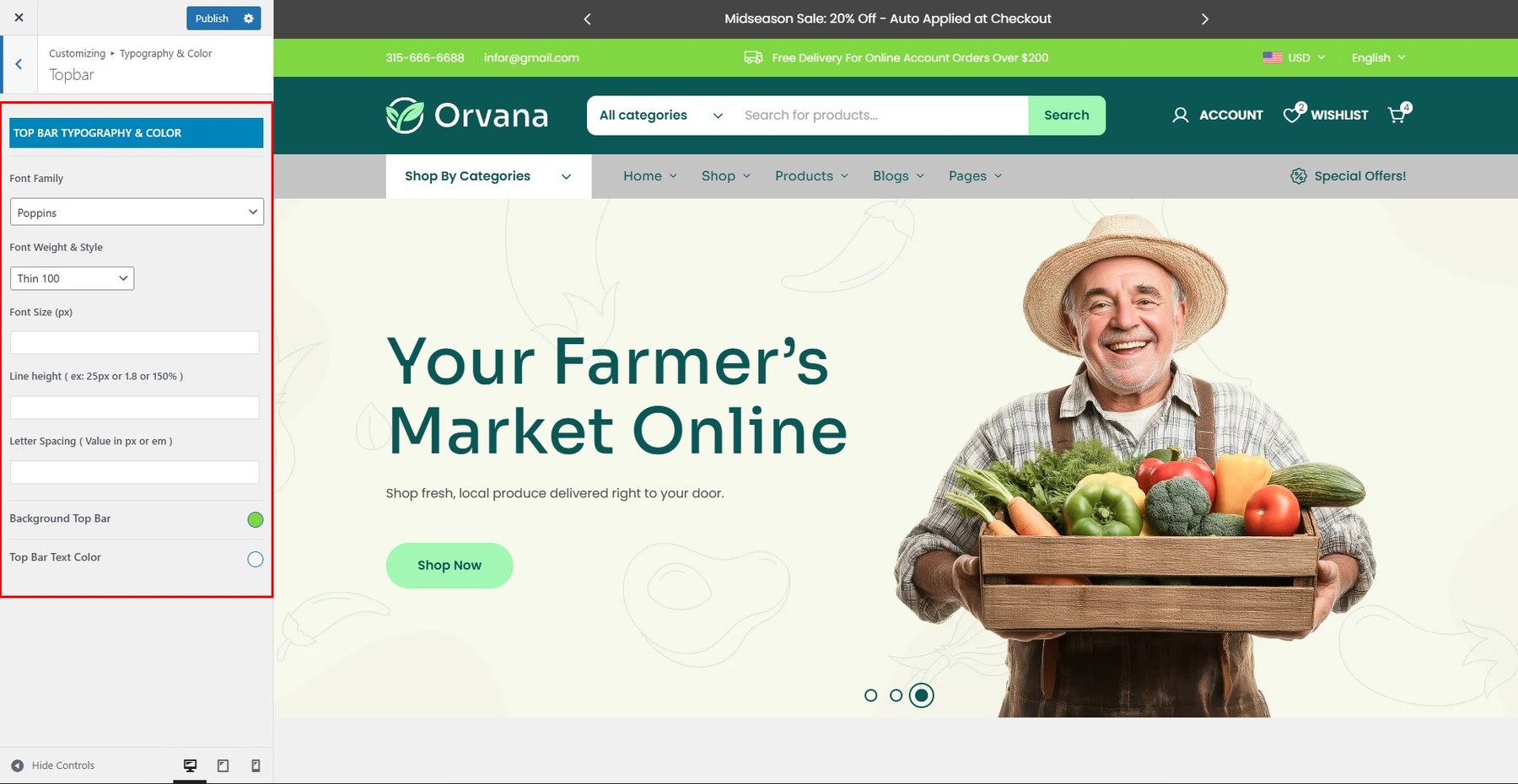
Customize the color background, font family, size, weight, and color for topbar.
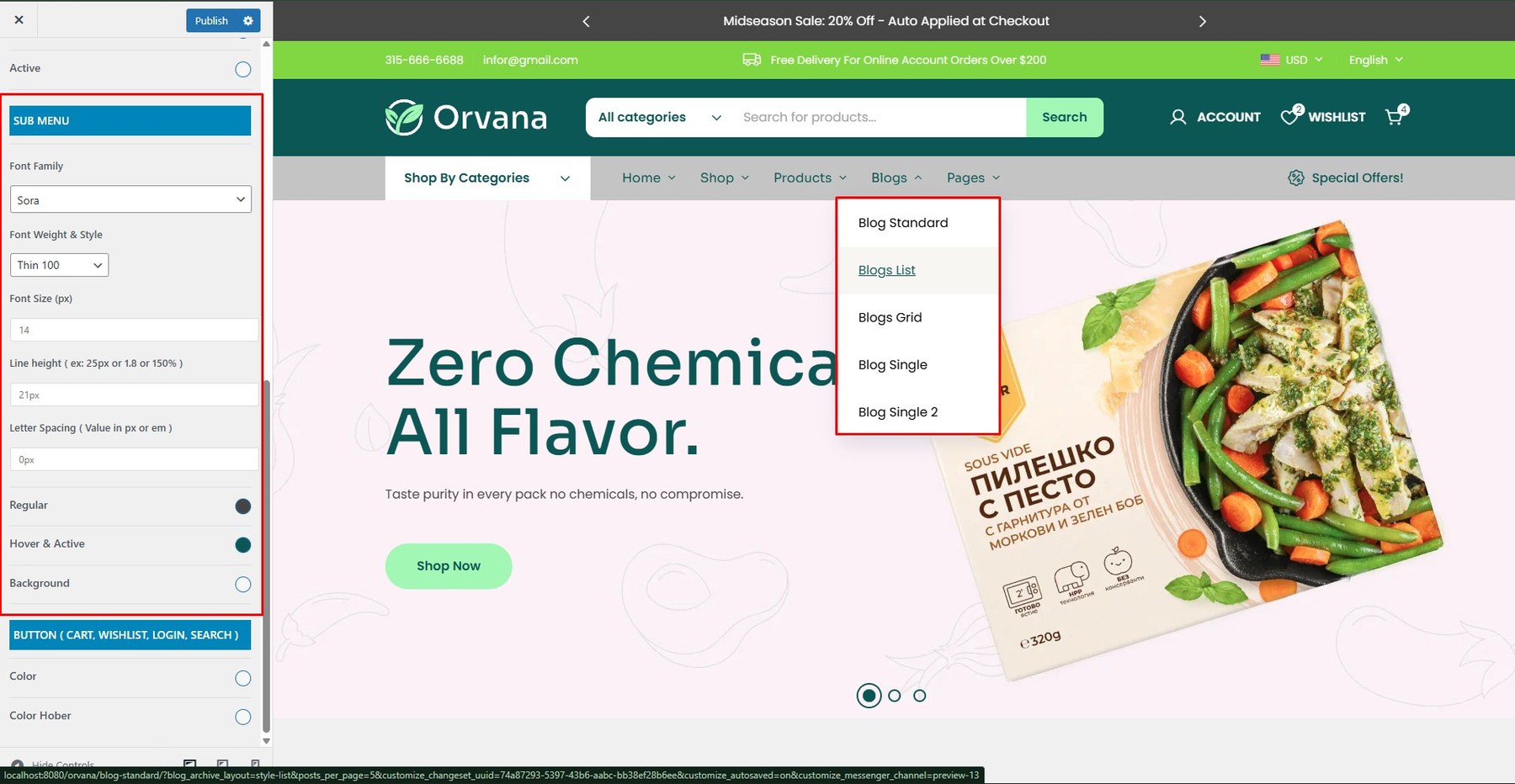
Customize the color background, font family, size, weight, and color for the main menu and submenus.
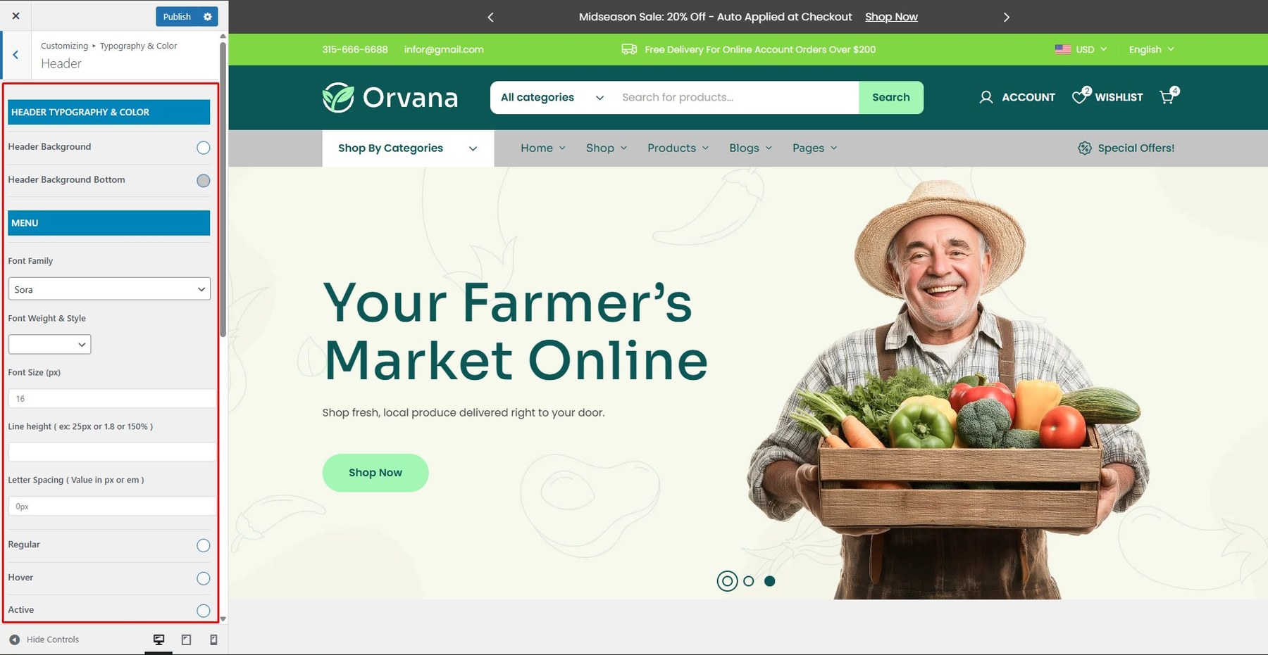
Submenu:
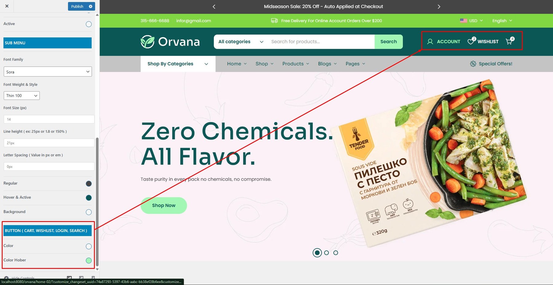
Button:
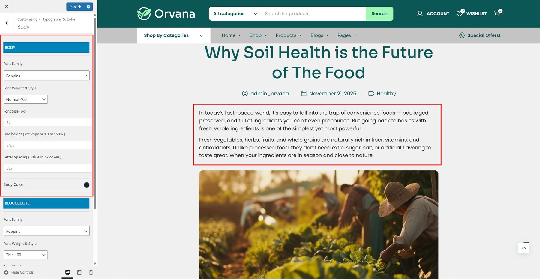
Customize the font family, size, weight, and color for body text.
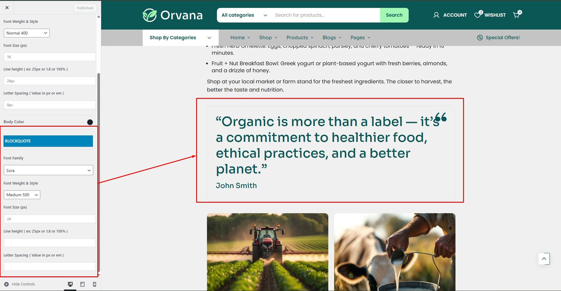
Blockquote Typography
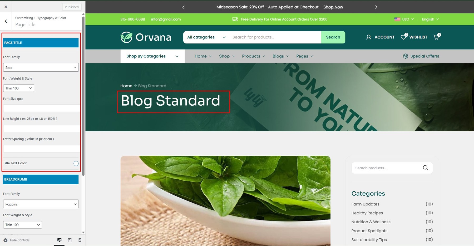
Customize the font family, size, weight, and color for Page Title.
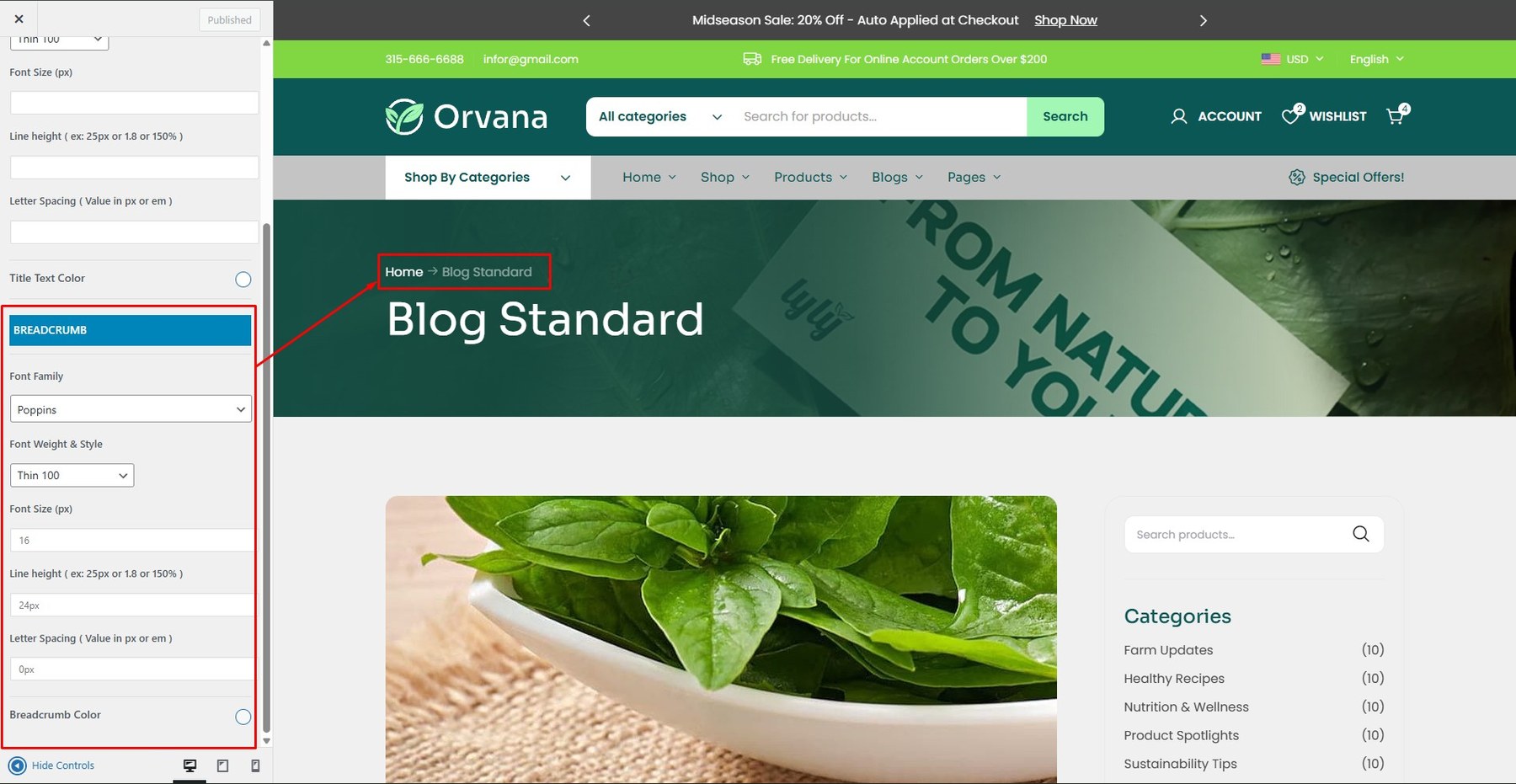
Breadcrumb Typography: Customize the font family, size, weight, and color for Breadcrumb.
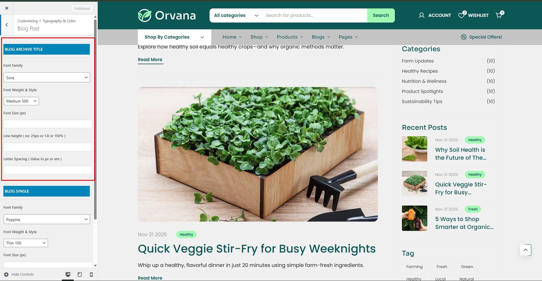
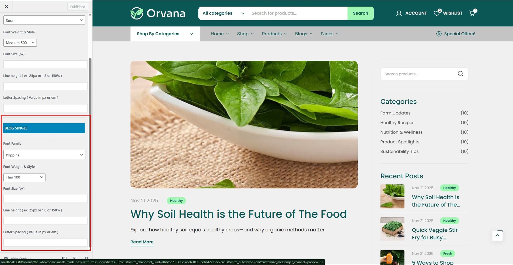
Customize the font family, size, weight, and color for Blog include: Blog Archive Title, Blog Archive Meta, Blog Single.
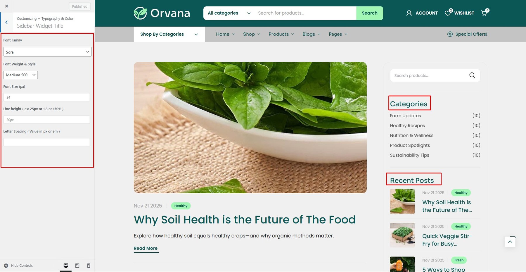
Customize the font family, size, weight, and color for Sidebar Widget Title.
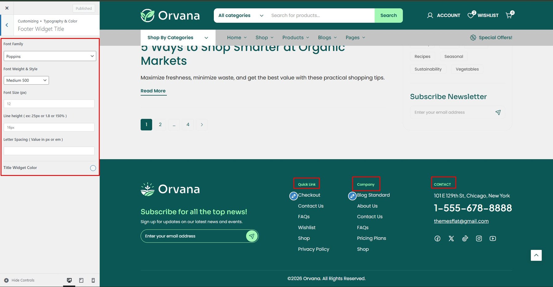
Customize the font family, size, weight, and color for Footer Widget Title.
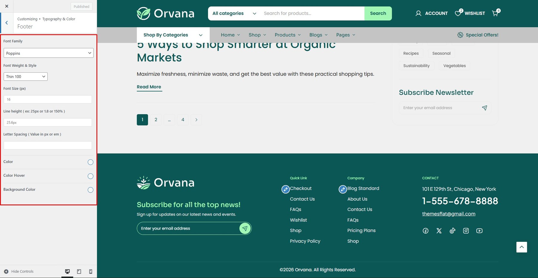
Customize the font family, size, weight, and color for Footer.
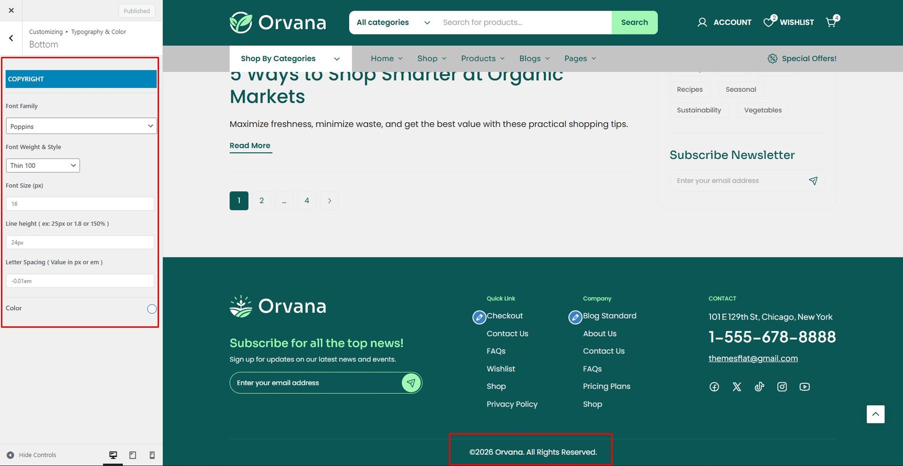
Customize the font family, size, weight, and color for Page Title.
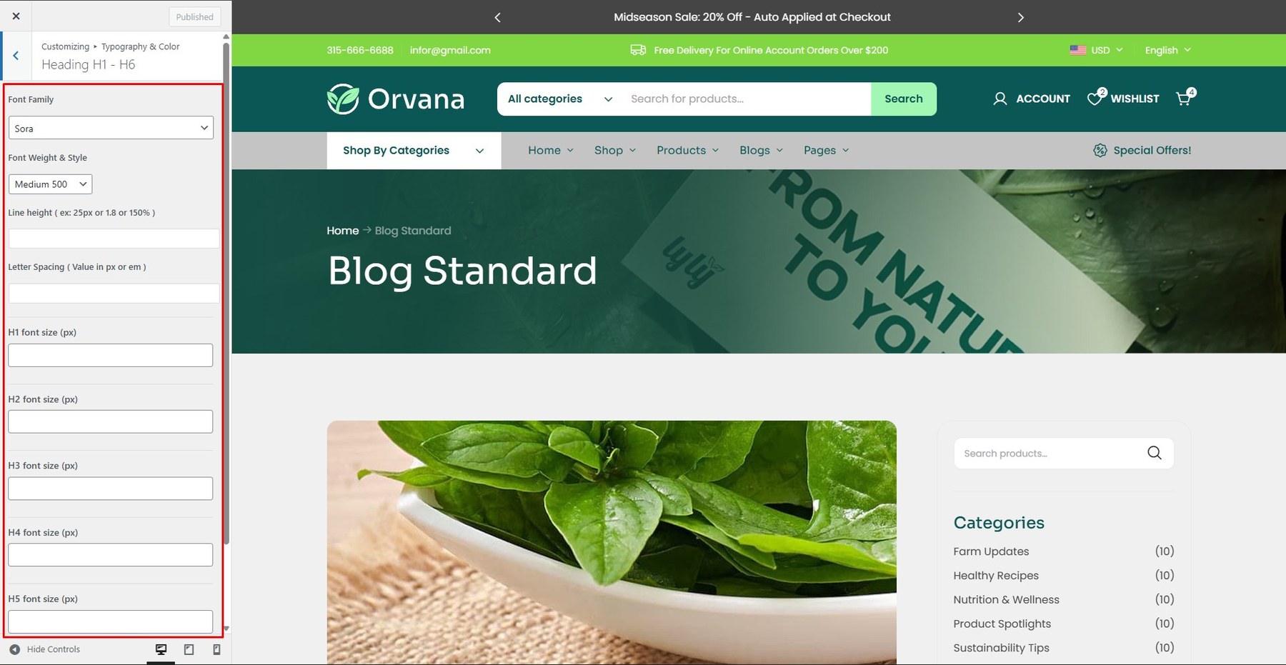
Adjust the font settings for all heading levels (H1–H6).
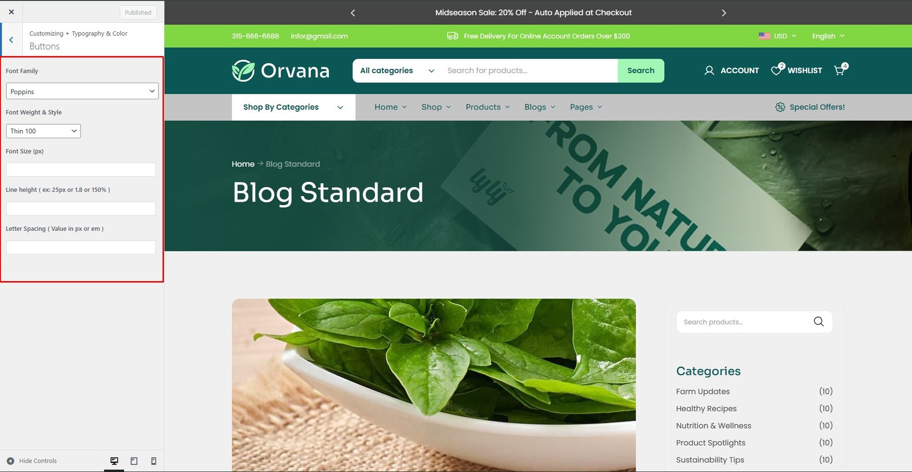
Adjust the font settings for Button.
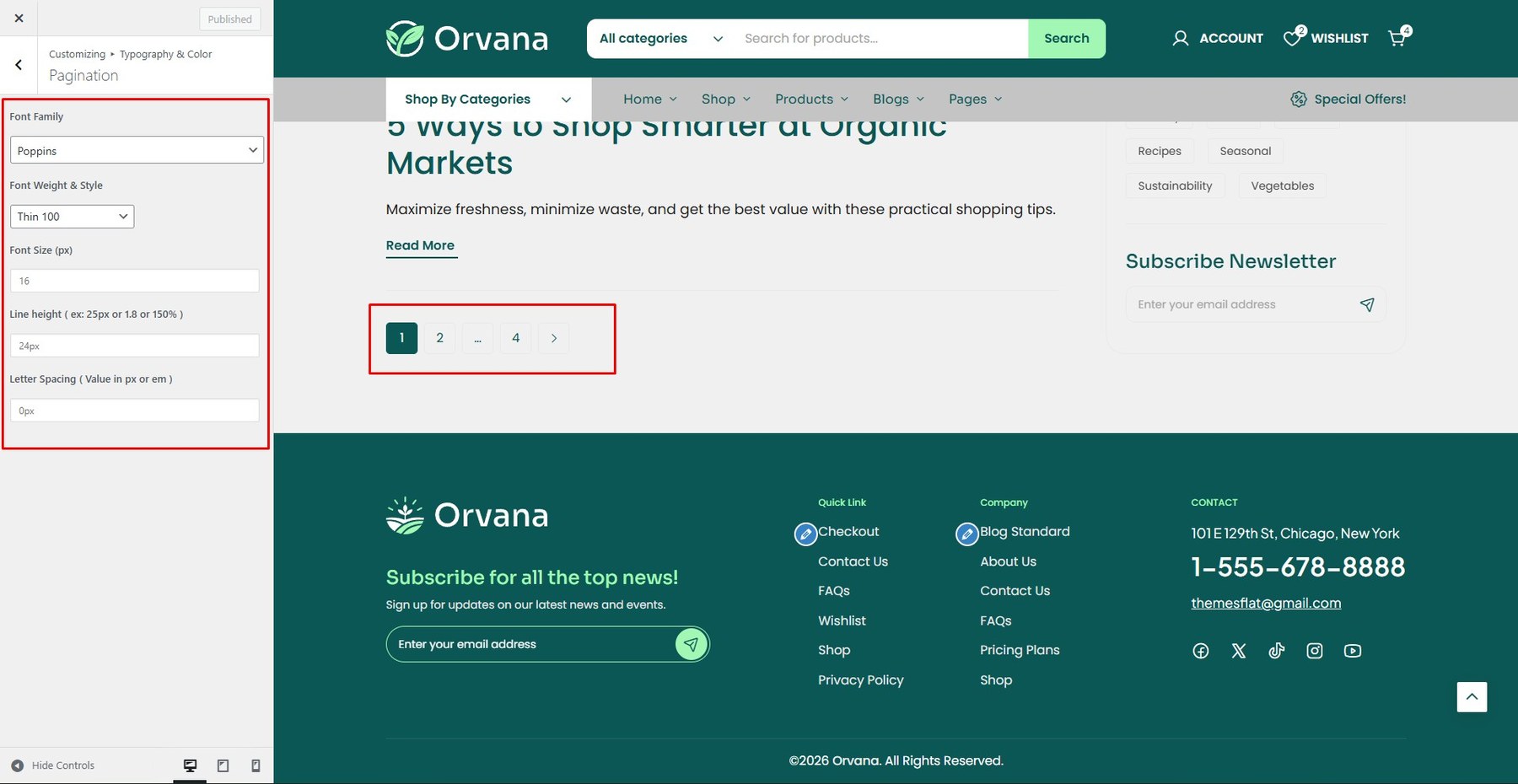
Adjust the font settings for all pagination.
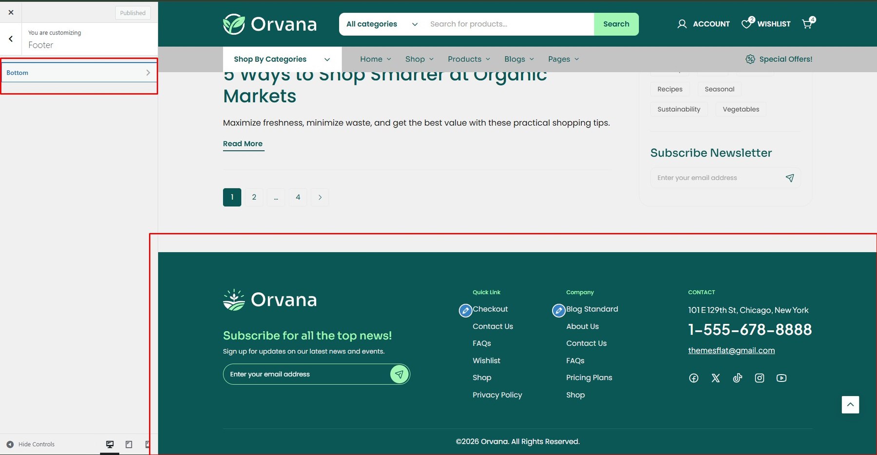
To edit the default footer, navigate to Dashboard > Appearance > Customize > Footer.
- <li> <h5>Top</h5> <p>You can customize the top of the footer or turn it off.</p> <div class=”screenshot-item”> <img class=”img-doc” src=”assets/images/theme/theme_38.jpg” alt=”Footer Top Settings” width=”1350px”> </div> </li>
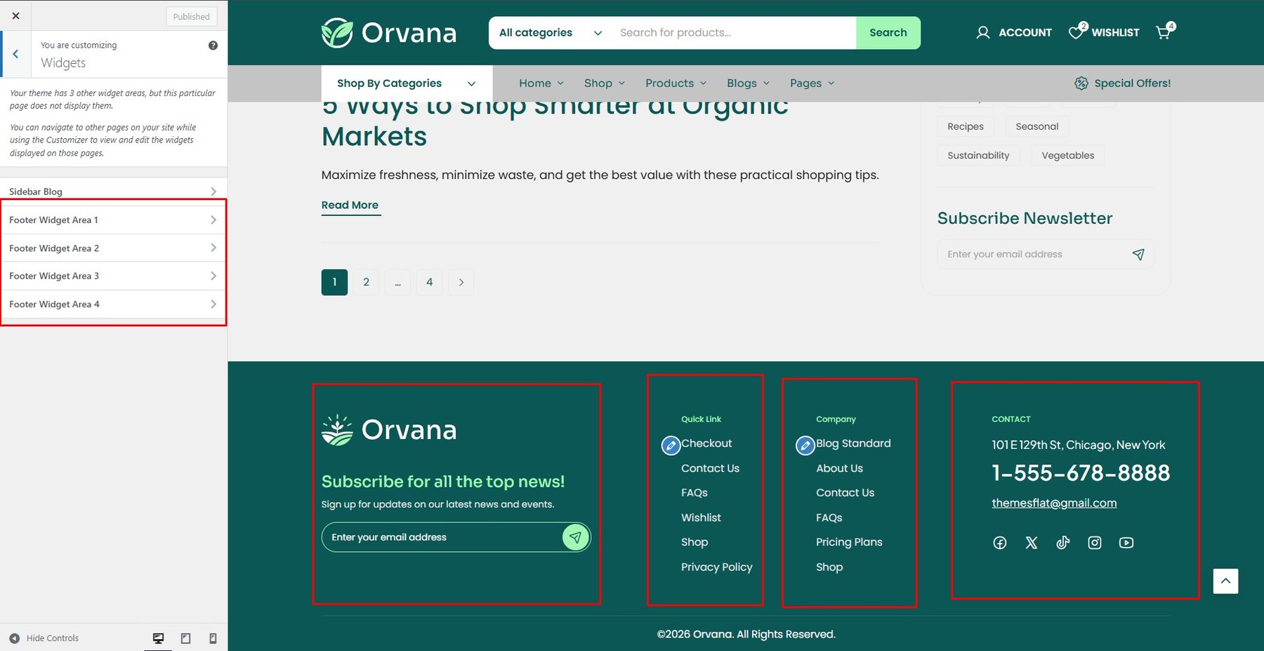
- Menu Footer
Go to Dashboard > Appearance > Widgets to edit the footer menu.

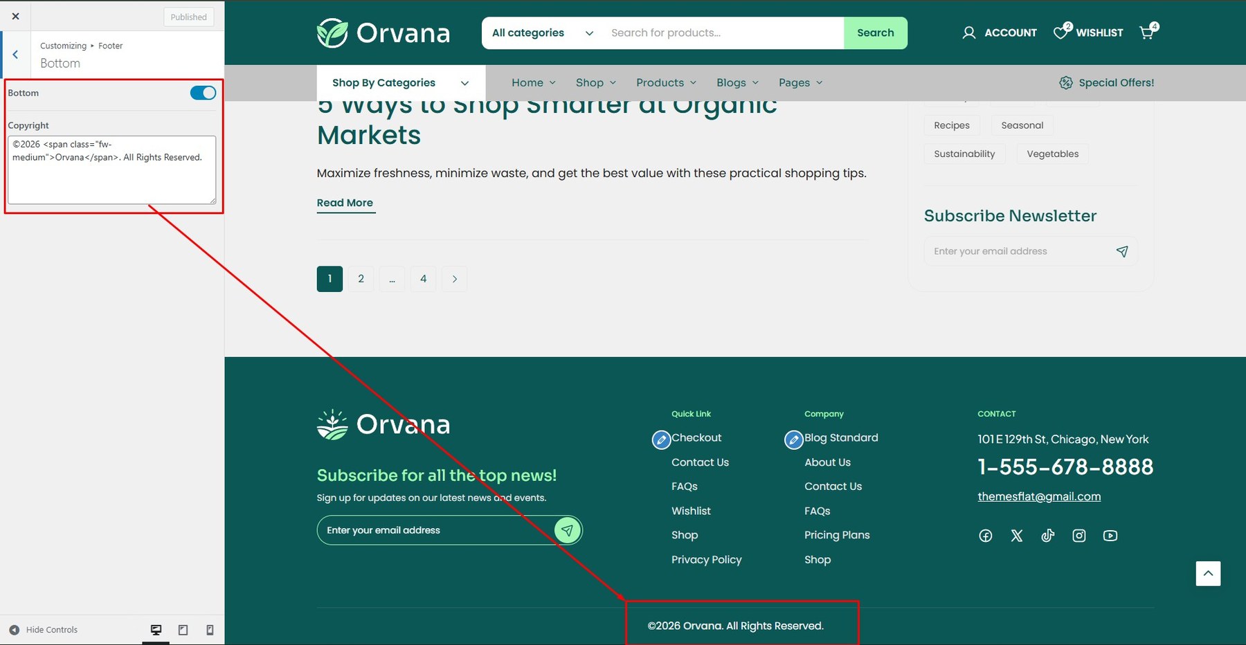
- Bottom
You can edit the contents of the bottom section here.

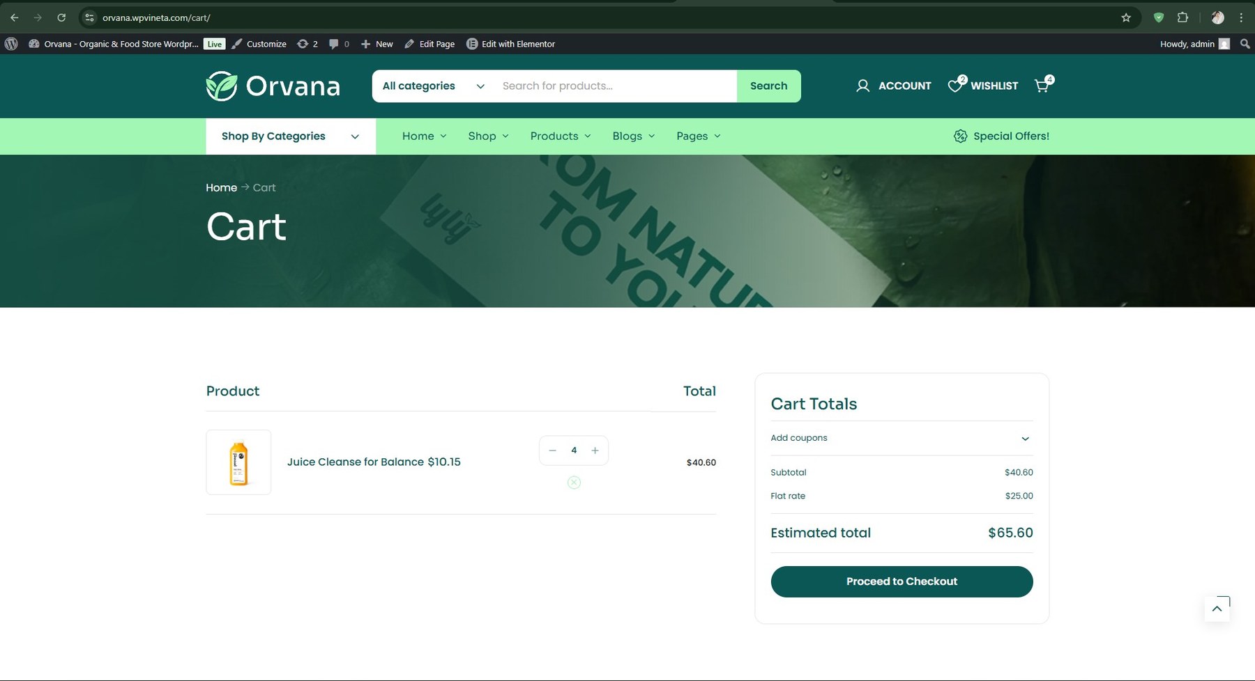
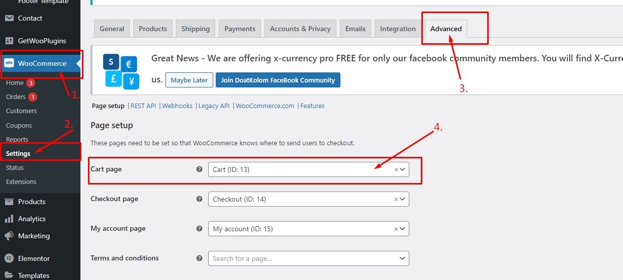
Step 1: From the admin dashboard, navigate to WooCommerce → Settings → Advanced → Cart Page.
Step 2: Enable Quick View. You can also customize the appearance under Style Options.
Step 3: Click Save Changes after finishing your setup.
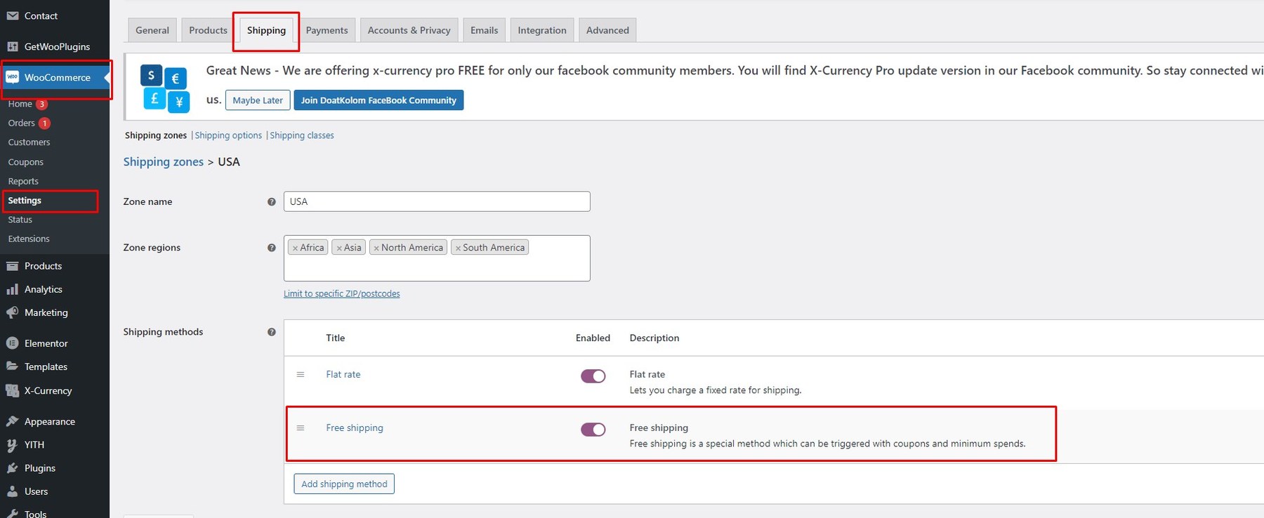
Step 1: From the admin dashboard, navigate to WooCommerce → Settings → Advanced → Shipping.
Step 2: Set up Shipping Zones.
Step 3: Create a Free Shipping method and define the minimum order amount.
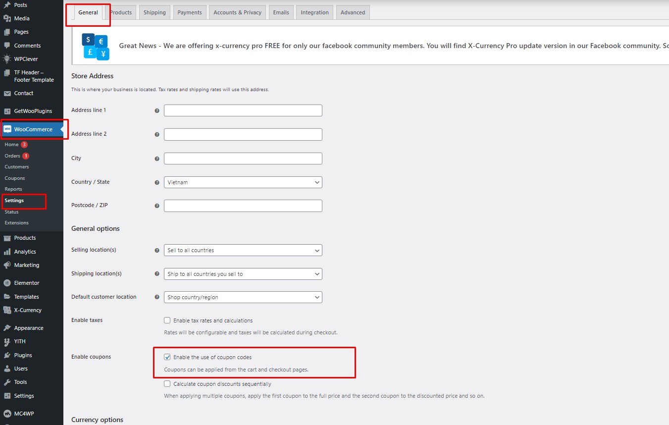
To enable coupons in the Cart Drawer, Cart Page, and Checkout Page, go to WooCommerce → Settings → General and check the Enable coupons option.
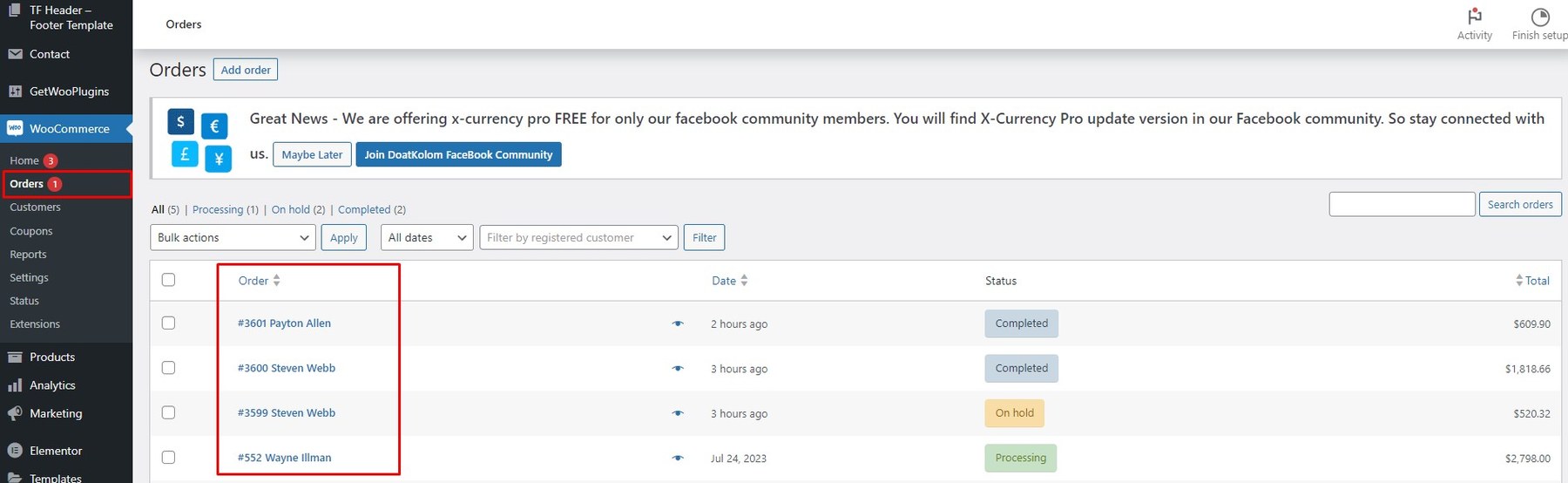
From the admin dashboard, navigate to WooCommerce → Orders.
You can view total orders on a daily, weekly, or monthly basis.
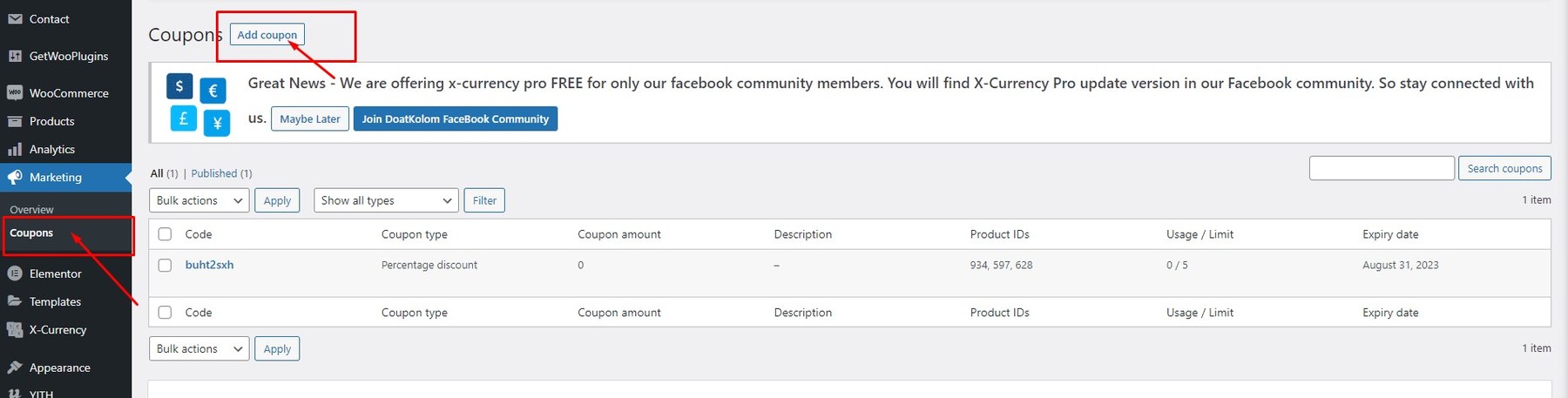
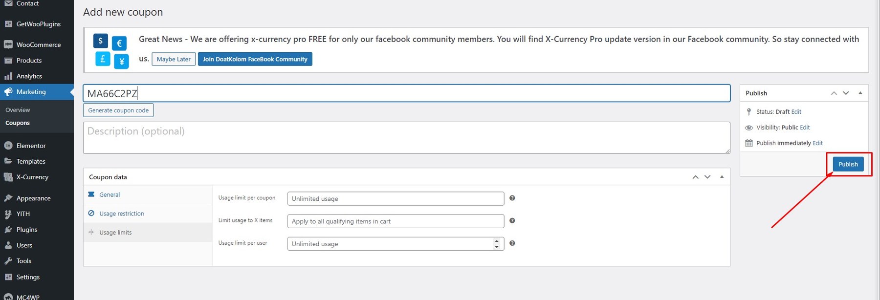
From the admin dashboard, navigate to Marketing → Coupons.
Click the Add coupon button to create a new coupon.
Fill in the required information and click Publish to save the coupon.
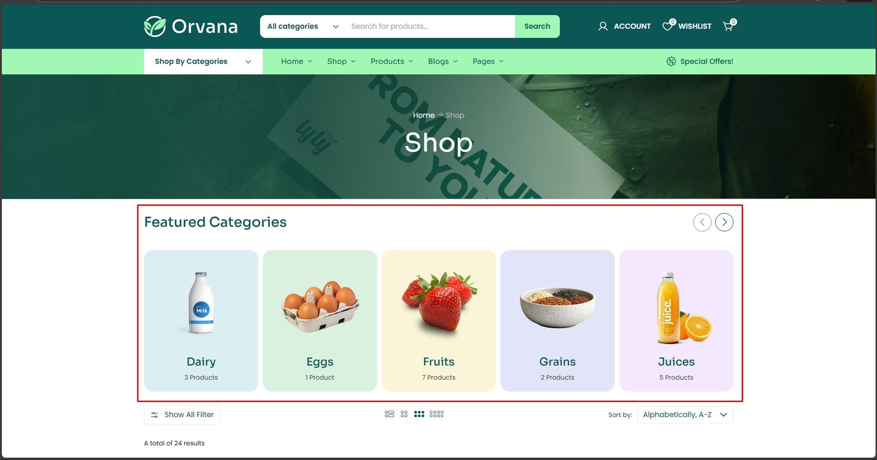
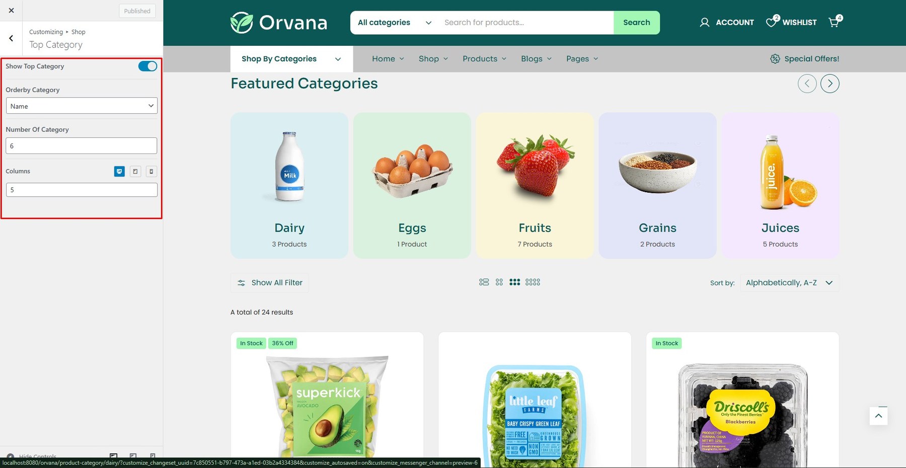
To enable this feature, go to Customize → Shop → Top Categories
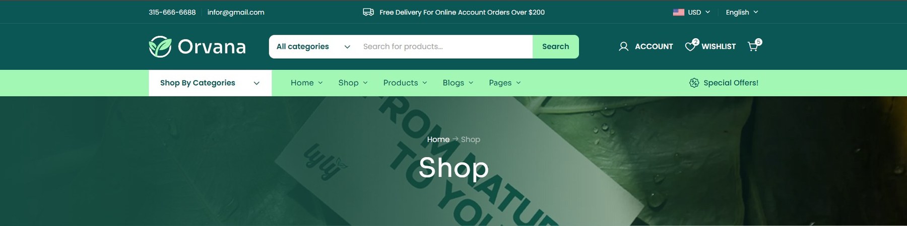
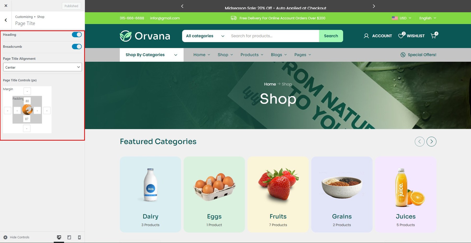
To enable this feature, go to Customize → Shop → Shop Page Title
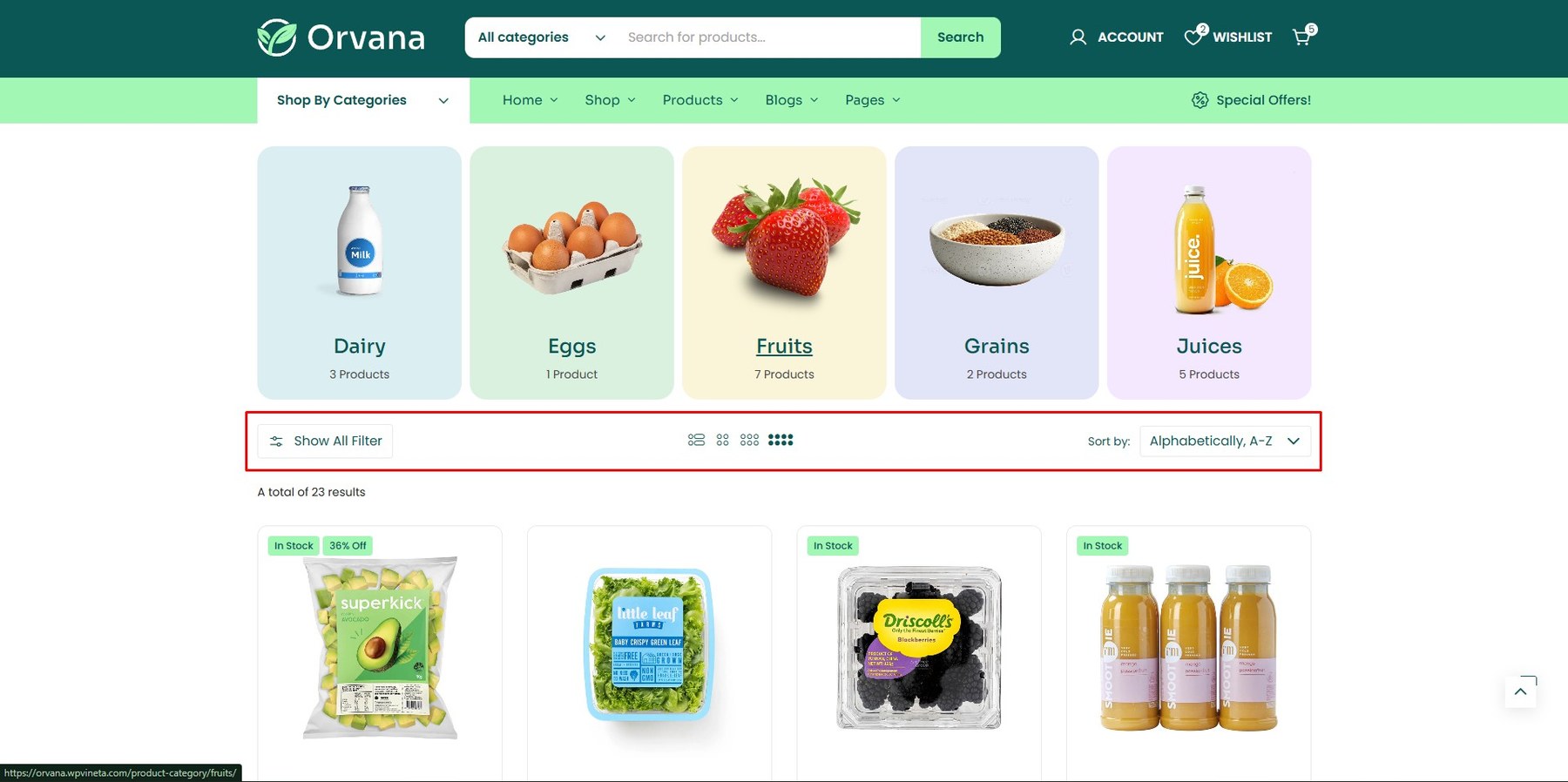
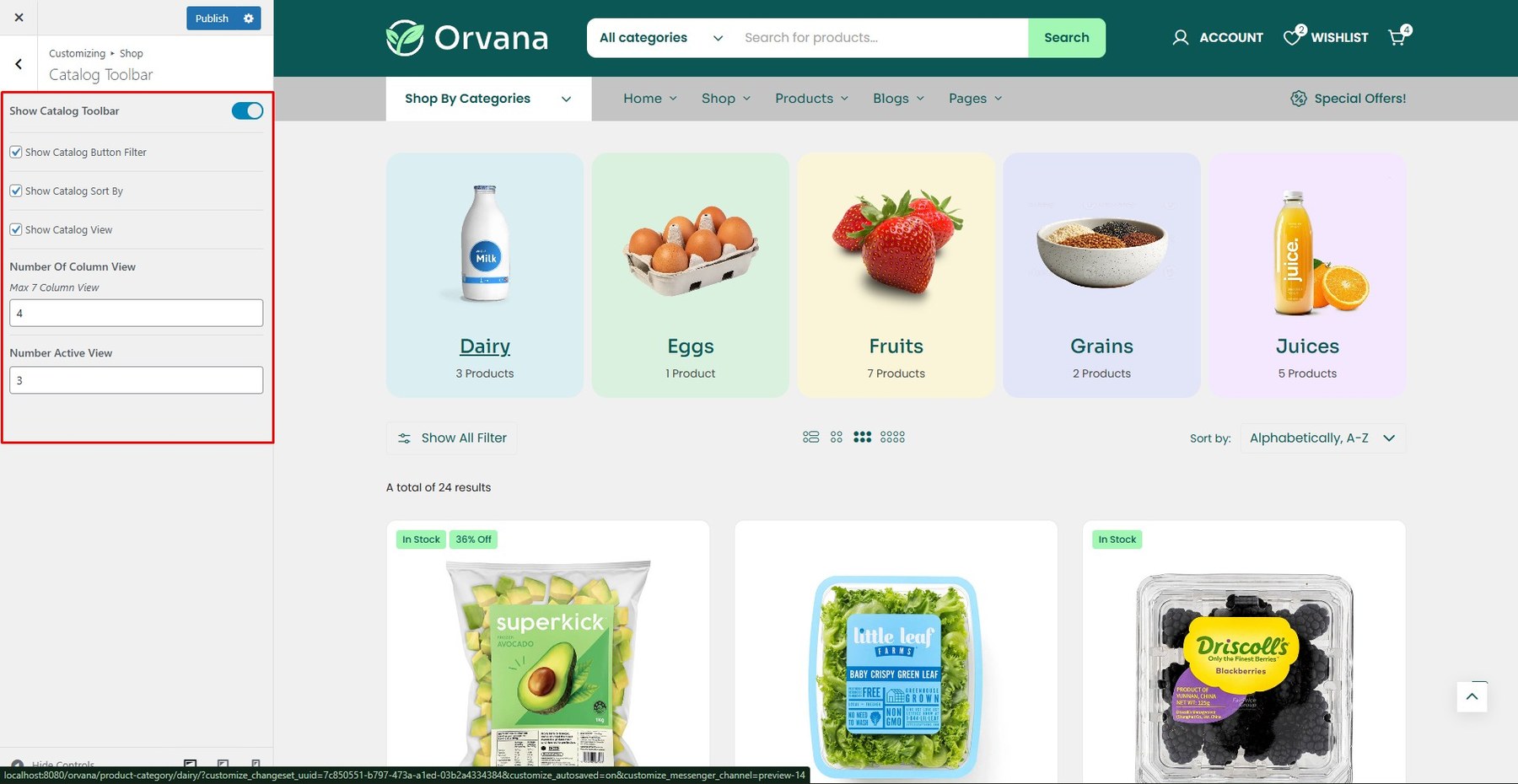
To enable this feature, go to Customize → Shop → Catalog Toolbar
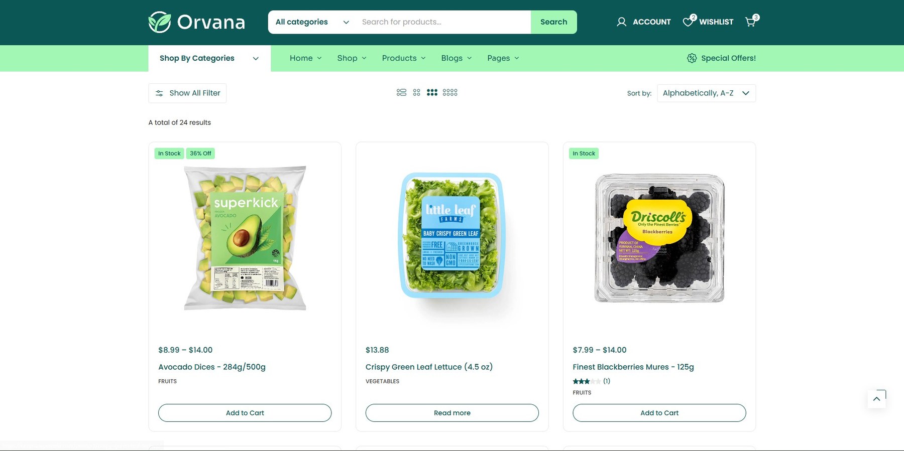
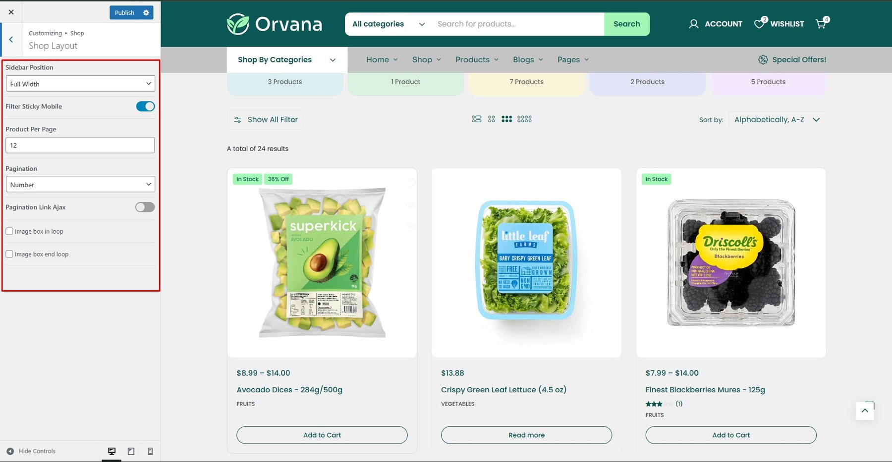
To enable this feature, go to Customize → Shop → Shop Layout
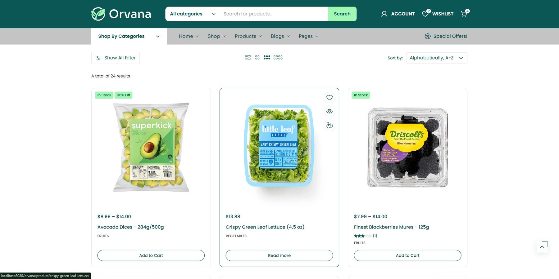
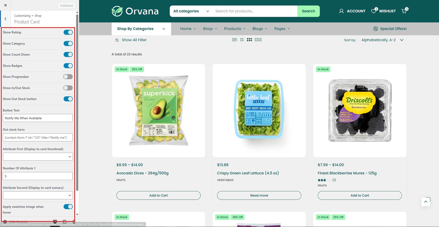
To enable this feature, go to Customize → Shop → Product Card
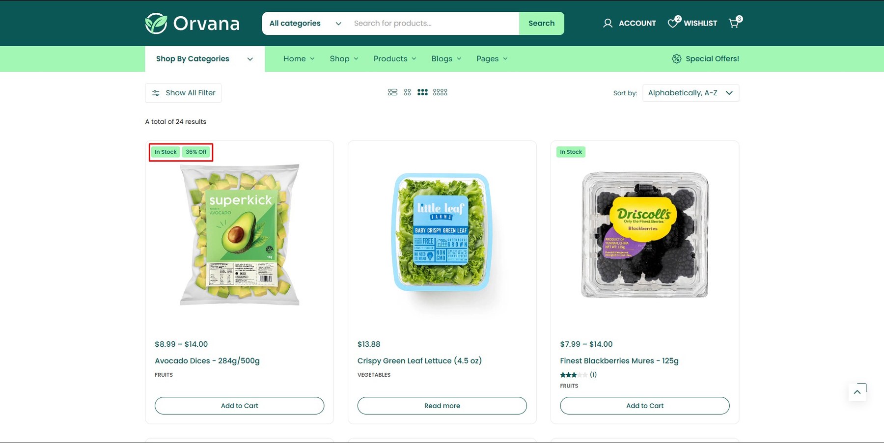
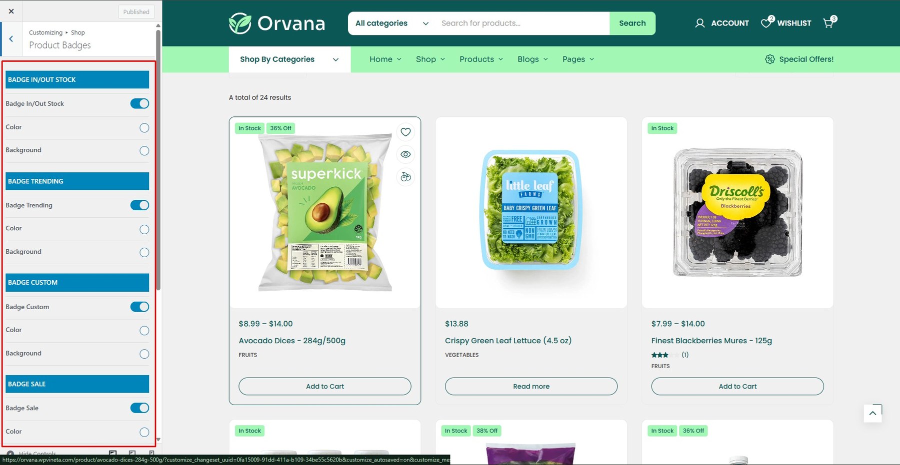
To enable this feature, go to Customize → Shop → Product Badges
<div id=”mini-cart”> <h4>10. Mini Cart</h4> <div class=”screenshot-item”> <img class=”img-doc” src=”assets/images/shop-archive/shop-archive_13.jpg” alt=”Mini Cart” width=”1350″ /> </div> <p>To enable this feature, go to <strong>Customize → Shop → Mini Cart</strong> and change content</p> <div class=”screenshot-item”> <img class=”img-doc” src=”assets/images/shop-archive/shop-archive_14.jpg” alt=”Mini Cart” width=”1350″ /> </div> </div> <div id=”icon-box”> <h4>11. Icon Box</h4> <div class=”screenshot-item”> <img class=”img-doc” src=”assets/images/shop-archive/shop-archive_15.jpg” alt=”Icon Box” width=”1350″ /> </div> <p>To enable this feature, go to <strong>Customize → Shop → Icon Box</strong> and change content</p> <div class=”screenshot-item”> <img class=”img-doc” src=”assets/images/shop-archive/shop-archive_16.jpg” alt=”Icon Box” width=”1350″ /> </div> </div> <div id=”live-notification”> <h4>12. Live Notification</h4> <div class=”screenshot-item”> <img class=”img-doc” src=”assets/images/shop-archive/shop-archive_17.jpg” alt=”Live Notification” width=”1350″ /> </div> <p>To enable this feature, go to <strong>Customize → Shop → Live Notification</strong></p> <div class=”screenshot-item”> <img class=”img-doc” src=”assets/images/shop-archive/shop-archive_18.jpg” alt=”Live Notification” width=”1350″ /> </div> </div> <div id=”cookies”> <h4>13. Cookies</h4> <div class=”screenshot-item”> <img class=”img-doc” src=”assets/images/shop-archive/shop-archive_19.jpg” alt=”Cookies” width=”1350″ /> </div> <p>To enable this feature, go to <strong>Customize → Shop → Cookies</strong></p> <div class=”screenshot-item”> <img class=”img-doc” src=”assets/images/shop-archive/shop-archive_20.jpg” alt=”Cookies” width=”1350″ /> </div> </div>
-
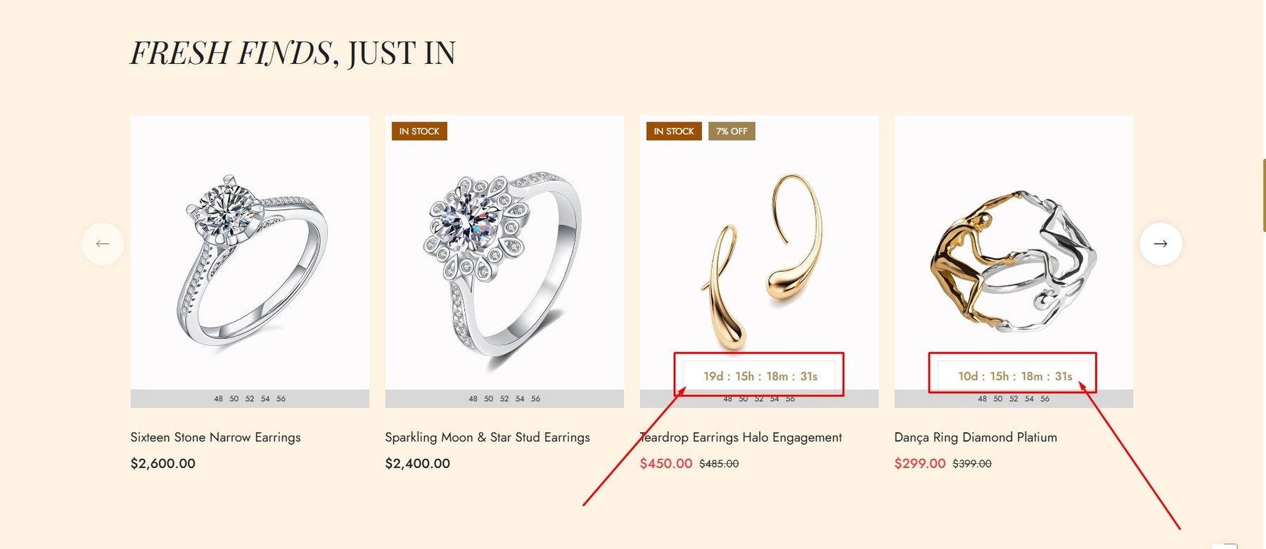
Step 1: From the admin dashboard, navigate to Products → All Products.
-
Step 2: Select the product you want to apply the sale countdown timer to.
-
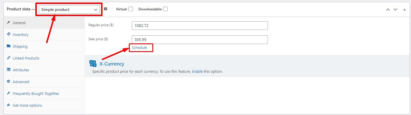
Step 3: In the Product data section, select Simple product as the product type.

-
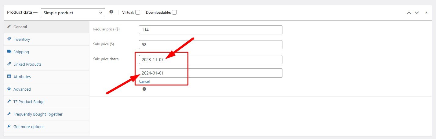
Step 4: In the General tab, click Schedule next to the Sale price field, then set the sale price and its valid date range.

-
Step 3: In the Product data section, select Variable product as the product type.
-
Step 4: In the General tab, click Schedule next to the Sale price field, then set the sale price and its valid date range.

-
Step 5: Configure the sale price, valid time range, and any other necessary details for each variation.

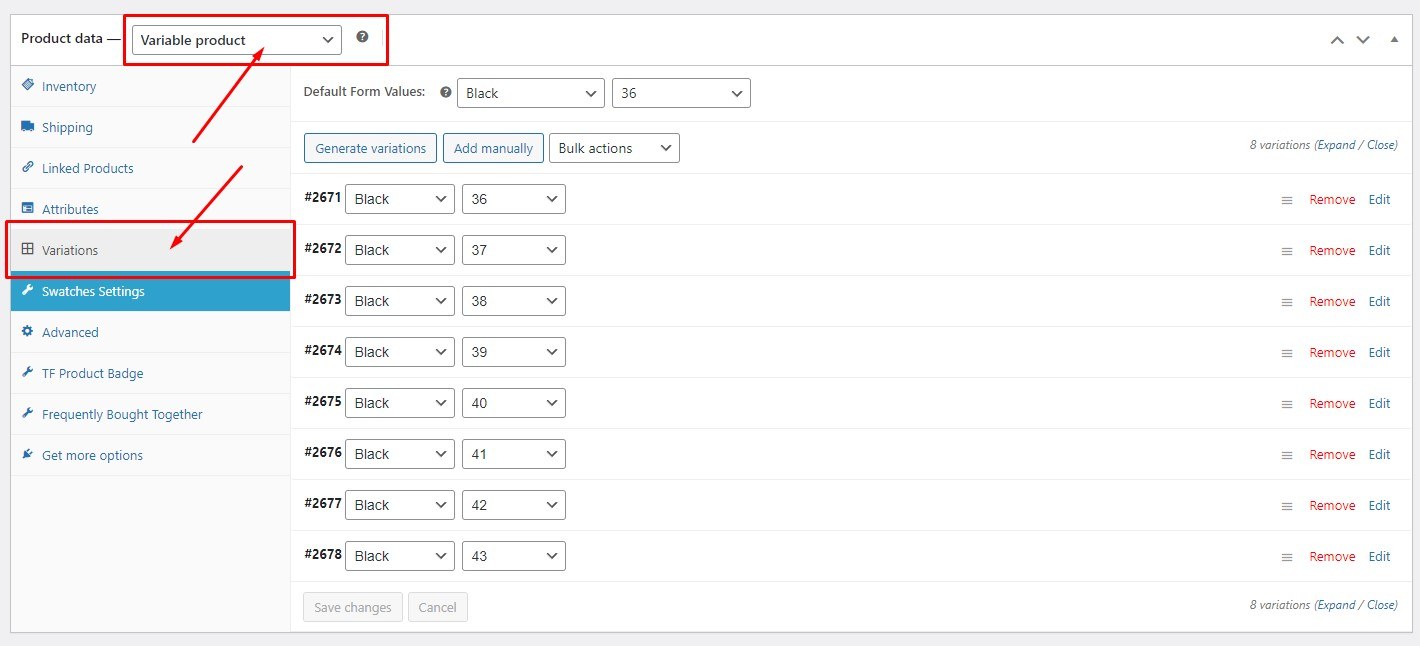
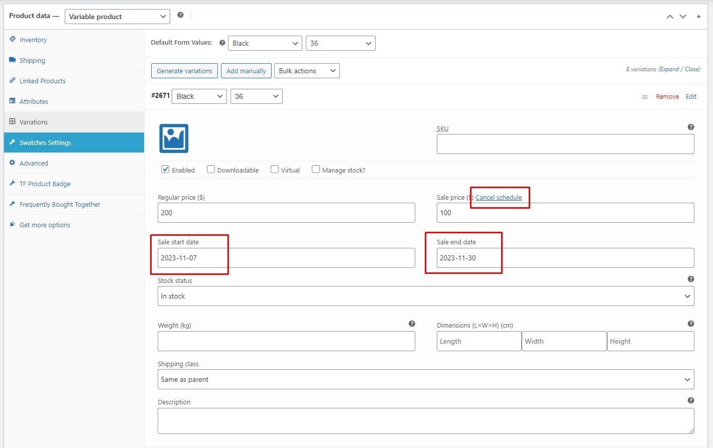
Step 6: Click Save changes after finishing your edits.
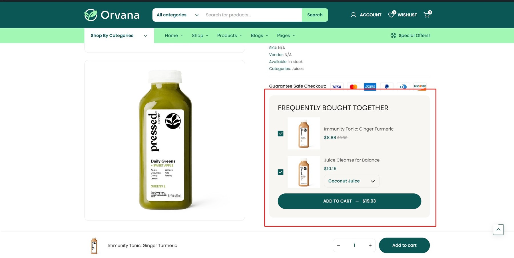
<div class=”screenshot-item”> <img class=”img-doc” src=”assets/images/woo/woo_07.jpg” alt=”Bought Together setup” width=”1350″ /> </div>
-
To enable this feature, go to Customize → Single Product → Buy Together
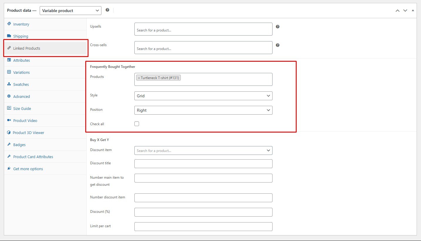
In this section, you can choose the display style (grid or list) and position (left or right).

-
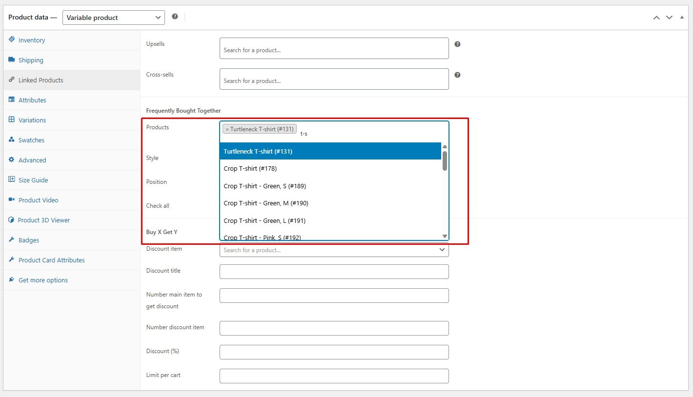
Select the product, then go to the Linked Product tab in the Product data section.

-
Search for and add products to this section.

-
Click Update to save your changes.
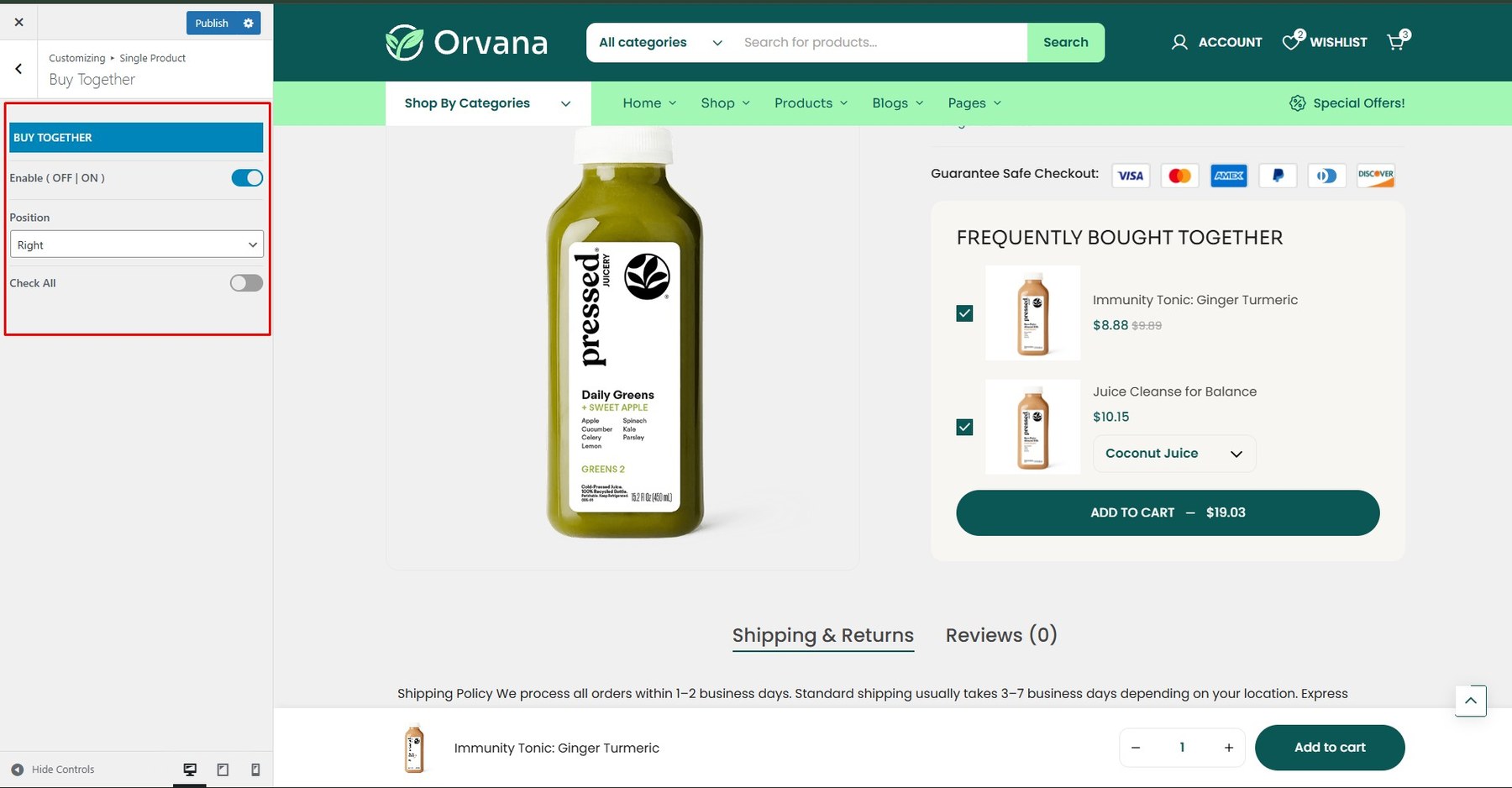
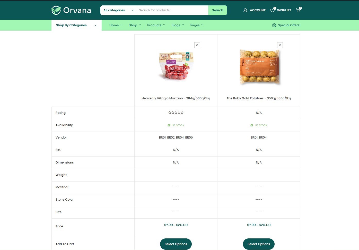
To enable this feature, install and activate the WCBoost – Compare plugin.
After activation, a new settings section called Products Compare will appear under WooCommerce → Settings → Products → General. Use this section to configure how the comparison feature is displayed.
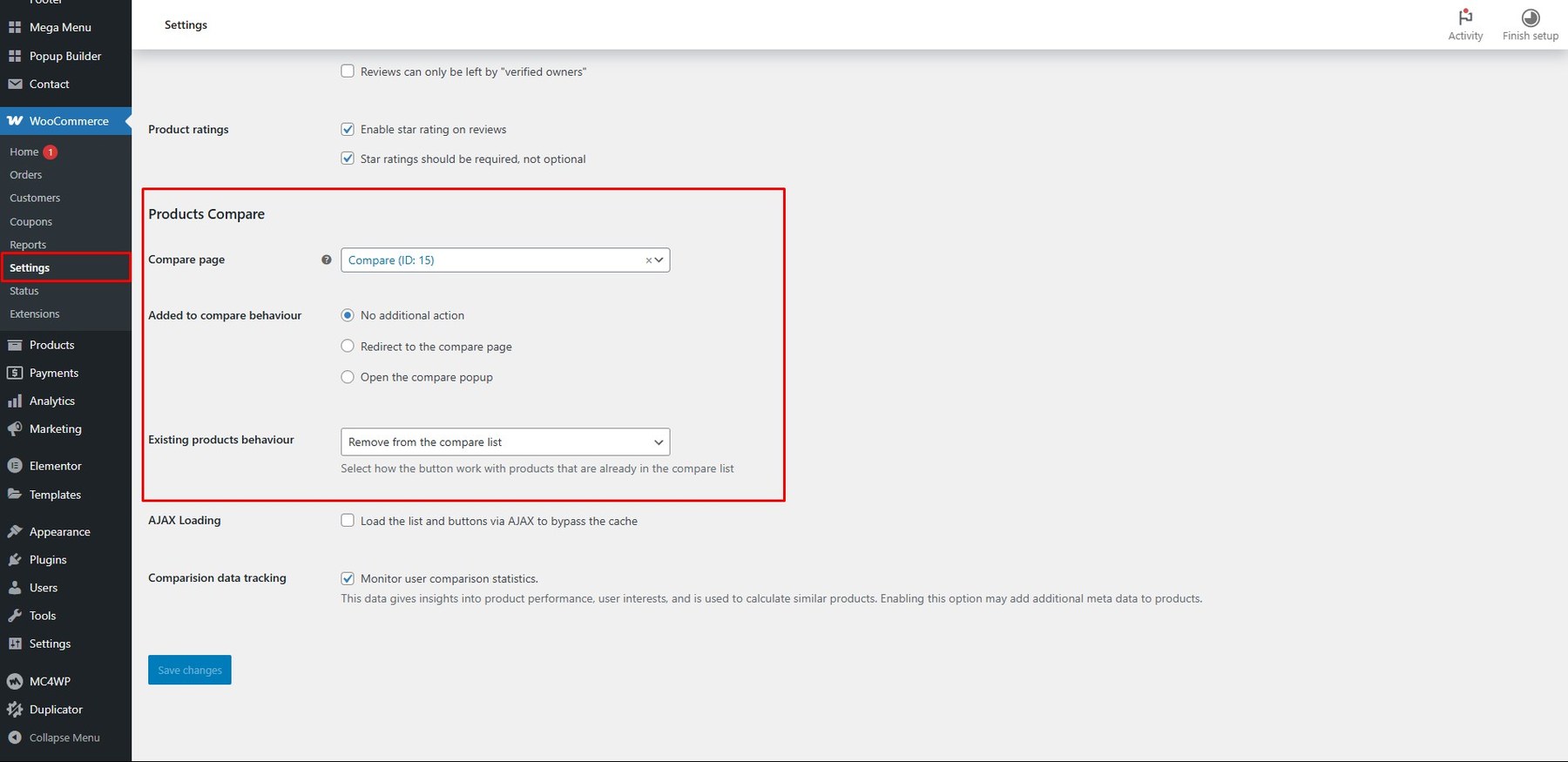
Click Update to save your settings.
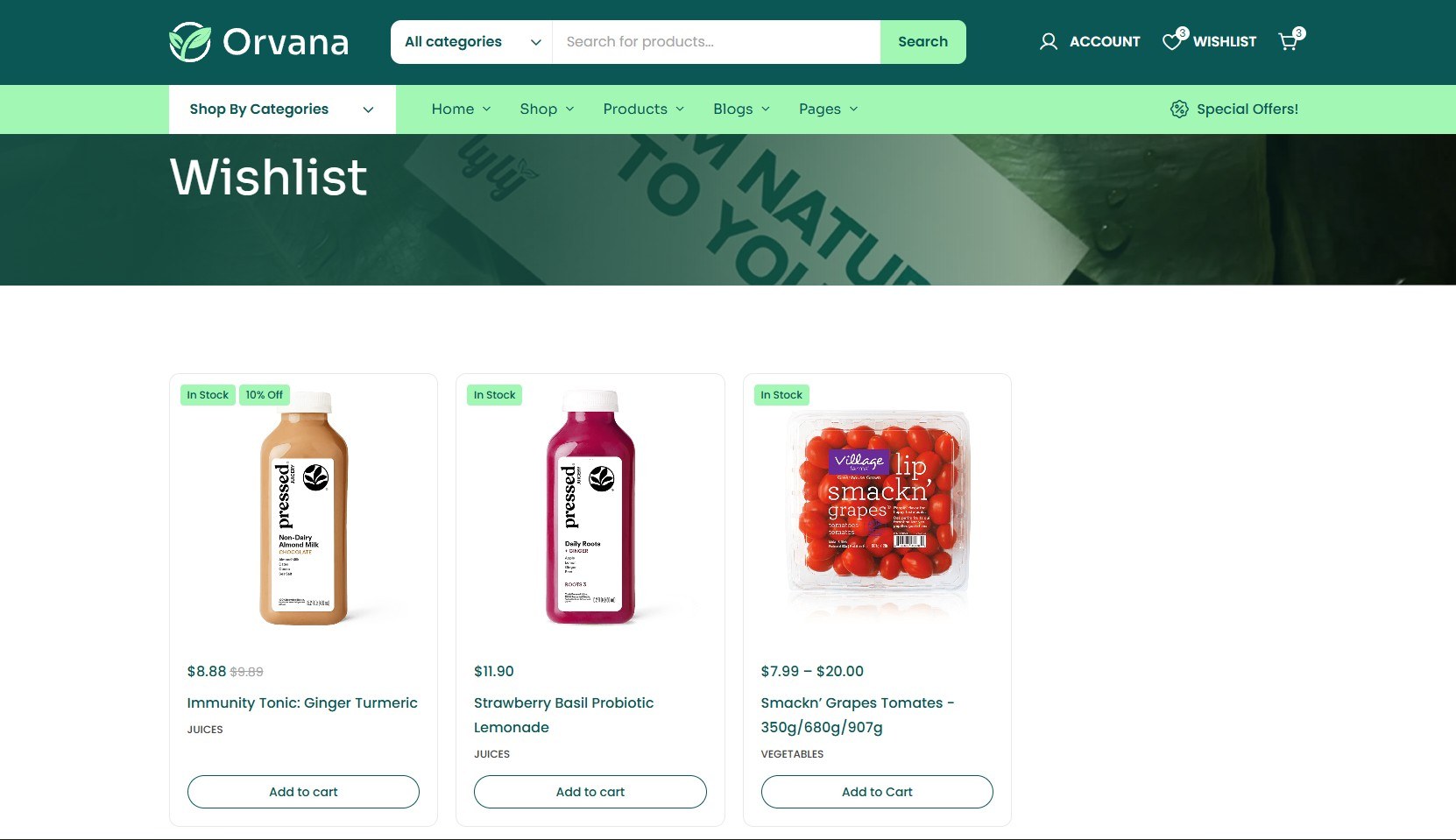
To enable this feature, install and activate the WCBoost – Wishlist plugin.
Once activated, a new Wishlist tab will appear under WooCommerce → Settings. This tab lets you configure how the wishlist is displayed.
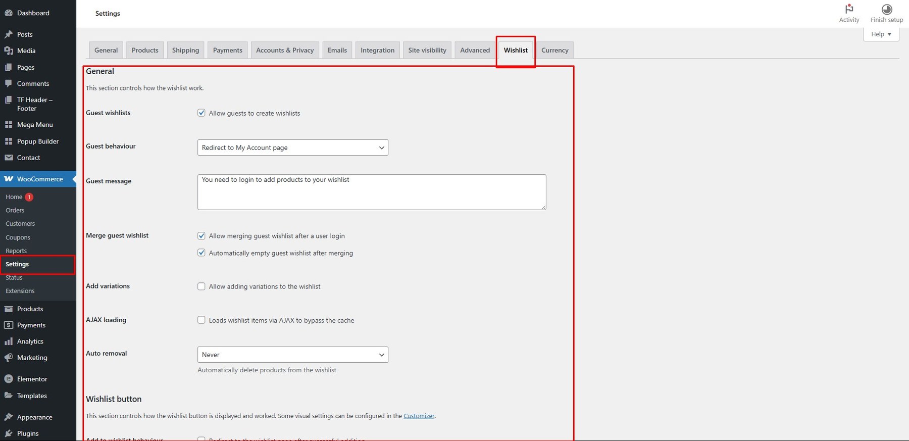
Click Save Options when you’re done.
To enable this feature, install and activate the FOX – Currency Switcher Professional for WooCommerce plugin.
To change your shop’s currency settings, go to WooCommerce → Settings → General → Currency Options, then select your desired currency from the dropdown menu.
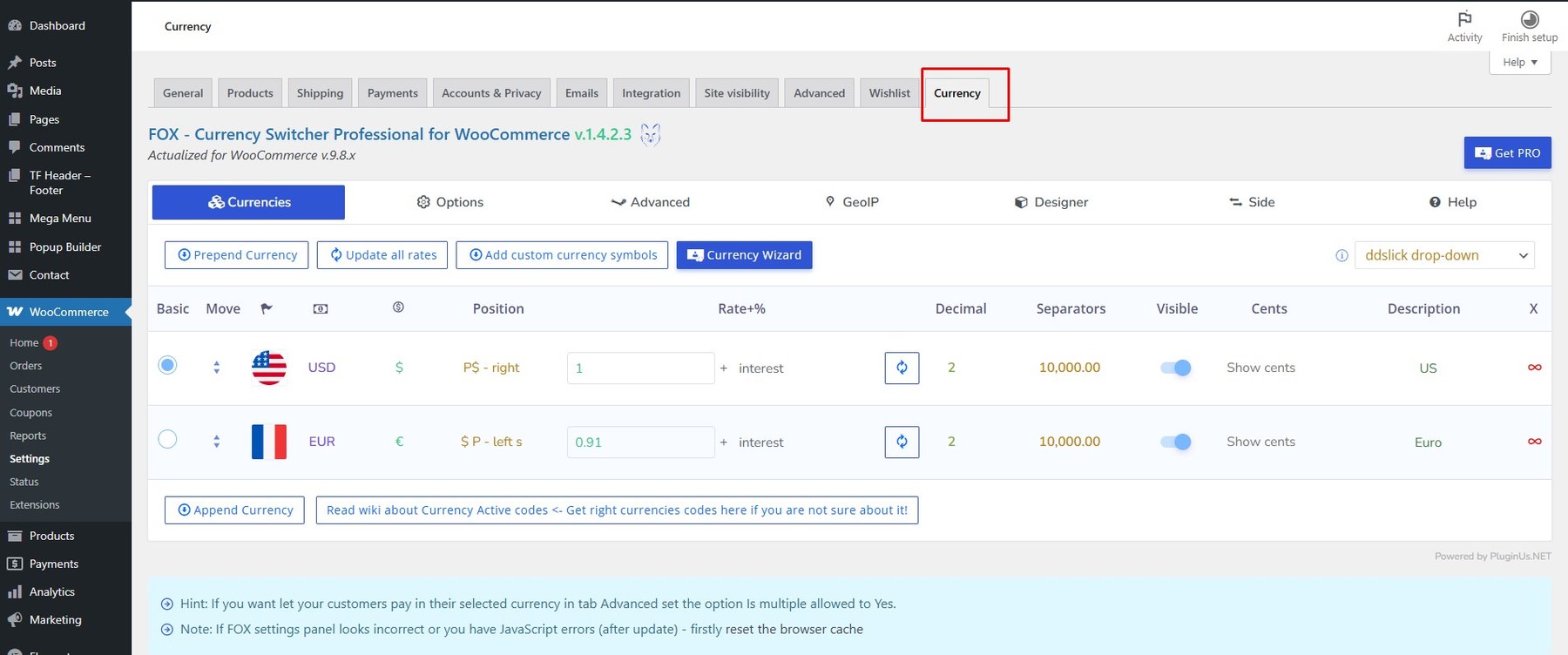
Click Save Options after completing the setup.
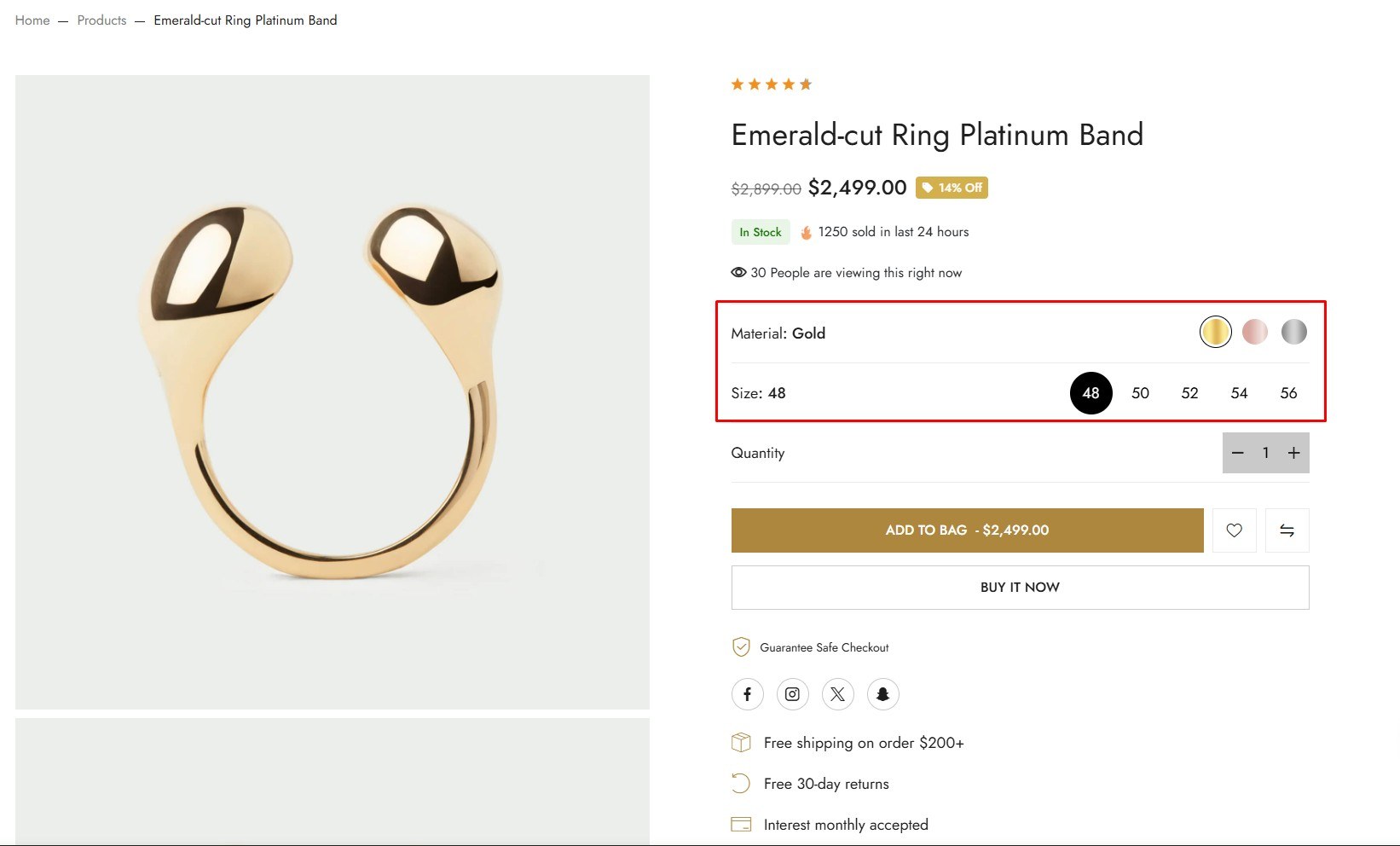
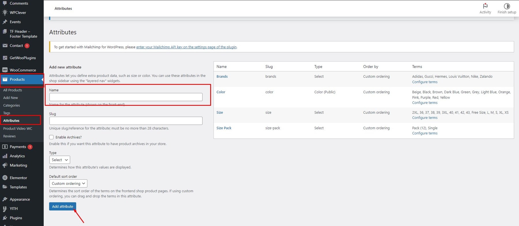
Note: If you want to display the correct Attribute Type, you must set the Type first.
-
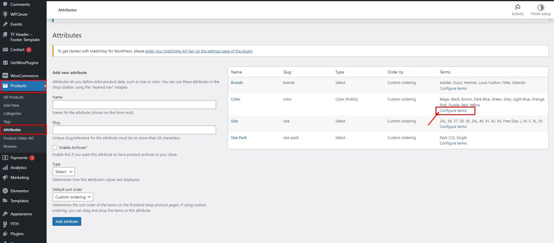
Step 1: From the admin dashboard, navigate to Products → Attributes.
-
Step 2: Fill in the attribute name (such as Size, Color, Image, etc.).

-
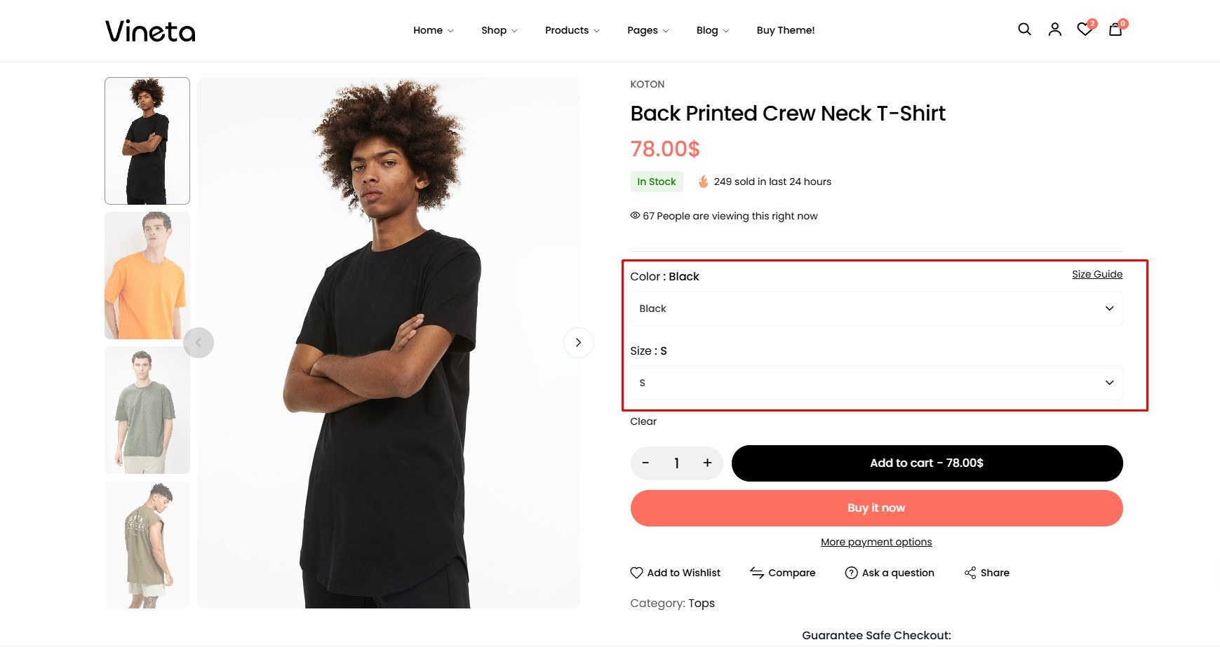
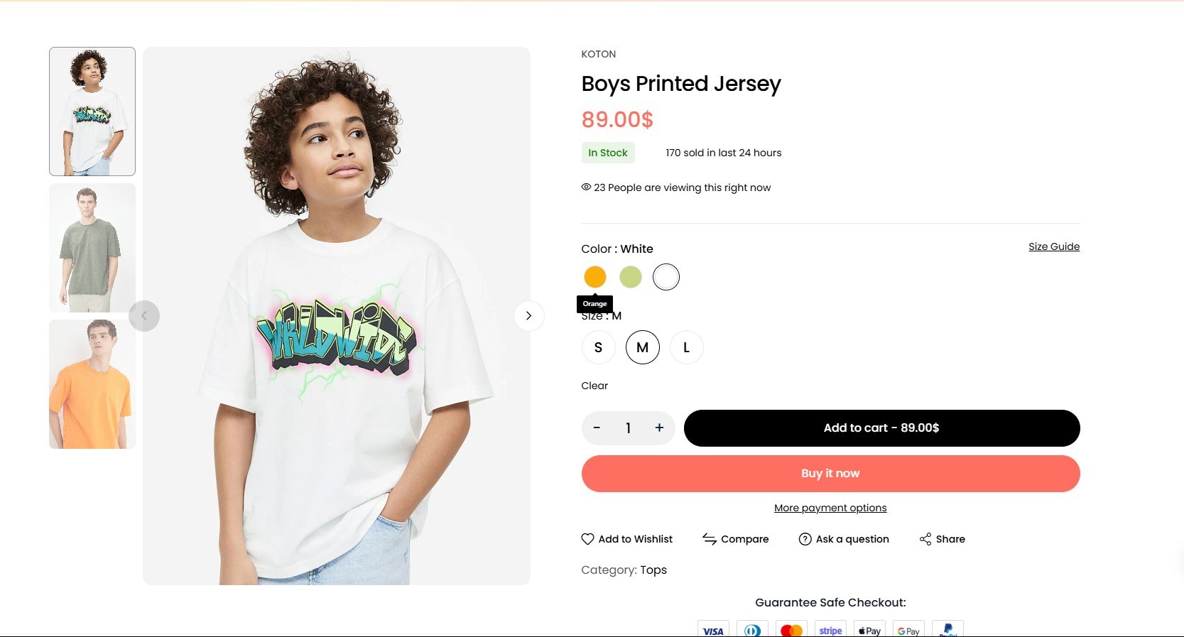
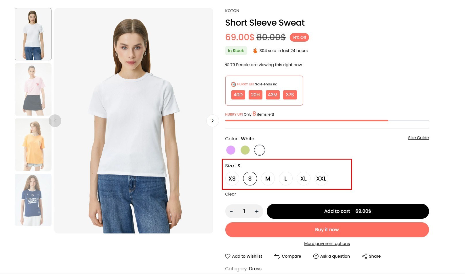
Step 3: Determine how the attribute values are displayed using Type.
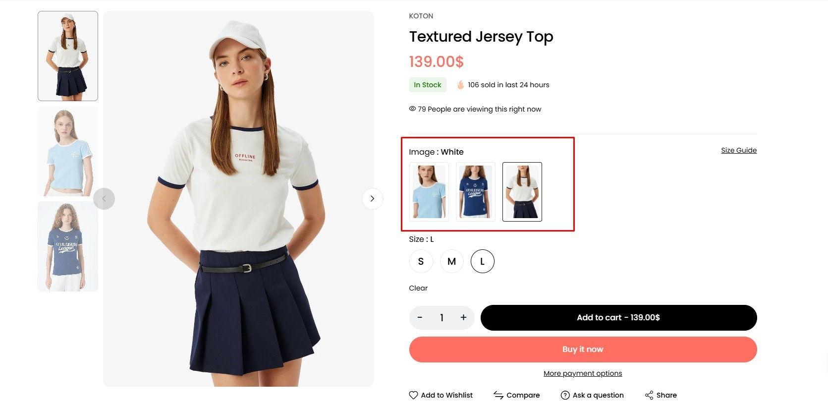
You can display your attribute in 4 types:
- Select Option

- Colors

- Label

- Images

- Select Option
-
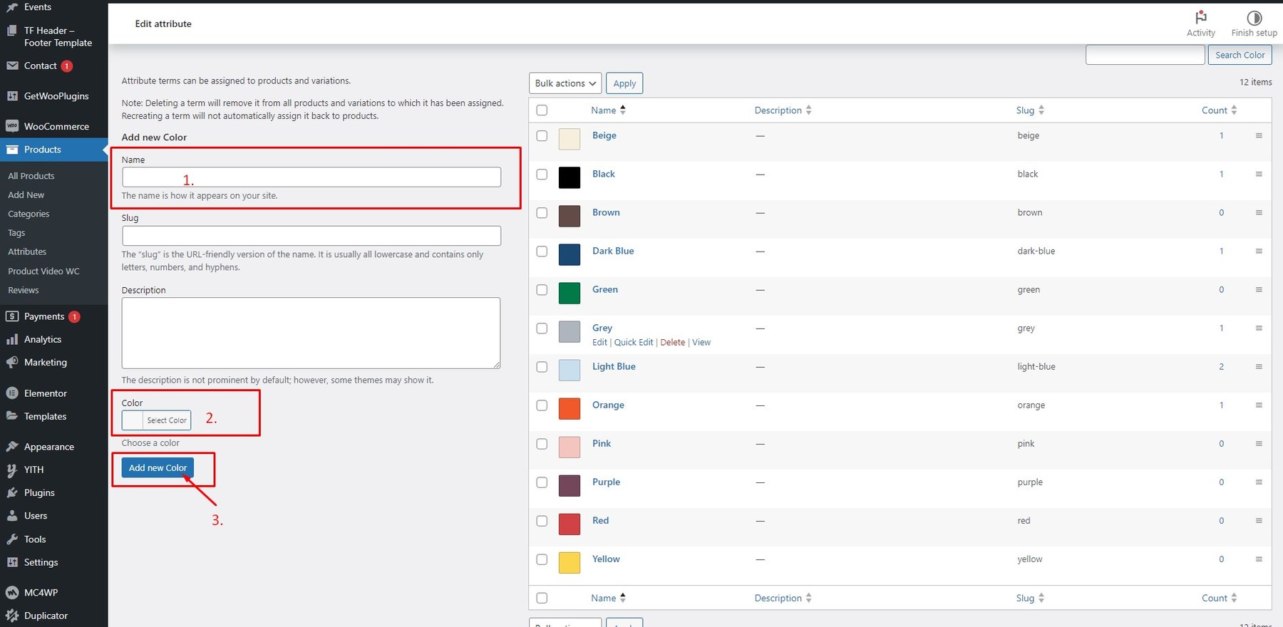
Step 4: Click Add attribute when you’re done. Then click on Configure terms to add new terms. The field will appear.


You can now use this attribute when creating new products or apply it to existing ones.
-
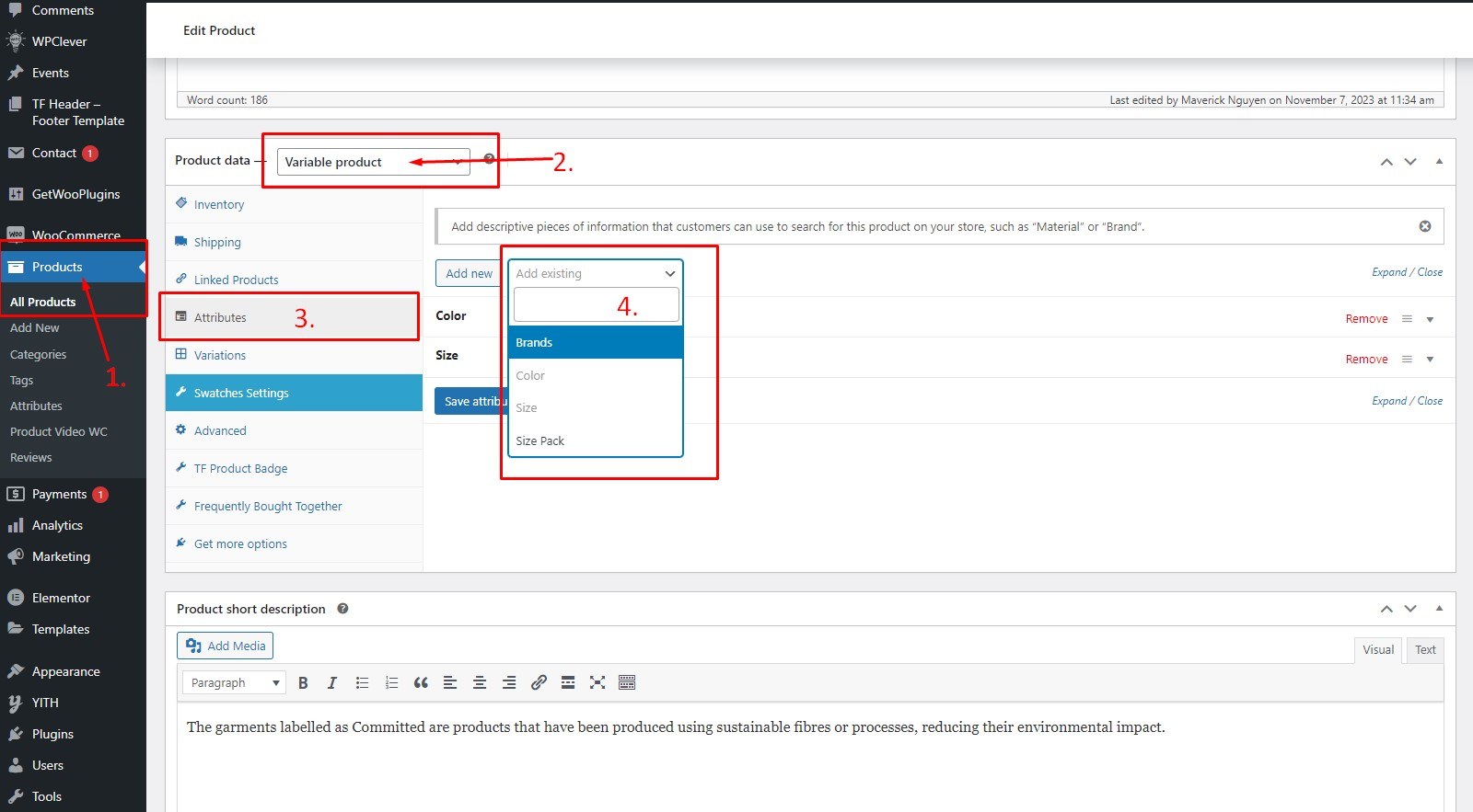
Step 1: From the admin dashboard, navigate to Products → All Products.
-
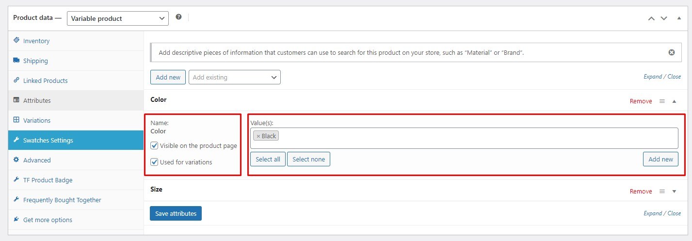
Step 2: Select the product you want to configure. In the Product data section, choose Variable product as the type.
-
Step 3: Go to the Attributes tab and add the attribute you created earlier.

-
Step 4: Enter attribute values, click Add new, and check both Visible on the product page and Used for variations. Then click Save Attributes.

-
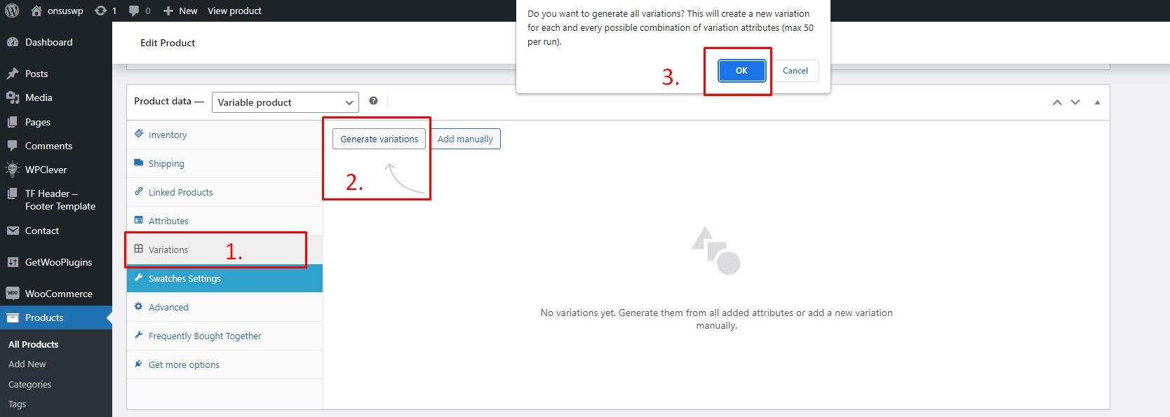
Step 5: Go to the Variations tab, click Generate variations from all attributes, and confirm.

-
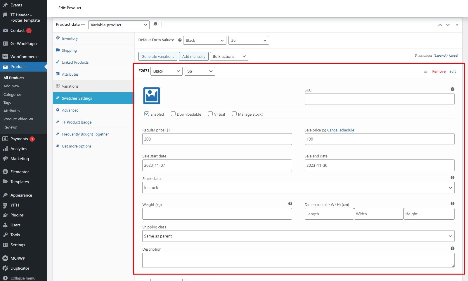
Step 6: All variations will now be generated. Select a default variation if desired and choose which attributes to show in the catalog.
-
Step 7: Click each variation to set its image, price, sale countdown, and other relevant details.

-
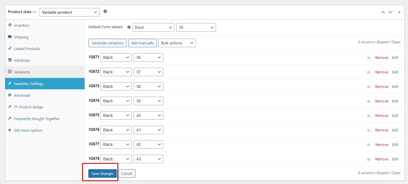
Step 8: Click Save changes and then click Update to save the product.

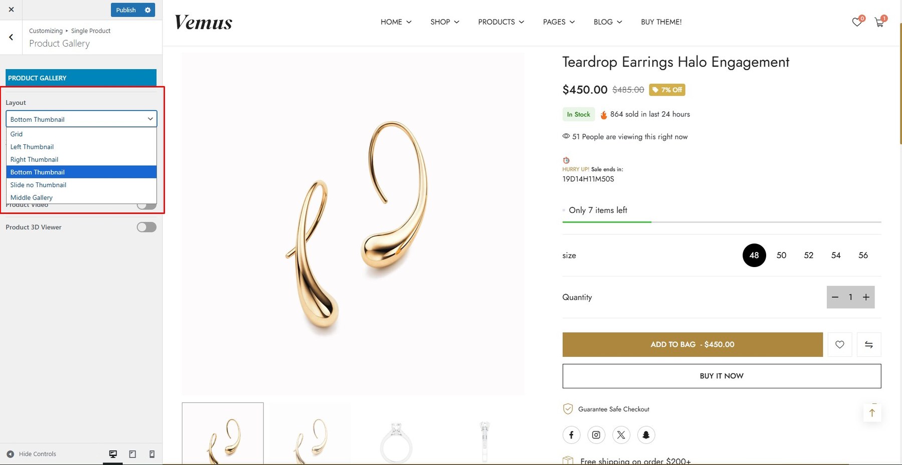
To enable this feature, go to Customize → Single Product → Product Gallery → Layout and choose your preferred image layout.
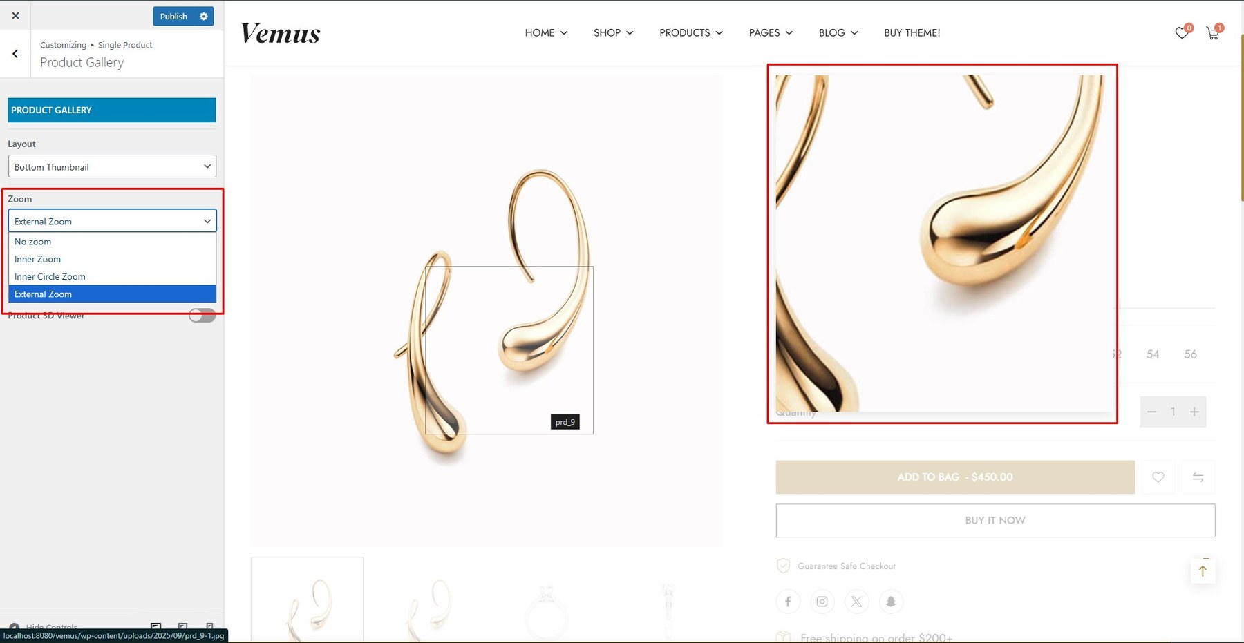
Enable zoom functionality to let customers view product details such as texture, color, and materials more clearly.
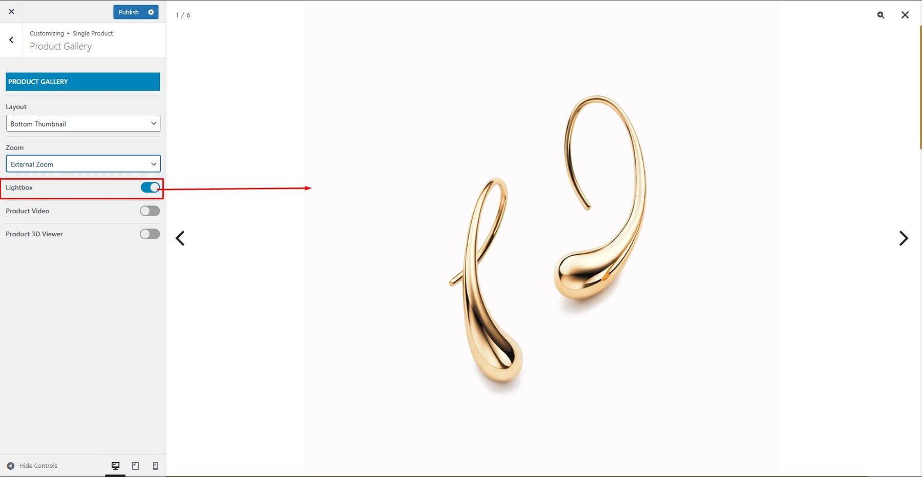
This feature opens product images in a lightbox, allowing users to see them in full size without leaving the page.
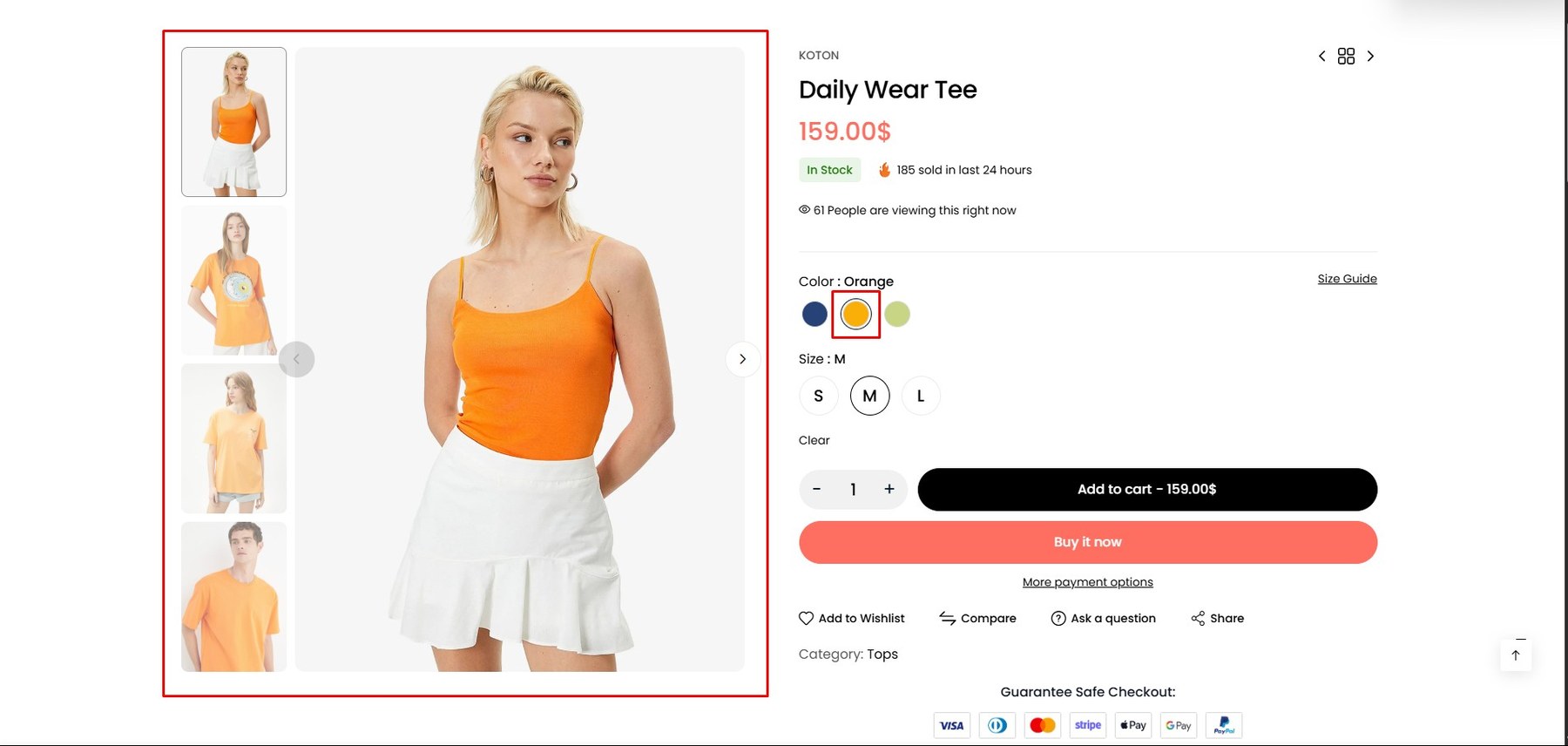
Show variation-specific images that automatically update when a customer selects a new option. This creates a more interactive and visually engaging experience.
-
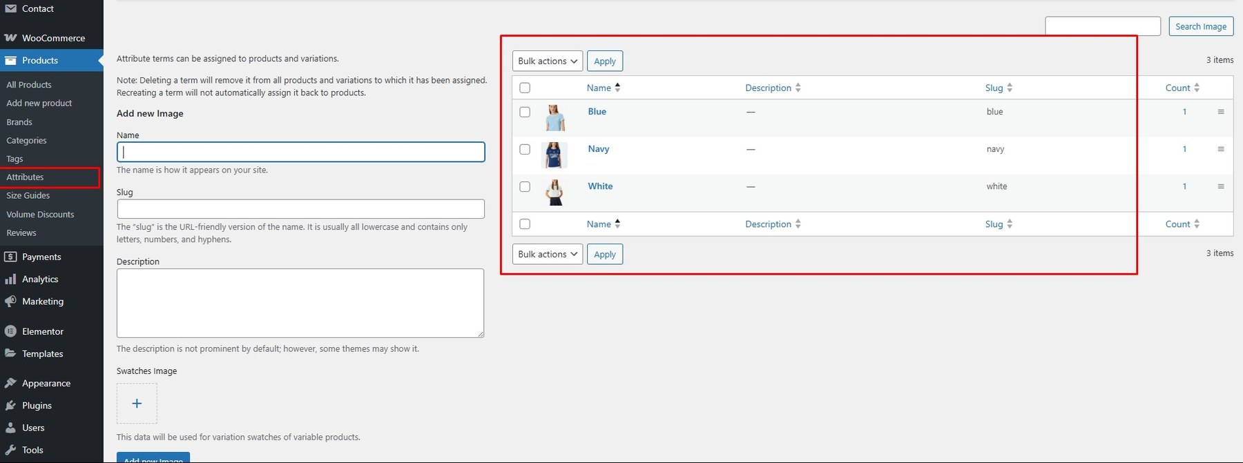
Step 1: Install and activate the WCBoost – Variation Swatches plugin that comes with the theme.
-
Step 2: Enable the Variation Images Gallery feature.
-
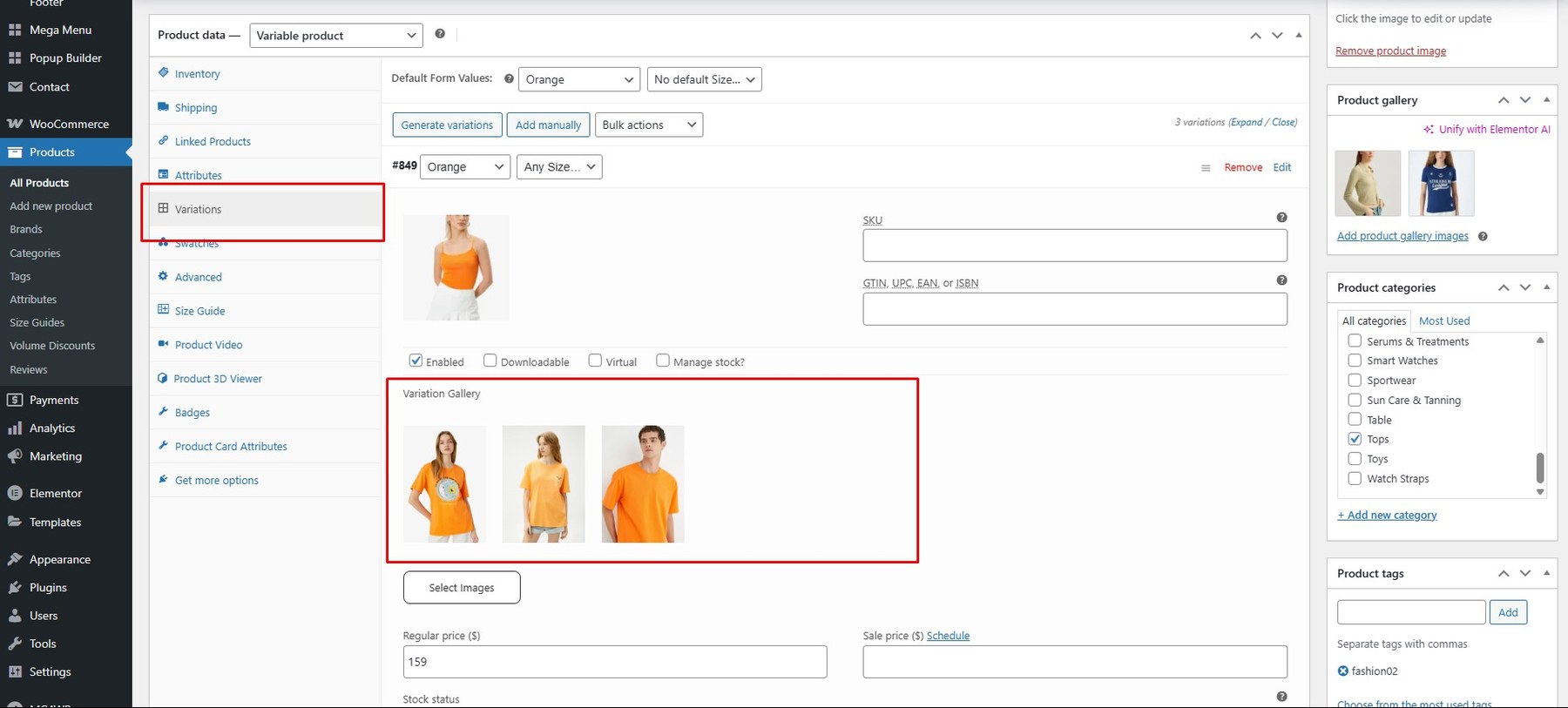
Step 3: Go to Products → Variations and create image attributes.

-
Step 4: In the Product → Variations tab, upload images for each variation.

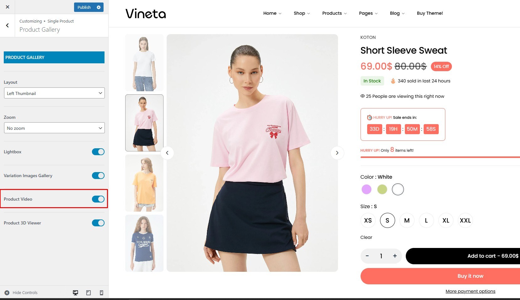
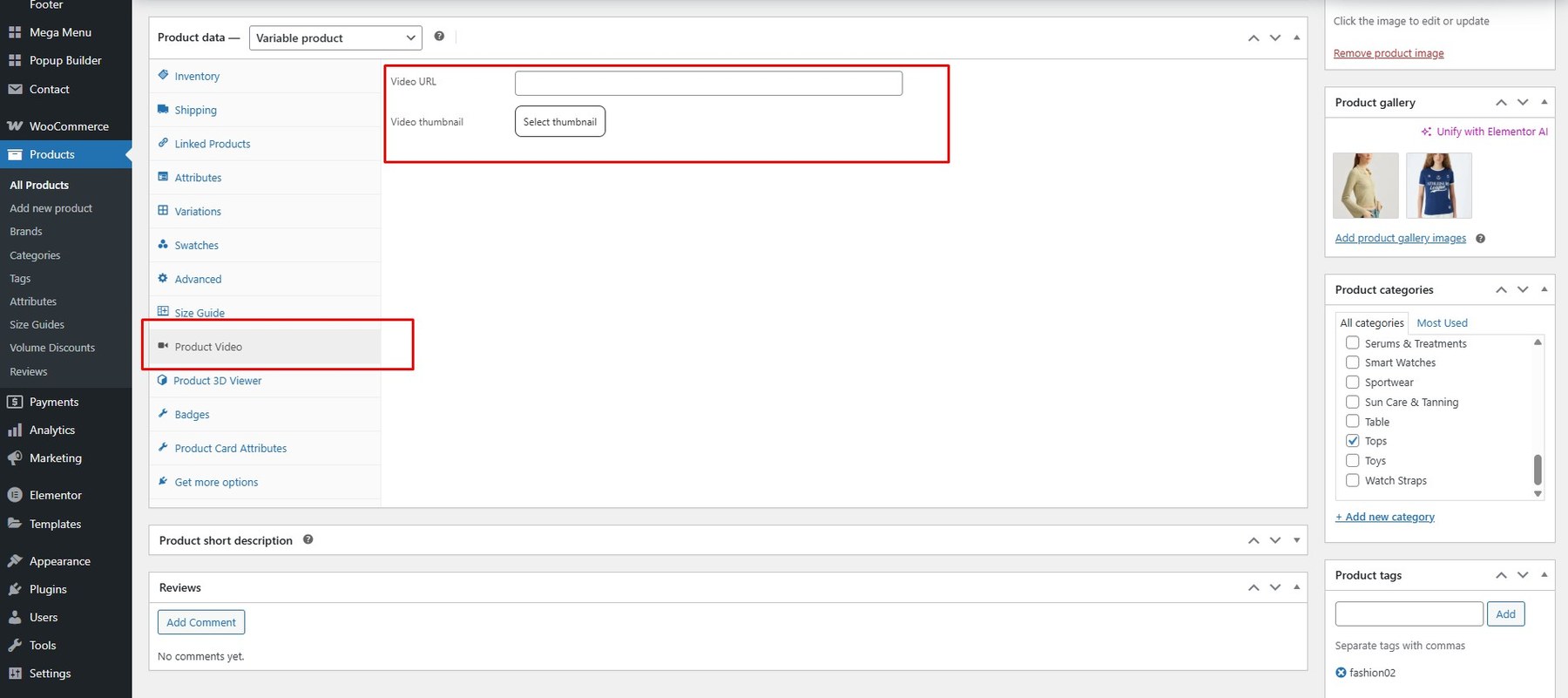
Add videos to showcase products in action, increase engagement, and build customer trust.
To enable product videos, navigate to the Product Video tab, then add the video URL and a thumbnail image.
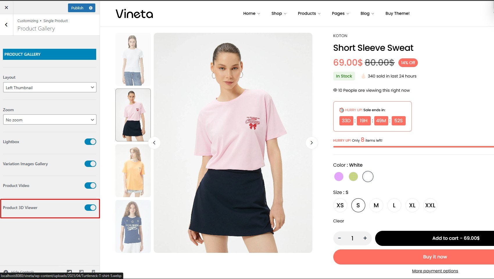
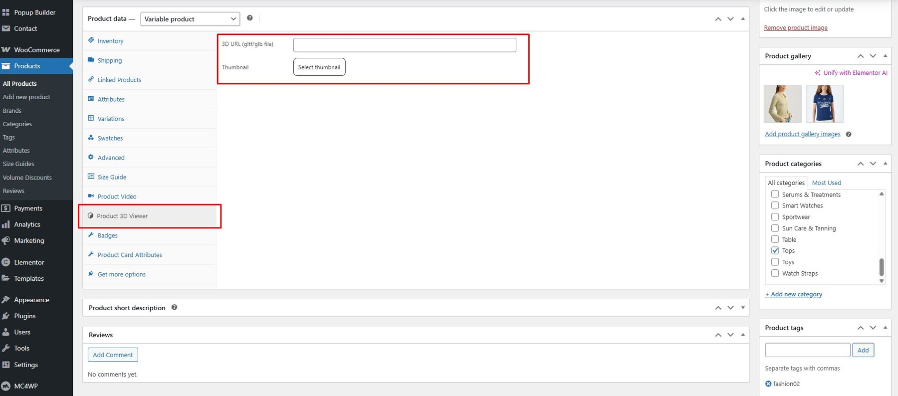
Provide a 360° or 3D interactive view, allowing customers to explore your product from every angle.
To enable this feature, go to the Product 3D Viewer tab and add the 3D model URL along with a thumbnail image.
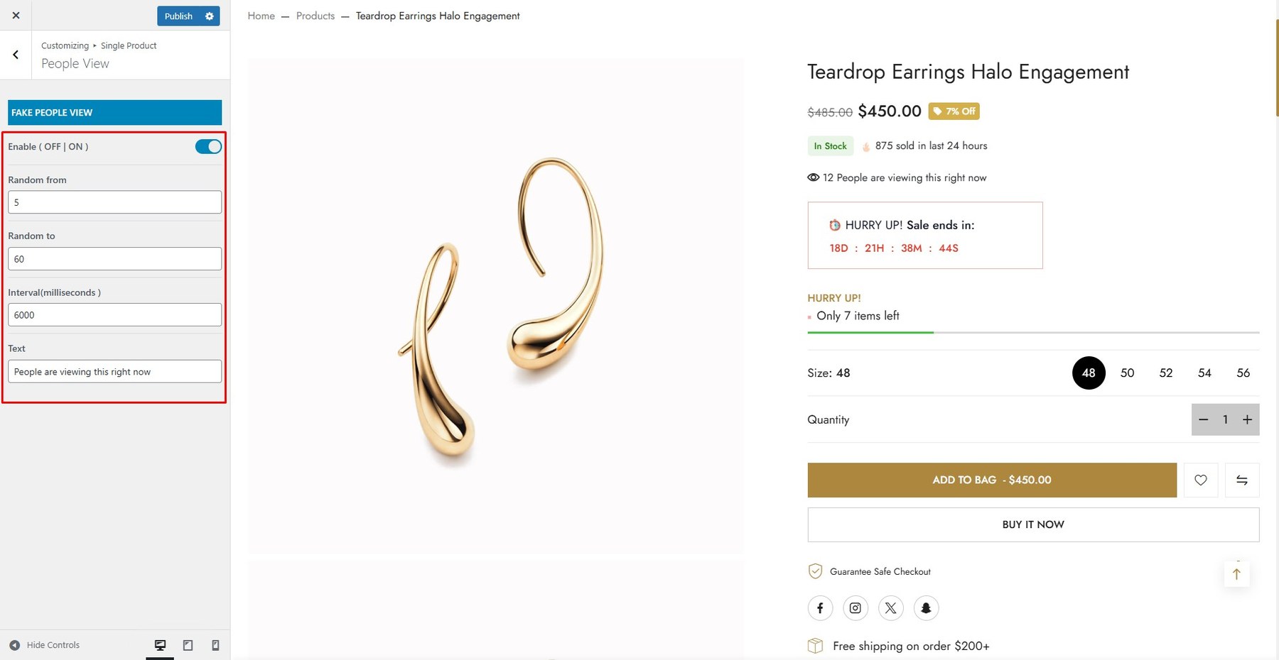
Display real-time viewer counts on product pages to create urgency and boost engagement.e.
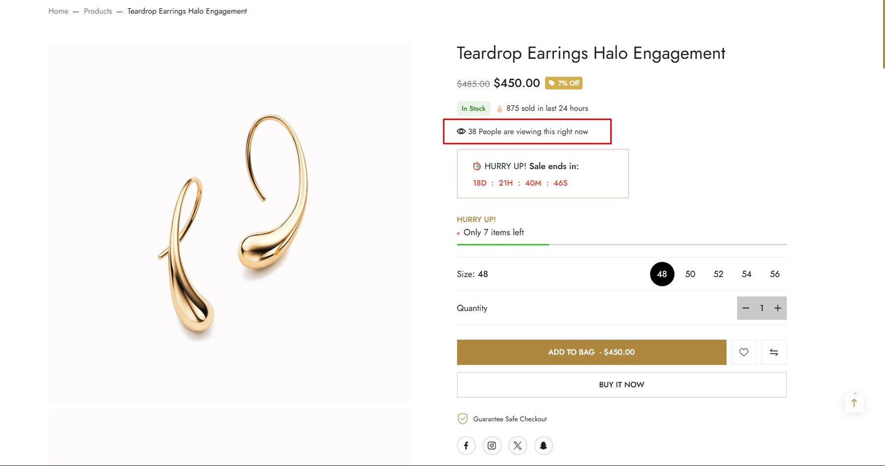
To enable this feature, go to Customize → Single Product → People View
Creates a sense of scarcity, encouraging purchases (urgency/FOMO).
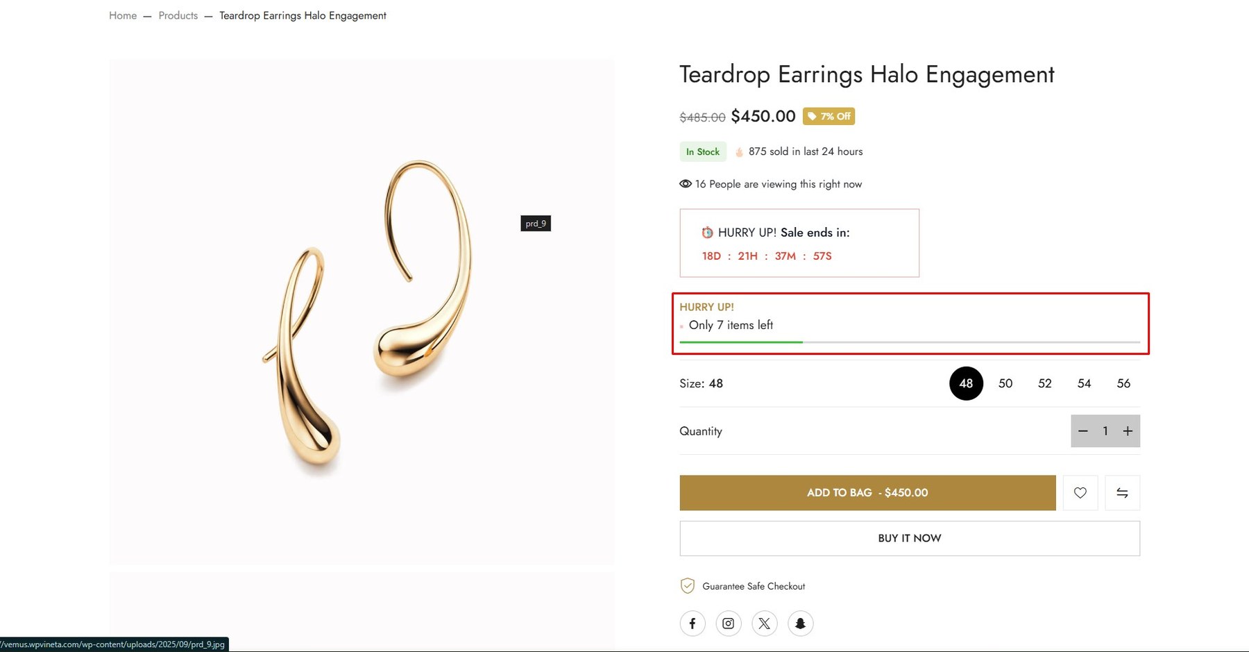
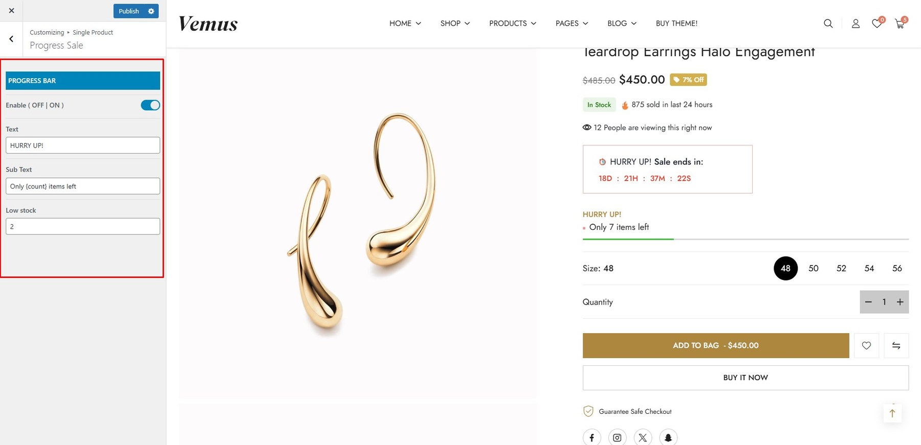
To enable this feature, go to Customize → Single Product → Progress Sale
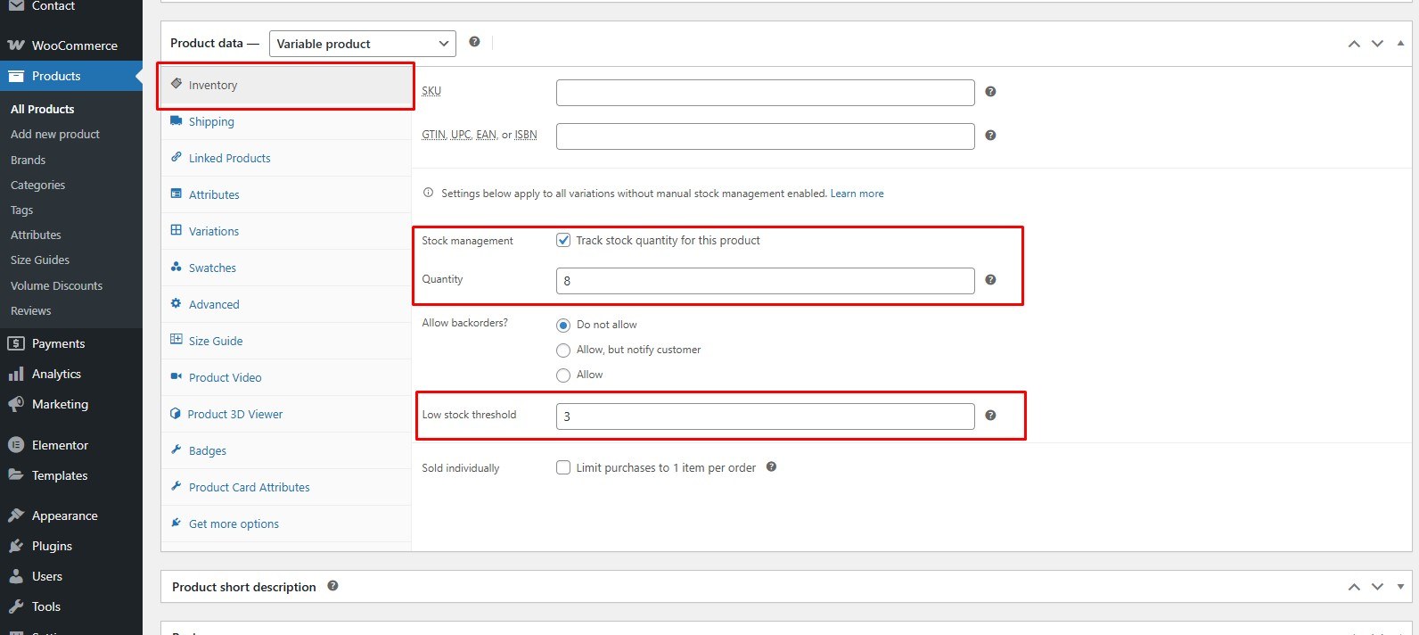
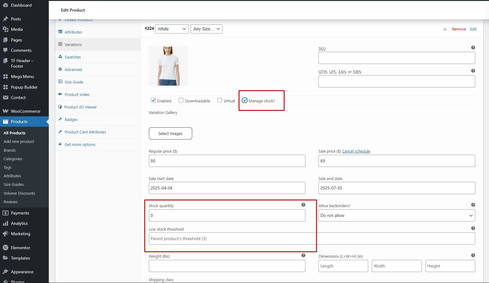
The progress bar will only appear if you’ve set a product quantity and the item has had some purchases.
<div id=”size-guide”> <h4> 10. Size Guide </h4> <p>Help your customers shop with confidence. A clear size chart takes the guesswork out of buying a slim-fit dress—no try-on needed, no surprises.</p> <div class=”screenshot-item”> <img class=”img-doc” src=”assets/images/woo/size-guide-01.jpg” alt=”Size Guide” width=”1350″ /> </div> <p>To enable this feature, go to <strong>Customize → Single Product → People View</strong></p> <div class=”screenshot-item”> <img class=”img-doc” src=”assets/images/woo/size-guide-02.jpg” alt=”Size Guide” width=”1350″ /> </div> <div> <h5>Add New Size Guide</h5> <p>Once you’ve enabled the size guide in your WooCommerce settings, a new menu item will appear: <strong>Products > Size Guides.</strong> On this page, simply click the “Add New” button at the top to create a new size guide for your products.</p> <div class=”screenshot-item”> <img class=”img-doc” src=”assets/images/woo/size-guide-03.jpg” alt=”Size Guide” width=”1350″ /> </div> <p>The key part of a size guide is the size table. In the Tables Box, use the plus/minus buttons to add or remove rows and columns. Click any cell to enter text directly.</p> <div class=”screenshot-item”> <img class=”img-doc” src=”assets/images/woo/size-guide-04.jpg” alt=”Size Guider” width=”1350″ /> </div> <p>In the product data box, a new <strong>Size Guide</strong> tab appears. Here, you can select a different size guide or adjust how it displays on the product page.</p> <div class=”screenshot-item”> <img class=”img-doc” src=”assets/images/woo/size-guide-05.jpg” alt=”Size Guide” width=”1350″ /> </div> </div> </div>
<div id=”volume-discount”> <h4> 11. Volume Discount </h4> <p>Offer quantity-based discounts or set prices per quantity. Apply discounts at the cart, assign pricing tables to products or categories, and restrict by user roles.</p> <div class=”screenshot-item”> <img class=”img-doc” src=”assets/images/woo/volume-discount-01.jpg” alt=”Volume Discount” width=”1350″ /> </div> <p>To enable this feature, go to <strong>Customize → Single Product → Volume Discount</strong></p> <div class=”screenshot-item”> <img class=”img-doc” src=”assets/images/woo/volume-discount-02.jpg” alt=”Volume Discount” width=”1350″ /> </div> <div> <h5>Add New Volume Discount</h5> <p>Once you’ve enabled the volume discount, a new menu item will appear: <strong>Products > Volume Discount.</strong> On this page, simply click the “Add New” button at the top to create a new volume discount for your products.</p> <div class=”screenshot-item”> <img class=”img-doc” src=”assets/images/volume-discount-03.jpg” alt=”Volume Discount” width=”1350″ /> </div> <p>In this section, you can choose the layout (list or thumbnail), position, products, and set the Price Per Quantity Discount.</p> <div class=”screenshot-item”> <img class=”img-doc” src=”assets/images/volume-discount-04.jpg” alt=”Volume Discount” width=”1350″ /> </div> <p>Click <strong>Publish</strong> to save your changes.</p> </div> </div>
The Buy X Get Y feature lets you run promotions that reward customers with free or discounted items—helping attract more buyers and boost conversions.
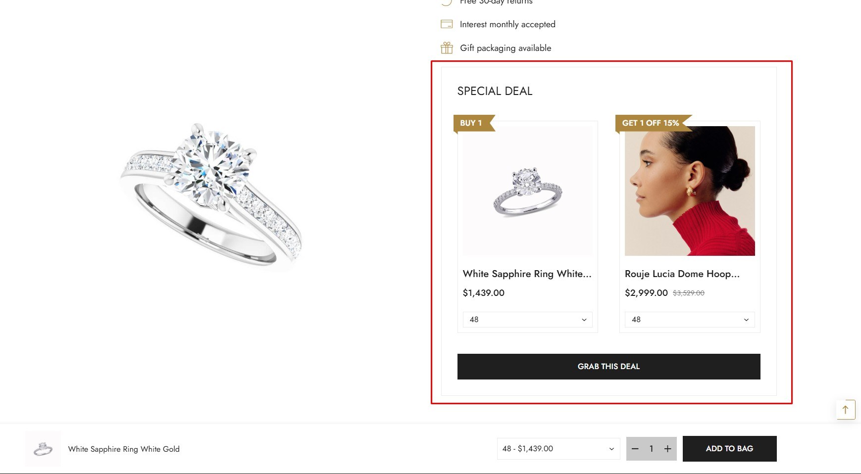
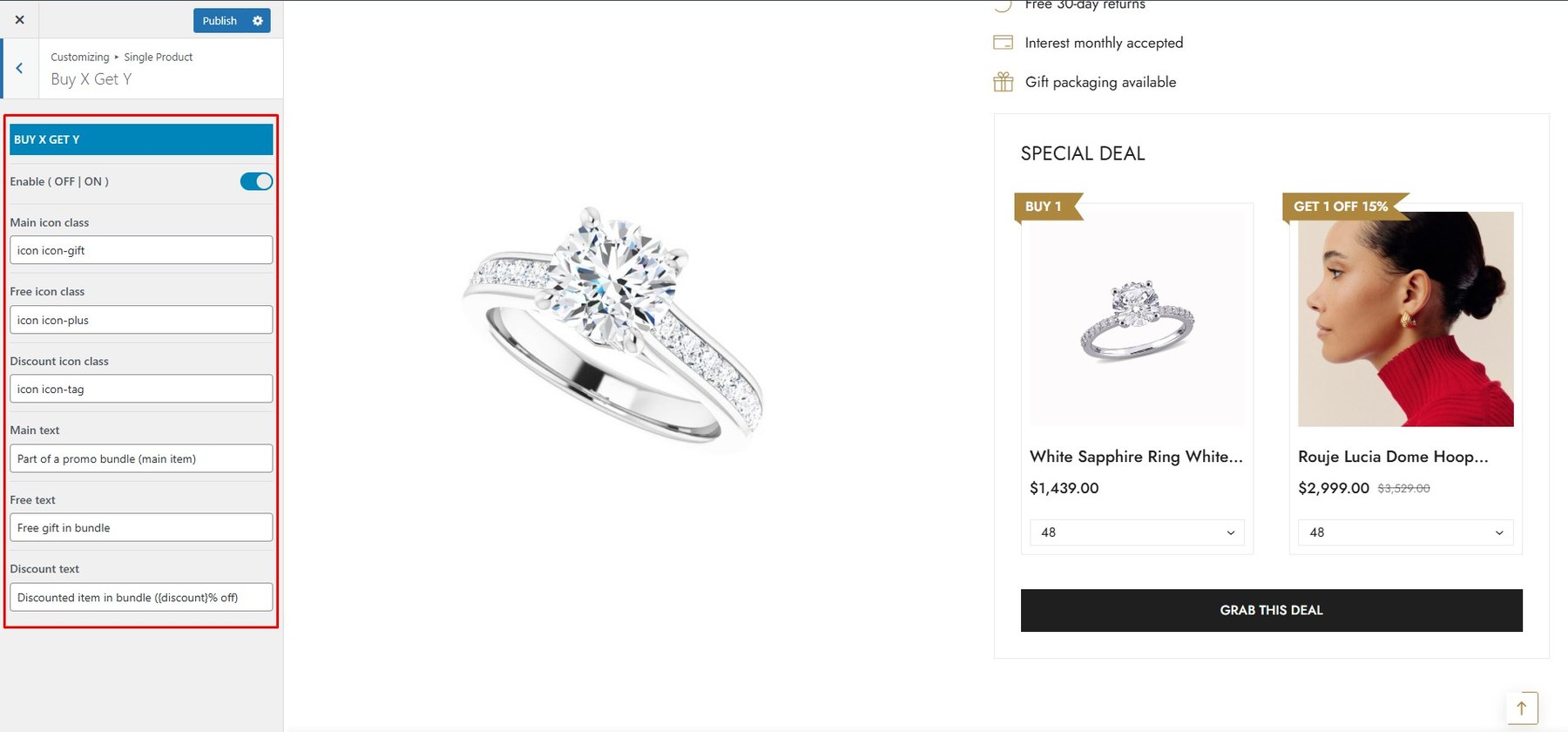
To enable this feature, go to Customize → Single Product → Buy X Get Y
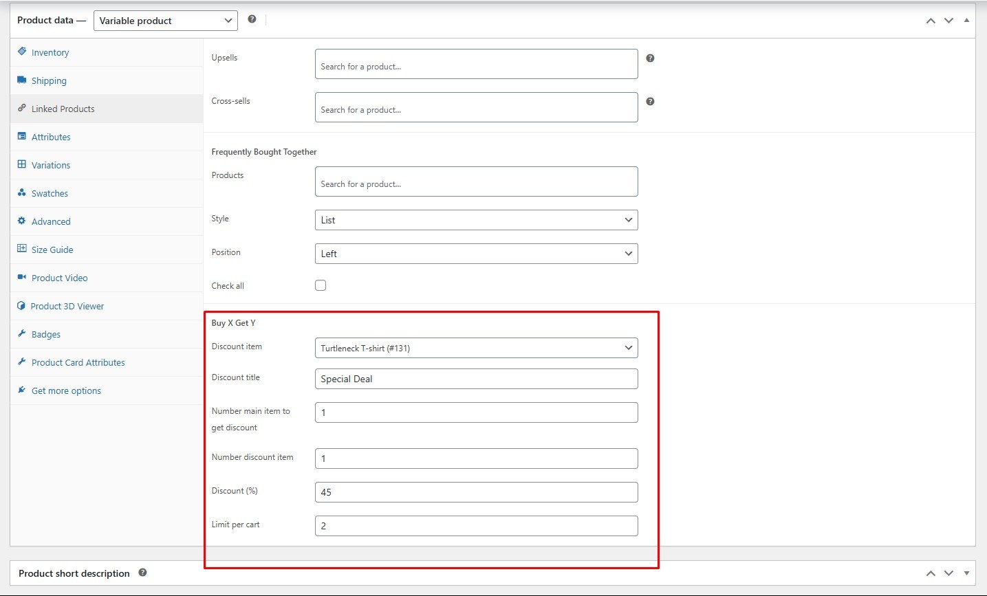
Choose the product you want to discount and specify the quantity.
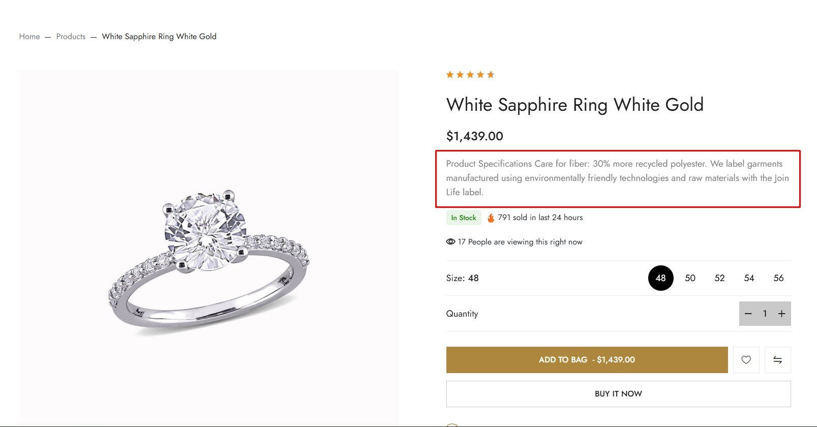
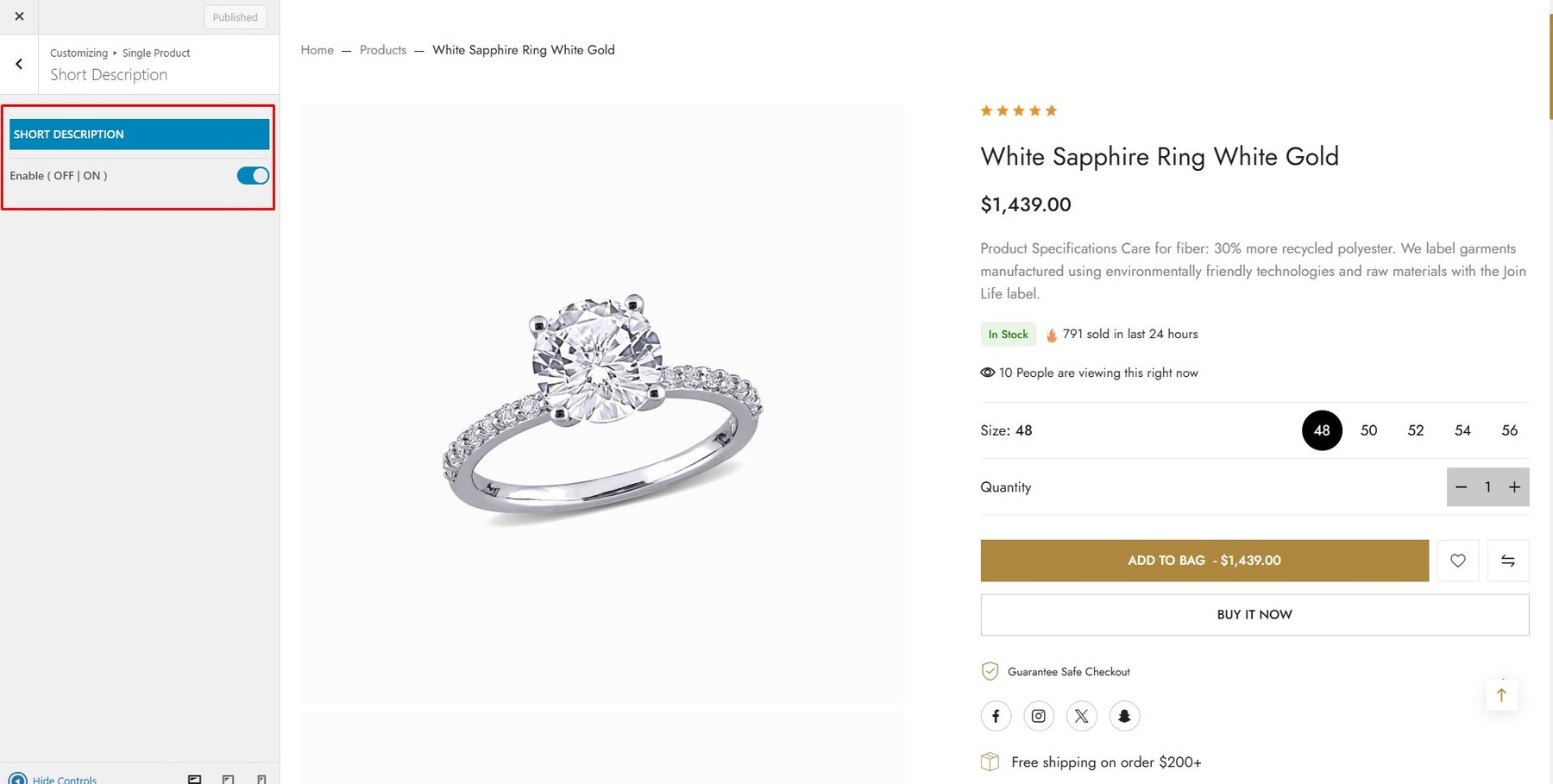
To enable this feature, go to Customize → Single Product → Short Description
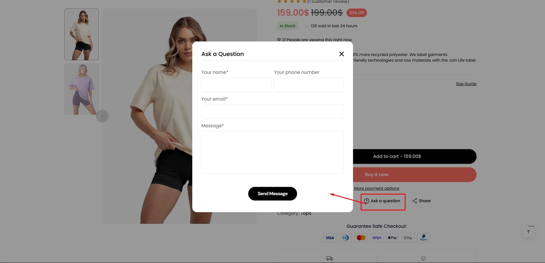
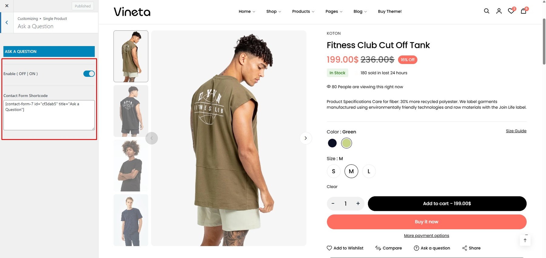
To enable this feature, go to Customize → Single Product → Ask A Question
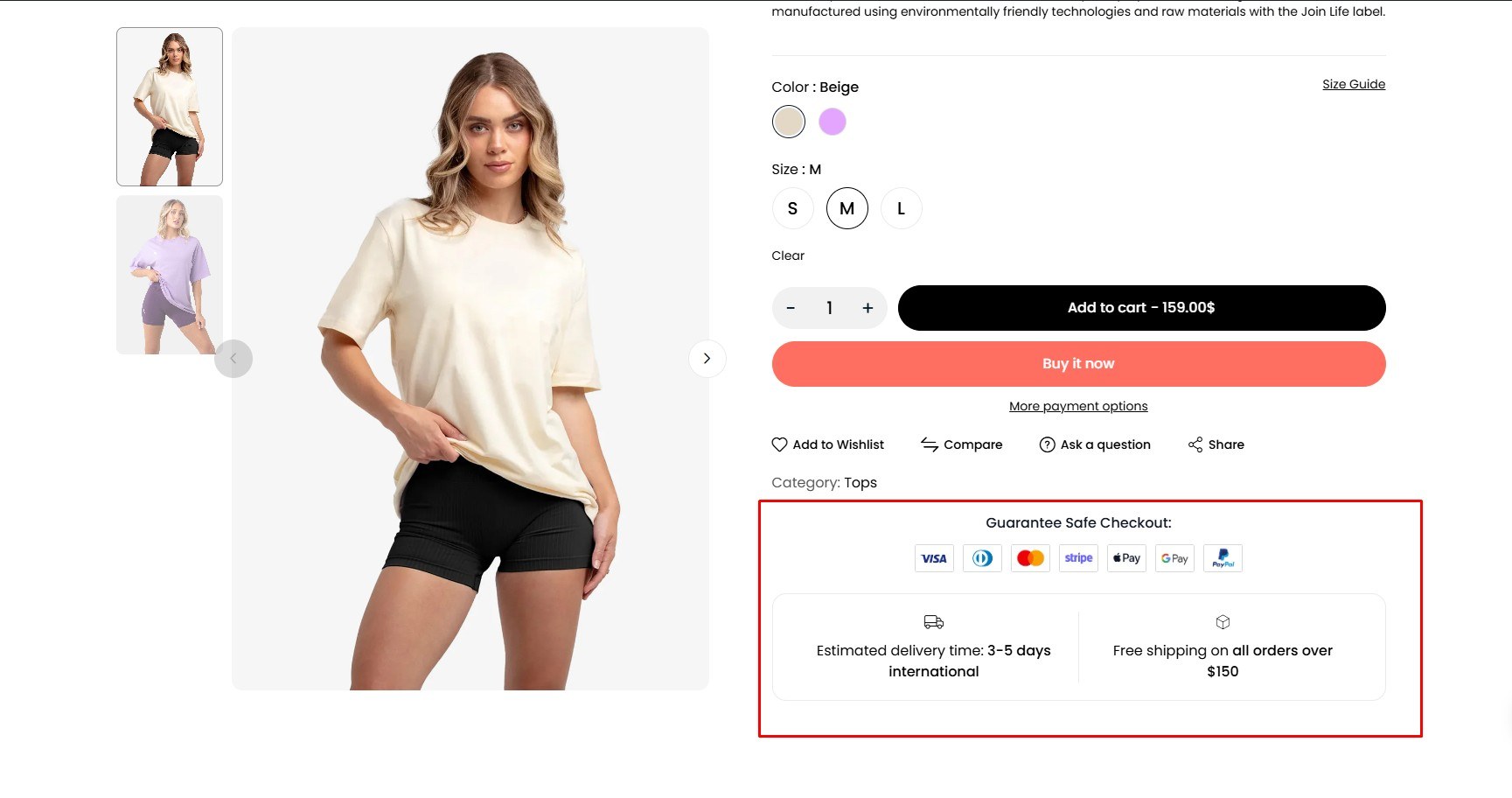
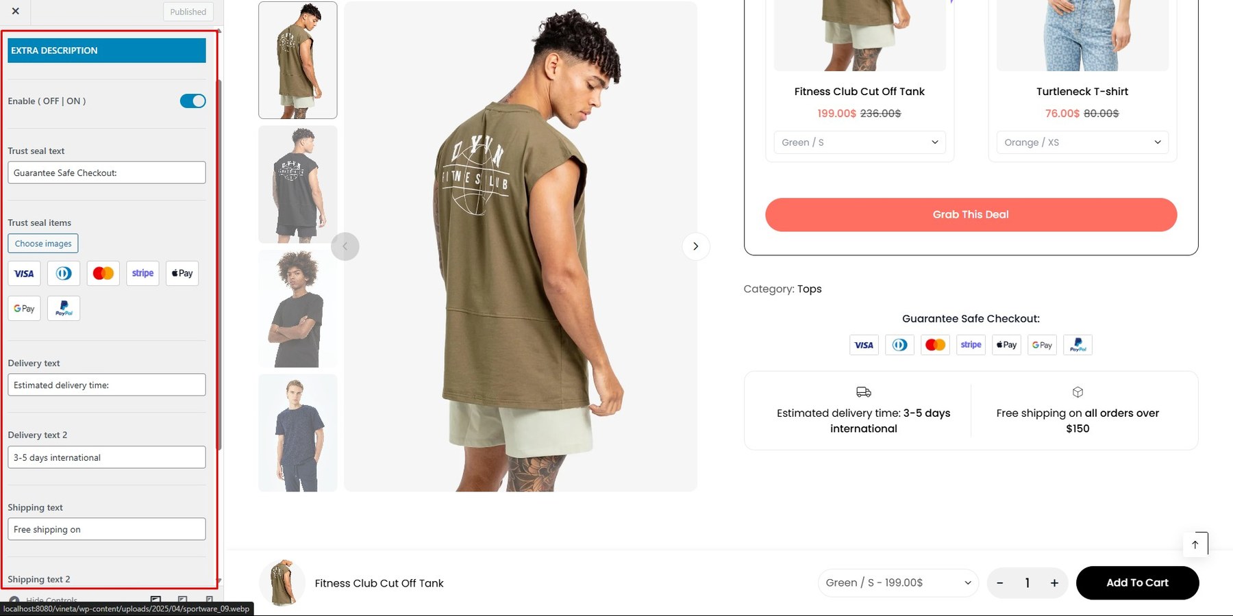
To enable this feature, go to Customize → Single Product → Extra Description
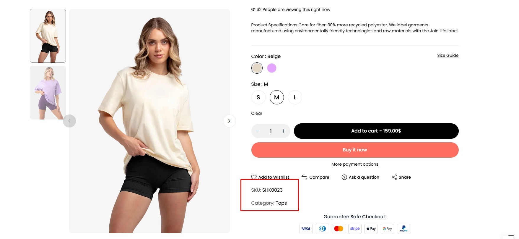
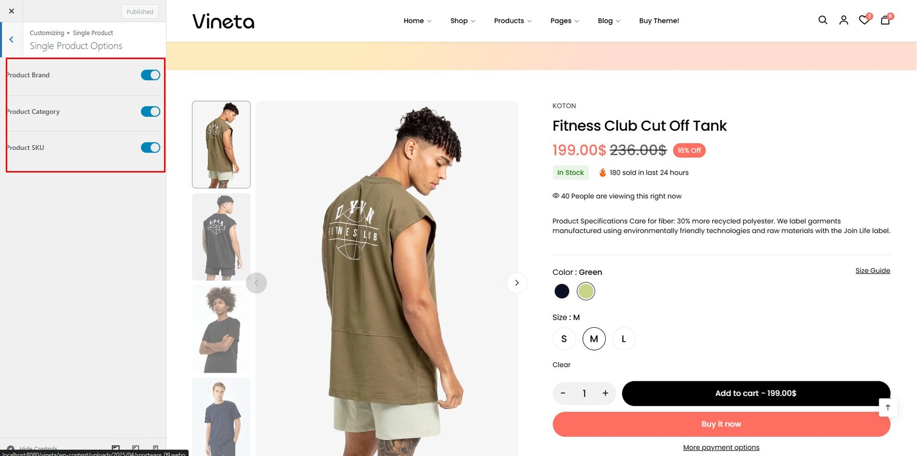
To enable this feature, go to Customize → Single Product → Single Production Options
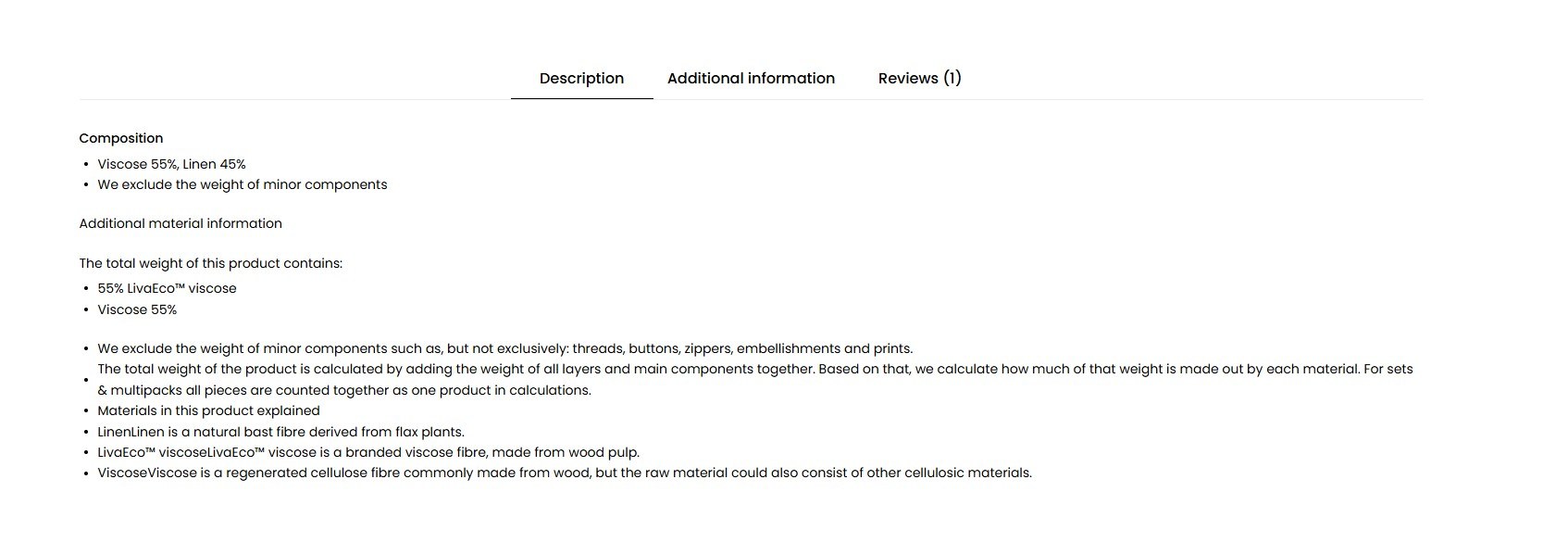
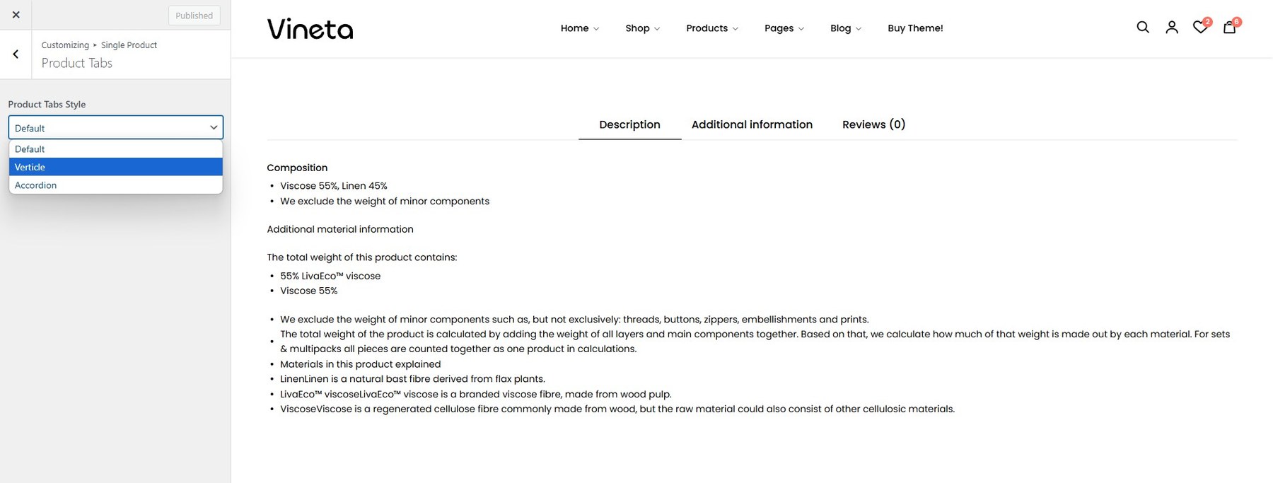
To Change Tab Style, go to Customize → Single Product → Product Tab
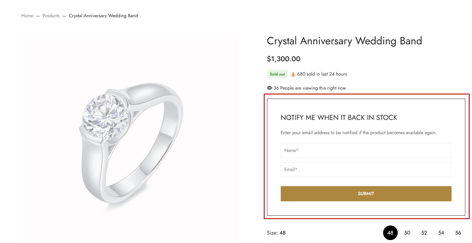
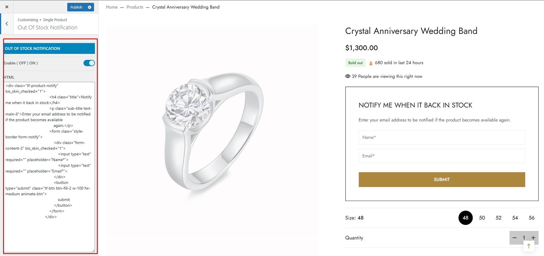
To Change Tab Style, go to Customize → Single Product → Out of Stock Notification
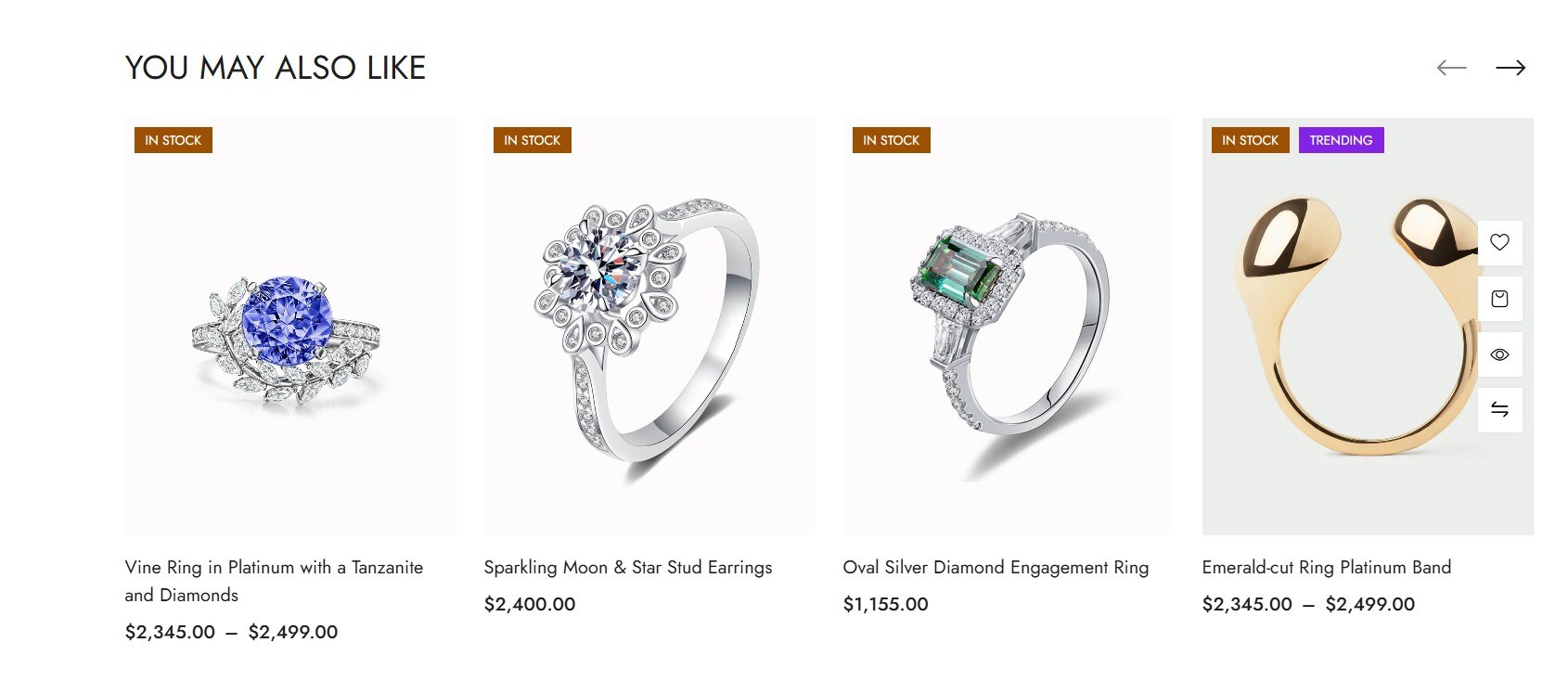
To Change Tab Style, go to Customize → Single Product → Related Product
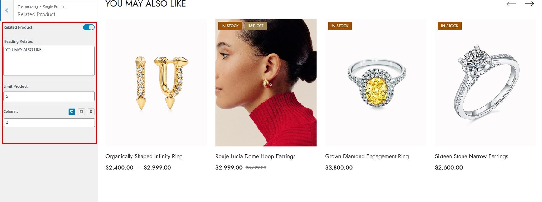
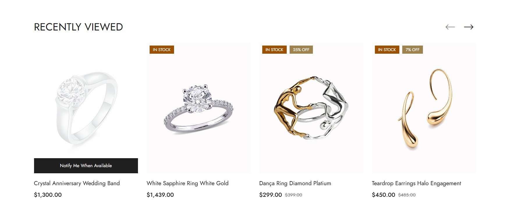
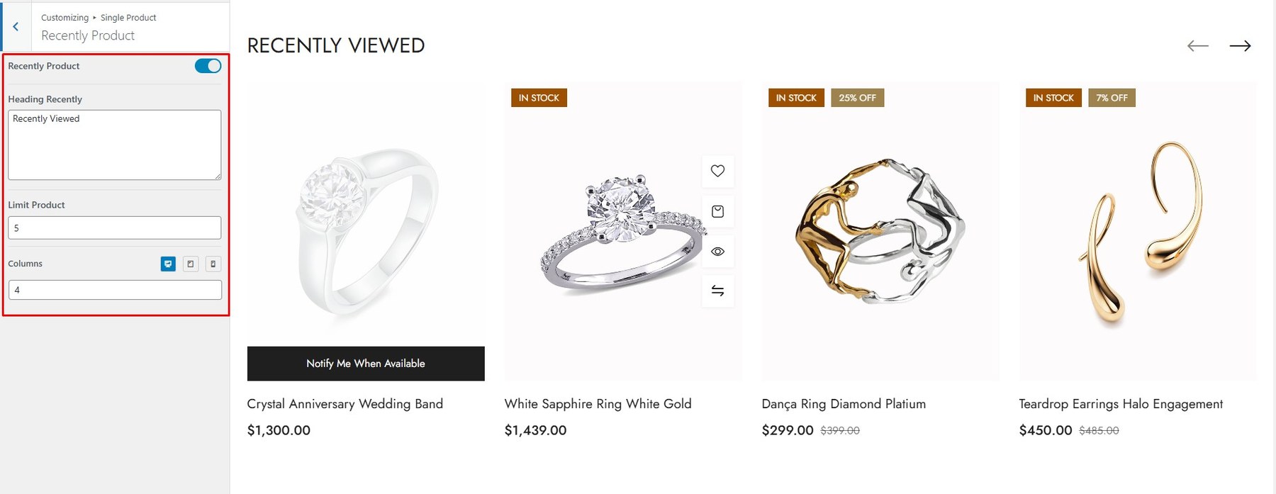
To Change Tab Style, go to Customize → Single Product → Recently Product
<div id=”up-sell-products”> <h4> 21. Up Sell Products </h4> <div class=”screenshot-item”> <img class=”img-doc” src=”assets/images/woo/woo_60.jpg” alt=”Up Sell Product” width=”1350″ /> </div> <p>To Change Tab Style, go to <strong>Customize → Single Product → Up Sell Product</strong></p> <div class=”screenshot-item”> <img class=”img-doc” src=”assets/images/woo/woo_61.jpg” alt=”Up Sell Product” width=”1350″ /> </div> <p>Choose the product you want to up-sell</p> <div class=”screenshot-item”> <img class=”img-doc” src=”assets/images/woo/woo_62.jpg” alt=”Buy X Get Y” width=”1350″ /> </div> </div>
<div id=”cross-sell-products”> <h4> 22. Cross-sell Products </h4> <div class=”screenshot-item”> <img class=”img-doc” src=”assets/images/woo/woo_63.jpg” alt=”Cross-sell Product” width=”1350″ /> </div> <p>To Change Tab Style, go to <strong>Customize → Single Product → Cross-sell Product</strong></p> <div class=”screenshot-item”> <img class=”img-doc” src=”assets/images/woo/woo_64.jpg” alt=”Cross-sell Product” width=”1350″ /> </div> <p>Choose the product you want to cross-sell</p> <div class=”screenshot-item”> <img class=”img-doc” src=”assets/images/woo/woo_65.jpg” alt=”Buy X Get Y” width=”1350″ /> </div> </div>
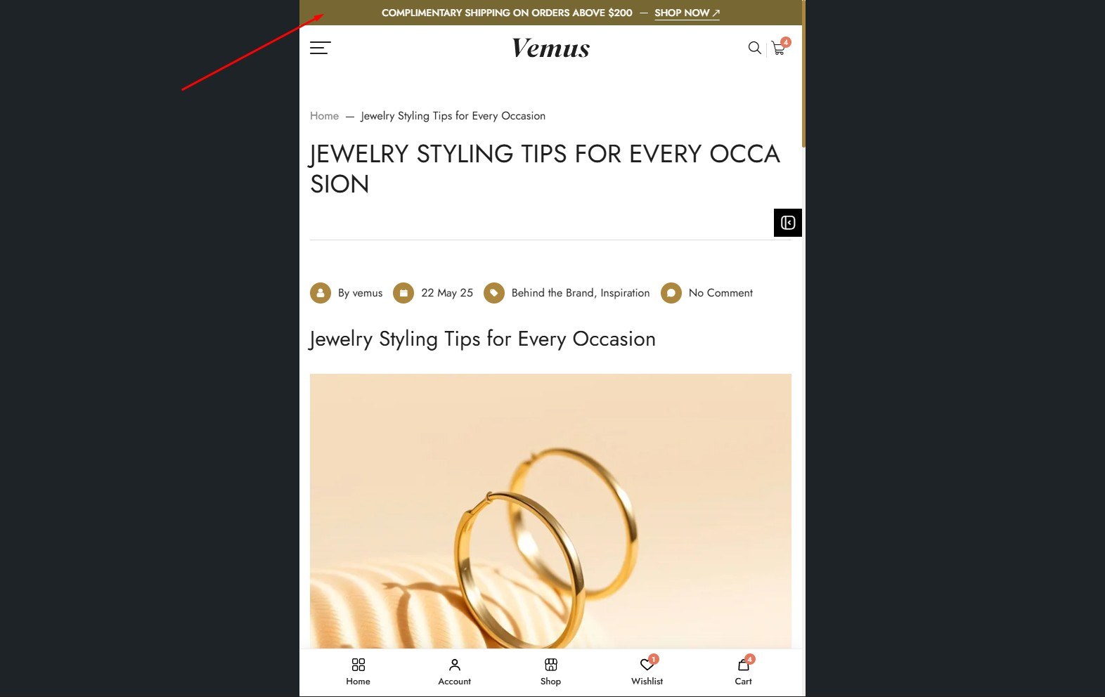
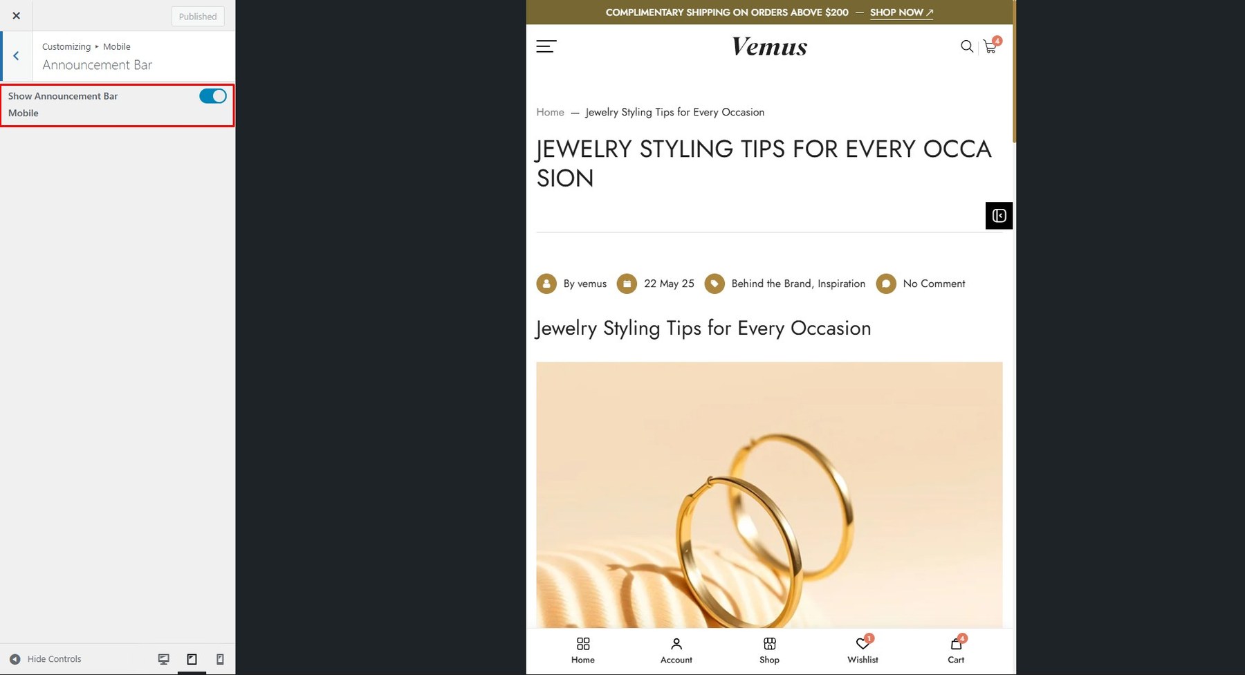
To enable/disable this feature, go to Customize → Mobile → Announcement Bar
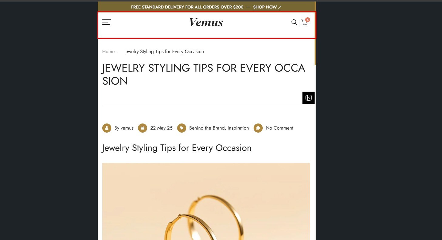
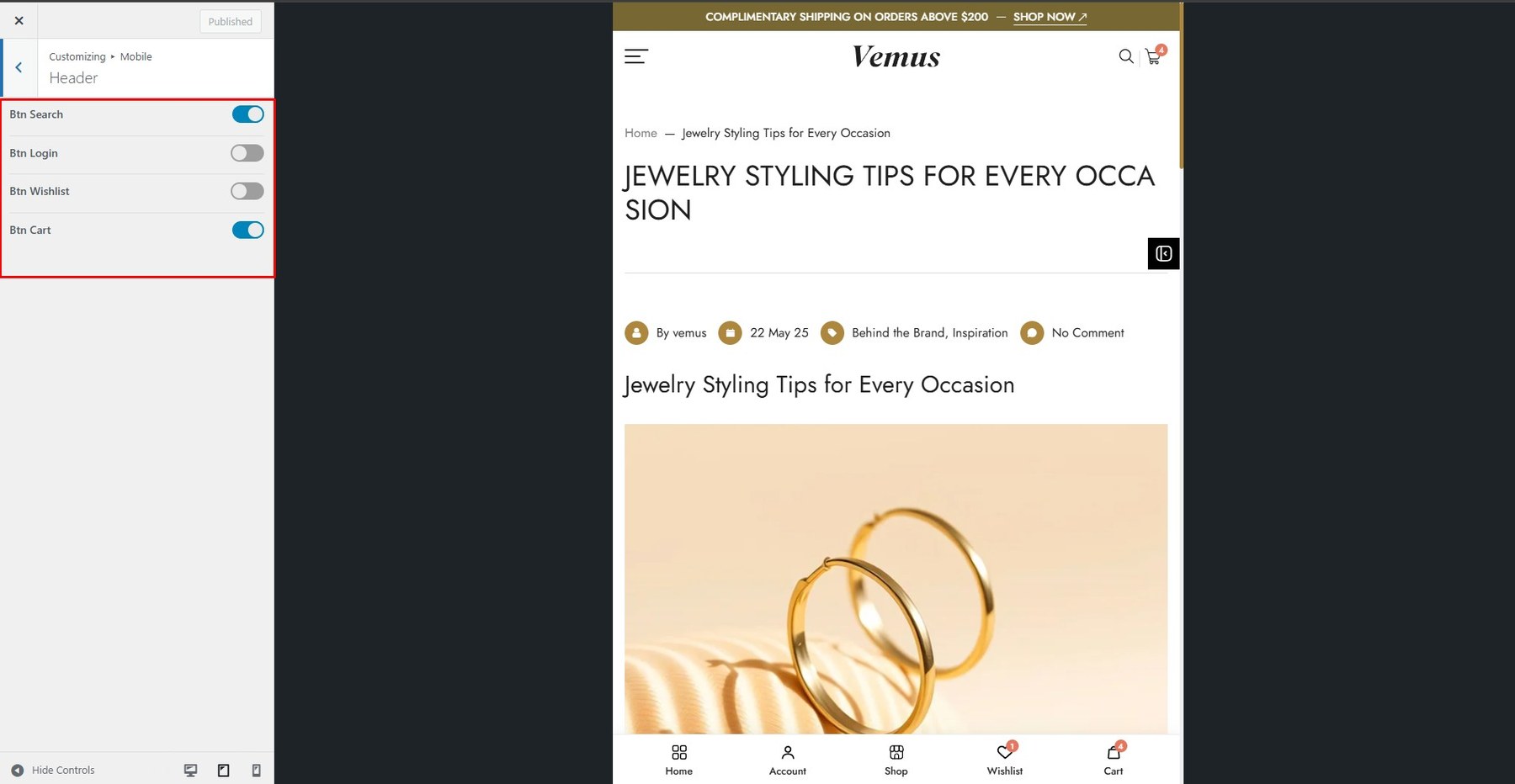
To enable this feature, go to Customize → Mobile → Header
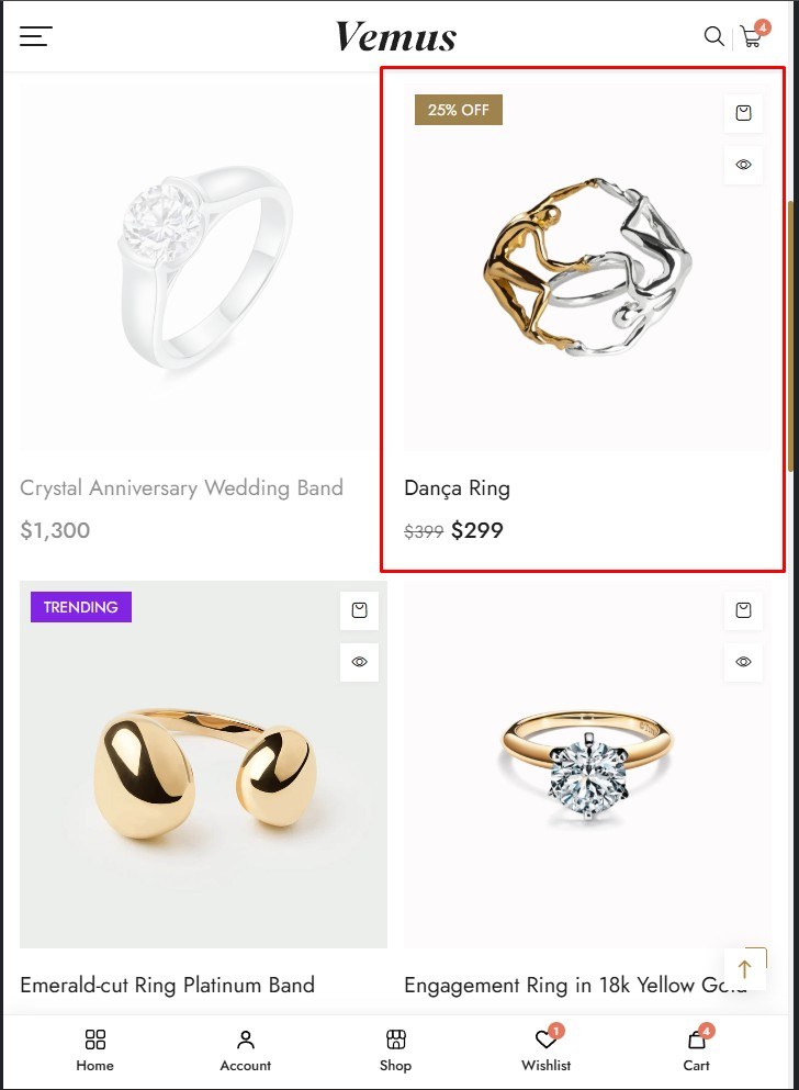
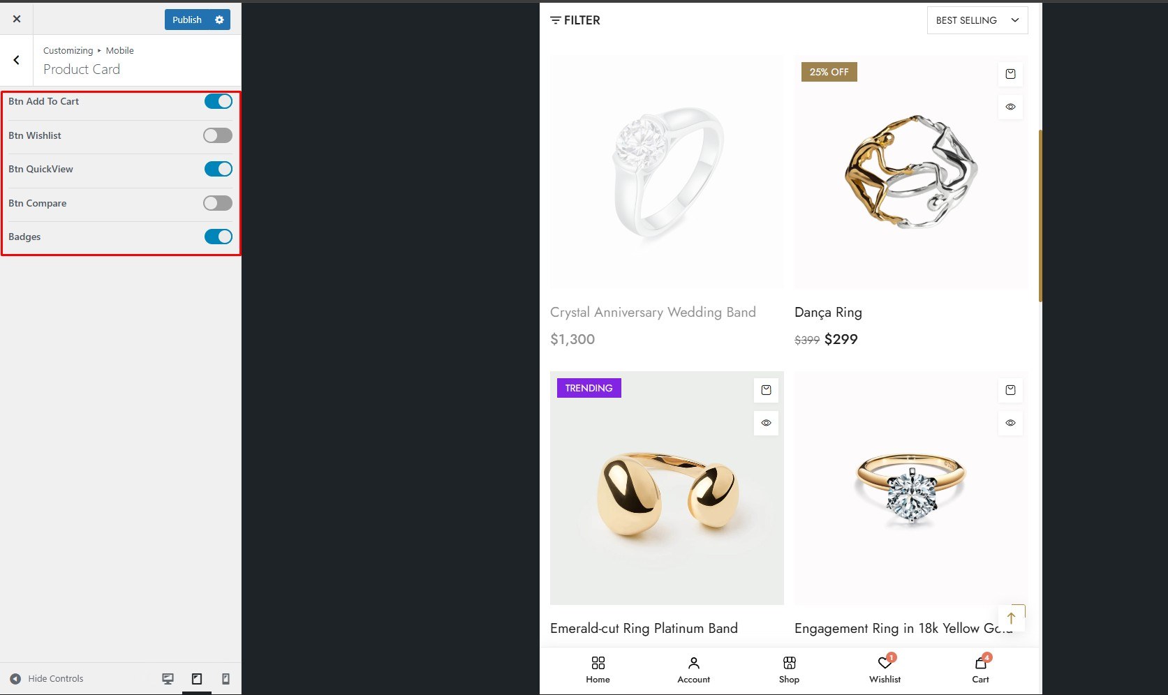
To enable this feature, go to Customize → Mobile → Product Card
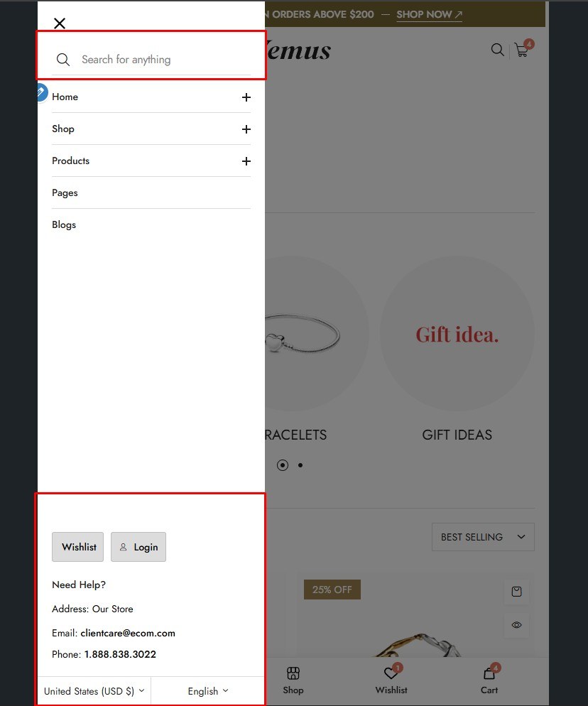
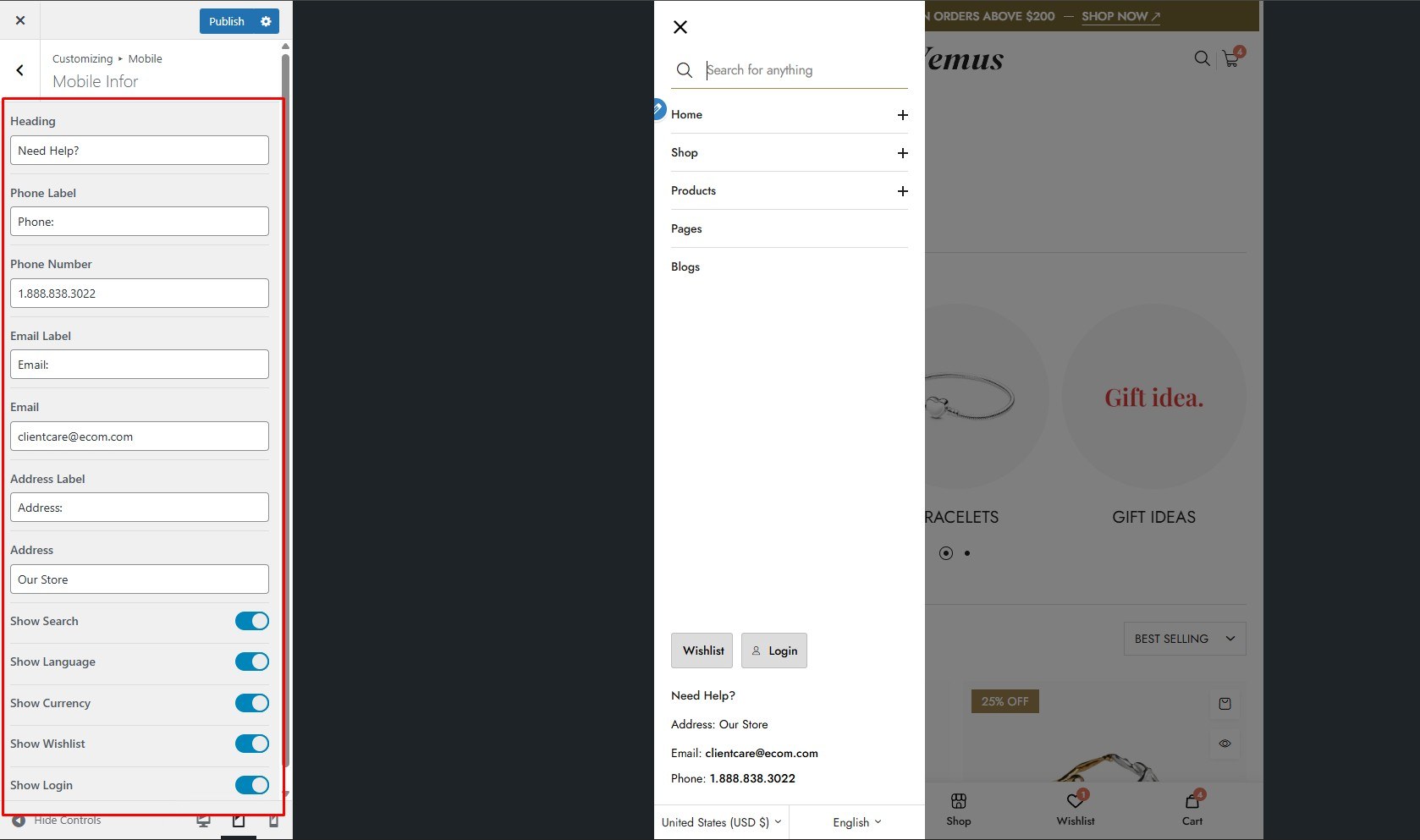
To enable this feature, go to Customize → Mobile → Mobile Info
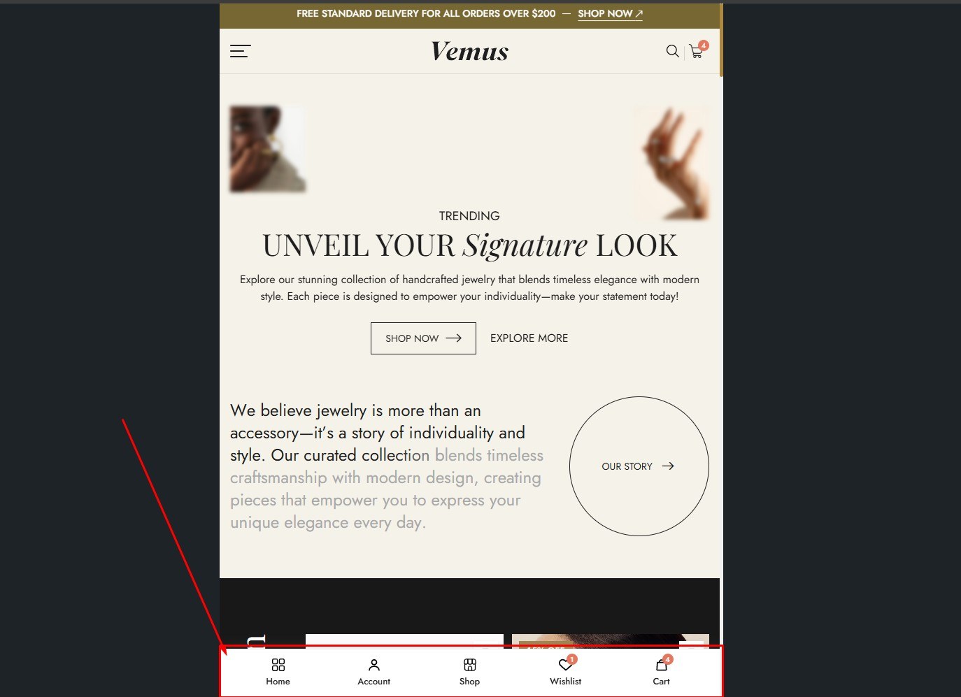
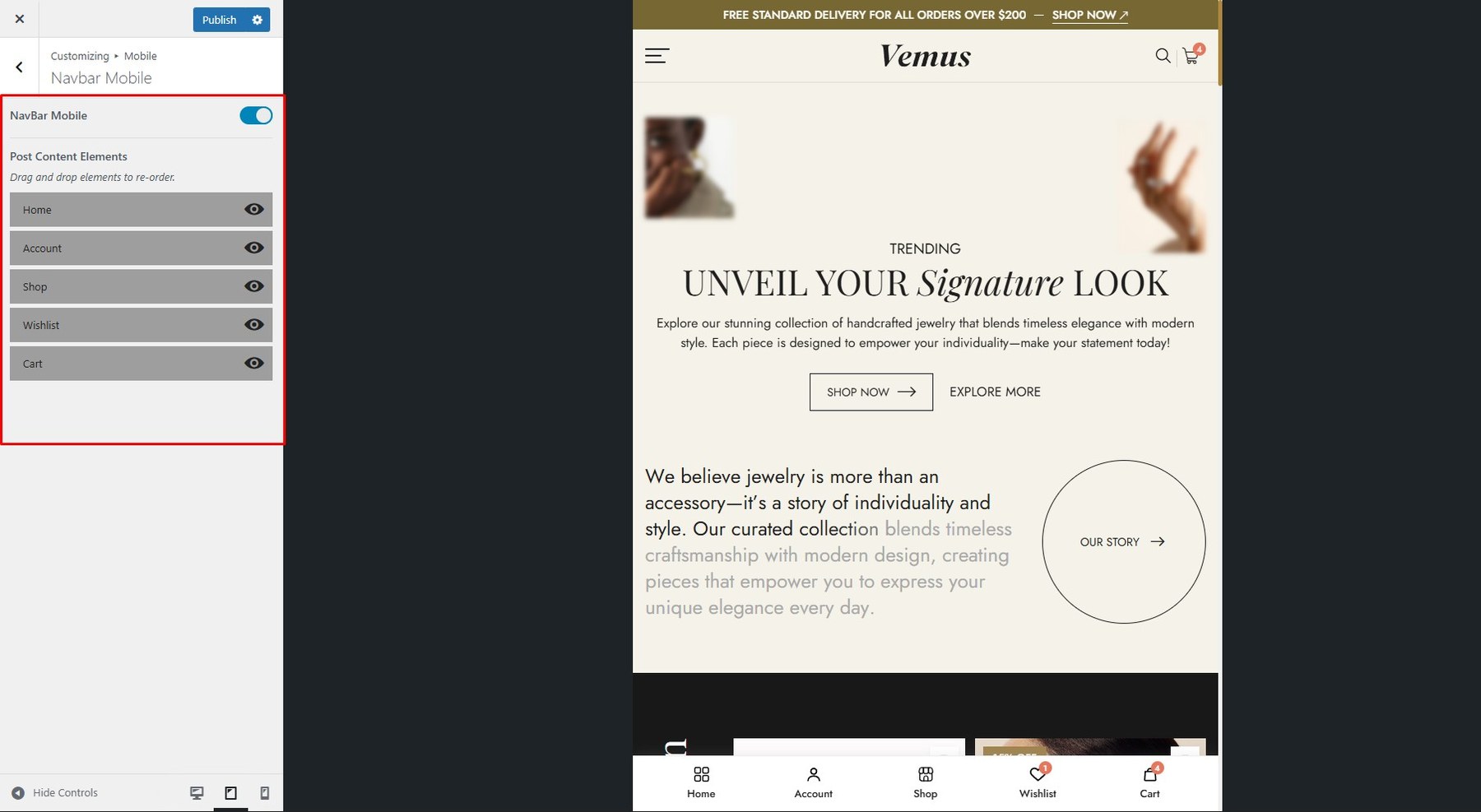
To enable this feature, go to Customize → Mobile → Navbar Mobile
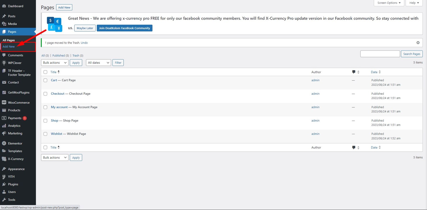
Step 1: Go to Pages in your admin sidebar and click Add New.
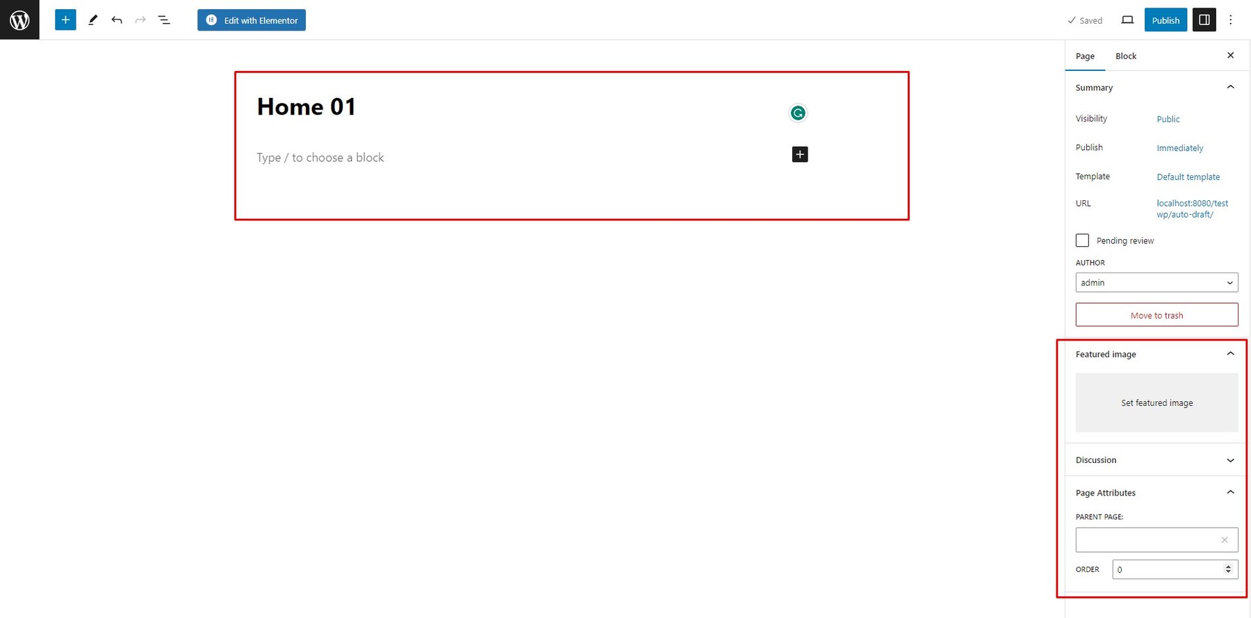
Step 2: Enter a page title, then in the Page Attributes box on the right, choose a Template.
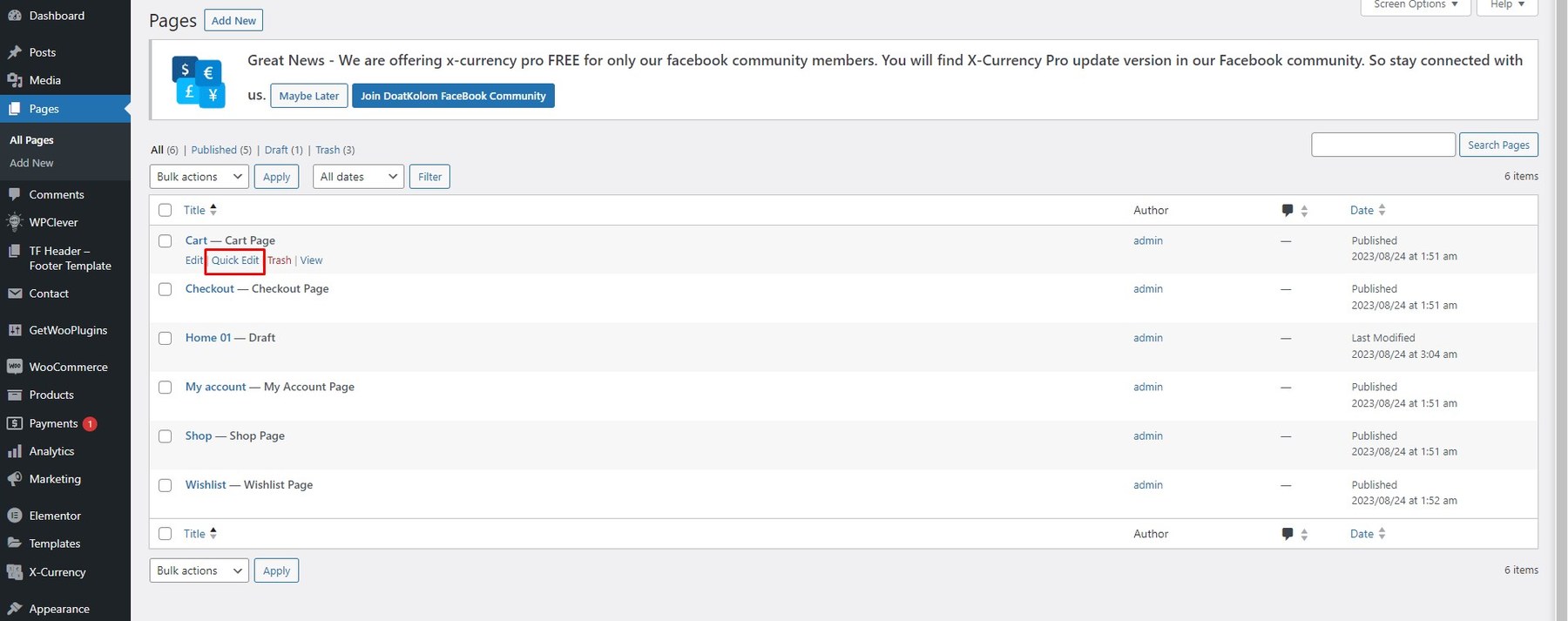
Step 1: Go to Pages → All Pages, hover over the page you want to update, and click Quick Edit.
Step 2: Update the page title and clear the current slug. Click Update to auto-generate a new slug.
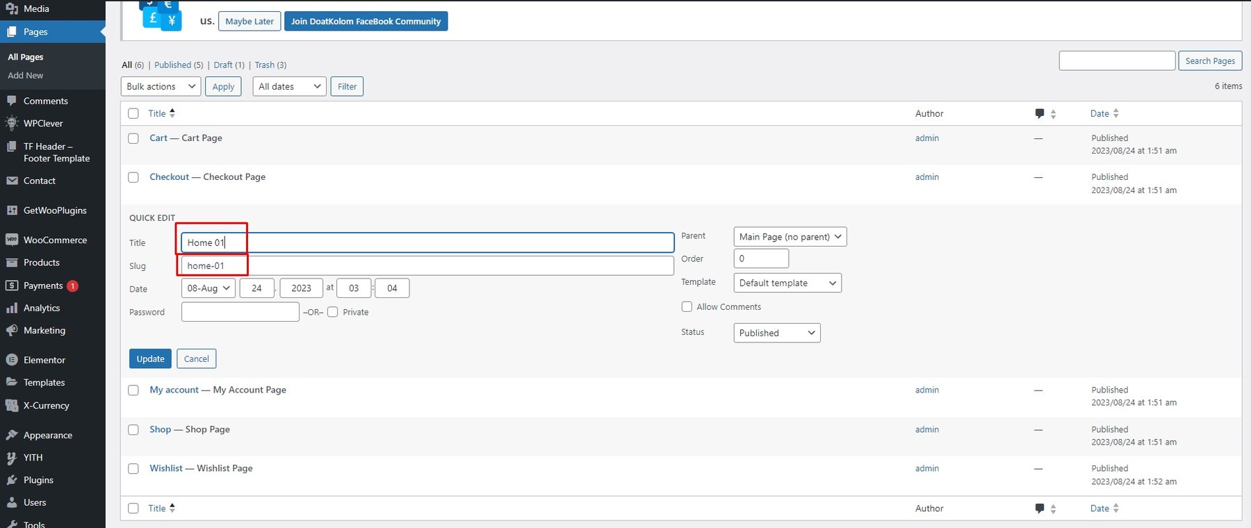
You can also modify parent, template, status, etc. For more options, click Edit instead of Quick Edit.
After creating a page, you can configure display options for it on the front end.
Example:
If the default header is Header Default, but you set Header Style 01 in Settings → TF Header → Header Style, and override it with Header Style 03 in the page options, then Header Style 03 will be used.
Step 1: Open the page in the editor and click Edit with Elementor.
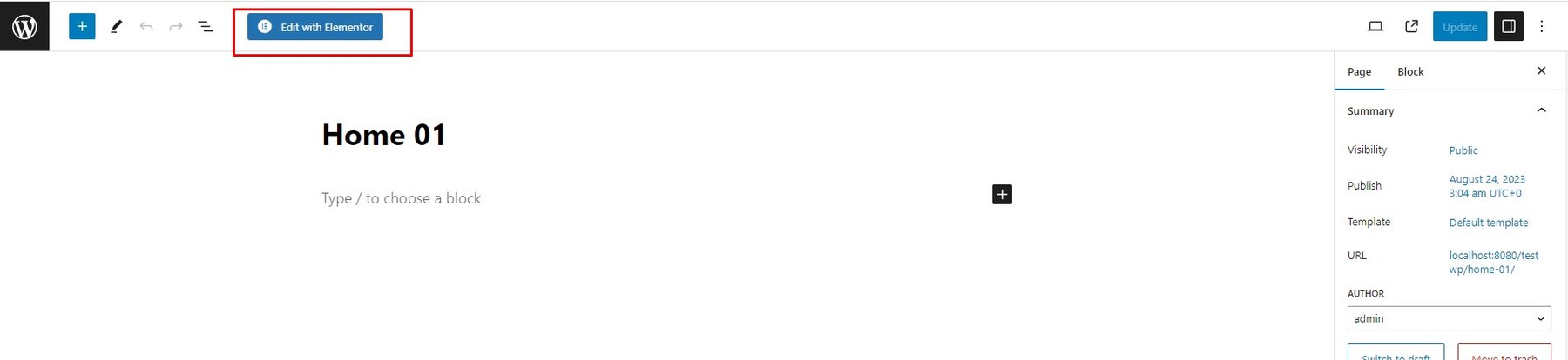
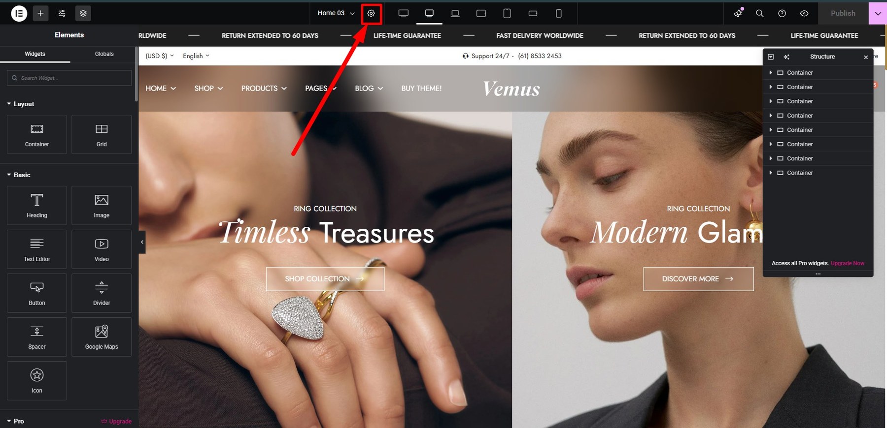
Step 2: In the top center of the page, click the Settings icon.
Step 3: In Page Settings → TF Header, select your desired Header Style.
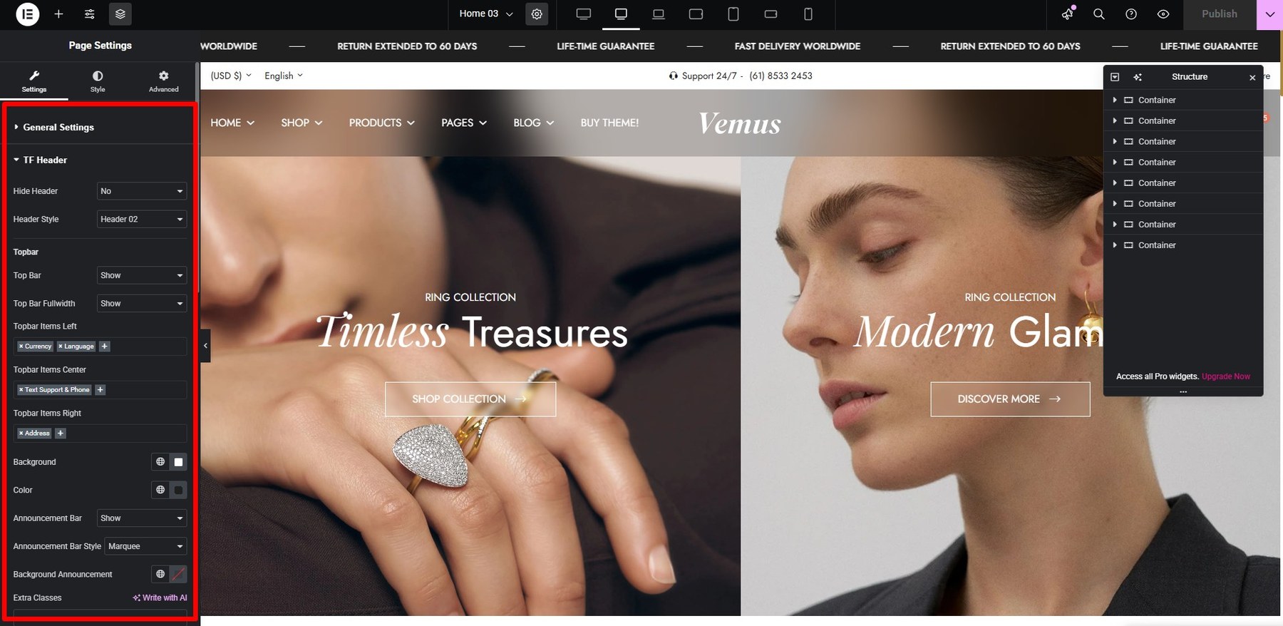
You can also adjust settings for the Logo, Topbar, Header, Page Title, Sidebars, and Footer.
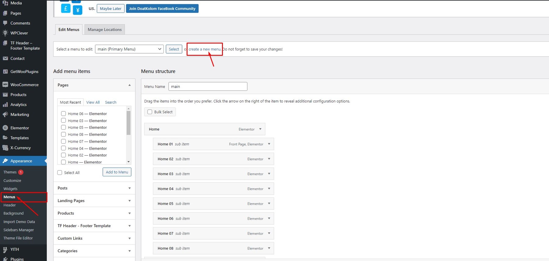
Step 1: Go to Appearance → Menu in the admin sidebar, then click Create a new menu.
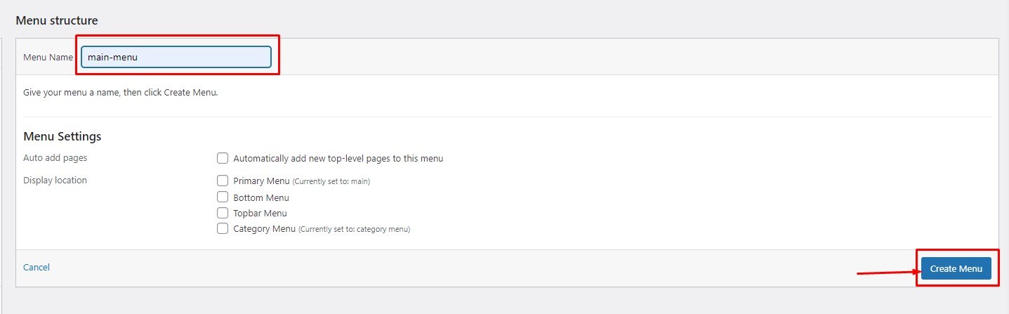
Step 2: Enter a name for your menu and click Create Menu.
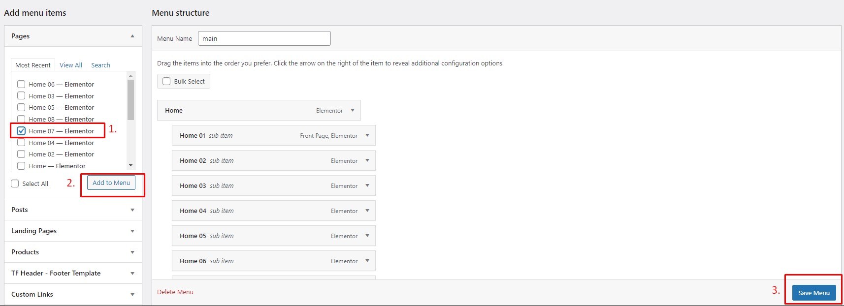
Step 3: Select the desired items from the left panel, click Add to Menu, then click Save Menu.
Step 1: Go to Appearance → Menu and click Create a new menu.
Step 2: Select existing menu items or add custom links.
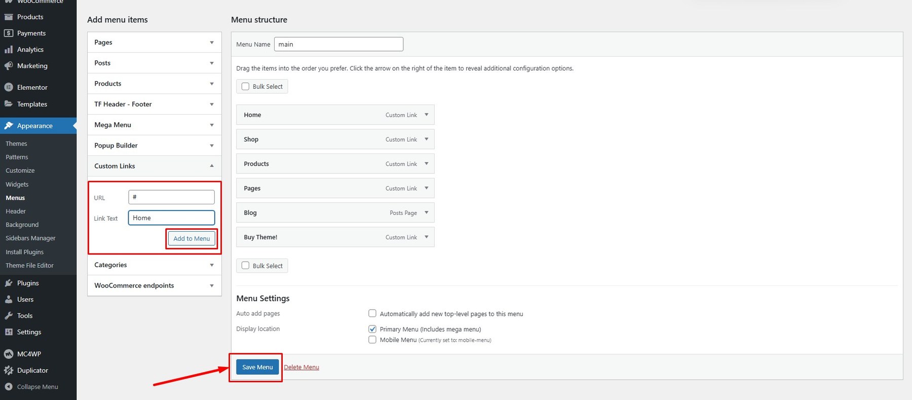
Step 3: Click Enable Mega Menu.
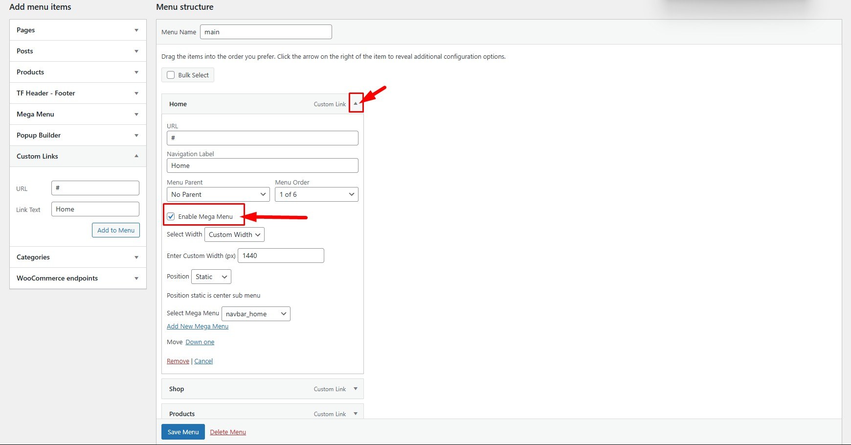
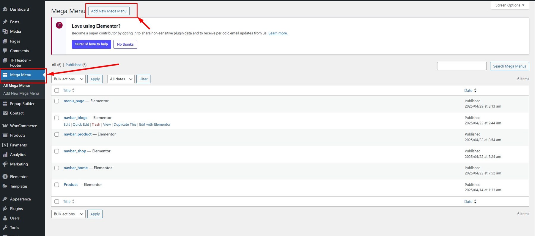
If you haven’t created a Mega Menu template, go to Mega Menu and add a new template.
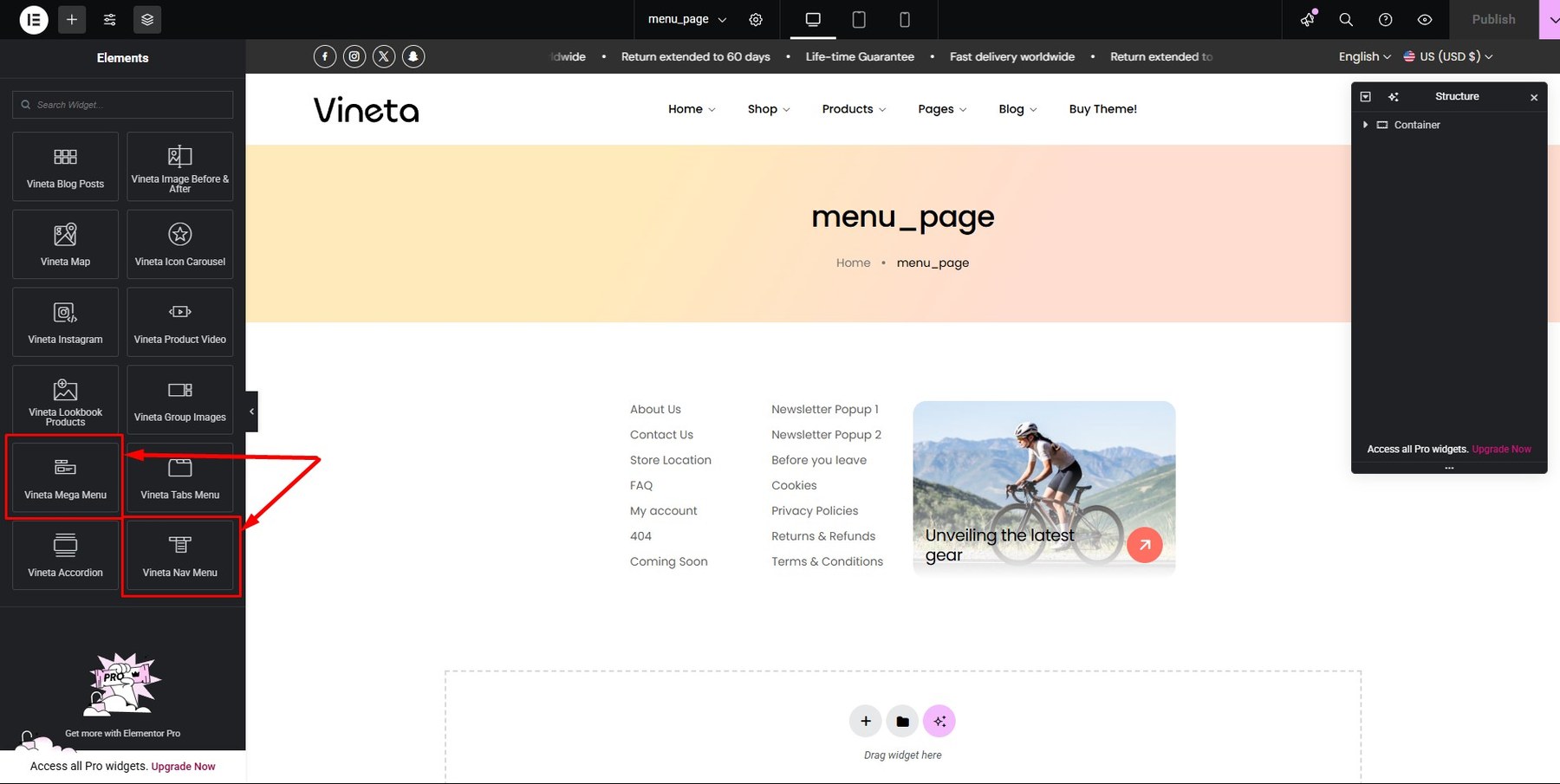
Customize your Mega Menu using elements from the sidebar, then click Publish.
Step 4: Once your Mega Menu is ready, return to Appearance → Menu. Click Enable Mega Menu, then set the width, position, and assign the Mega Menu template.
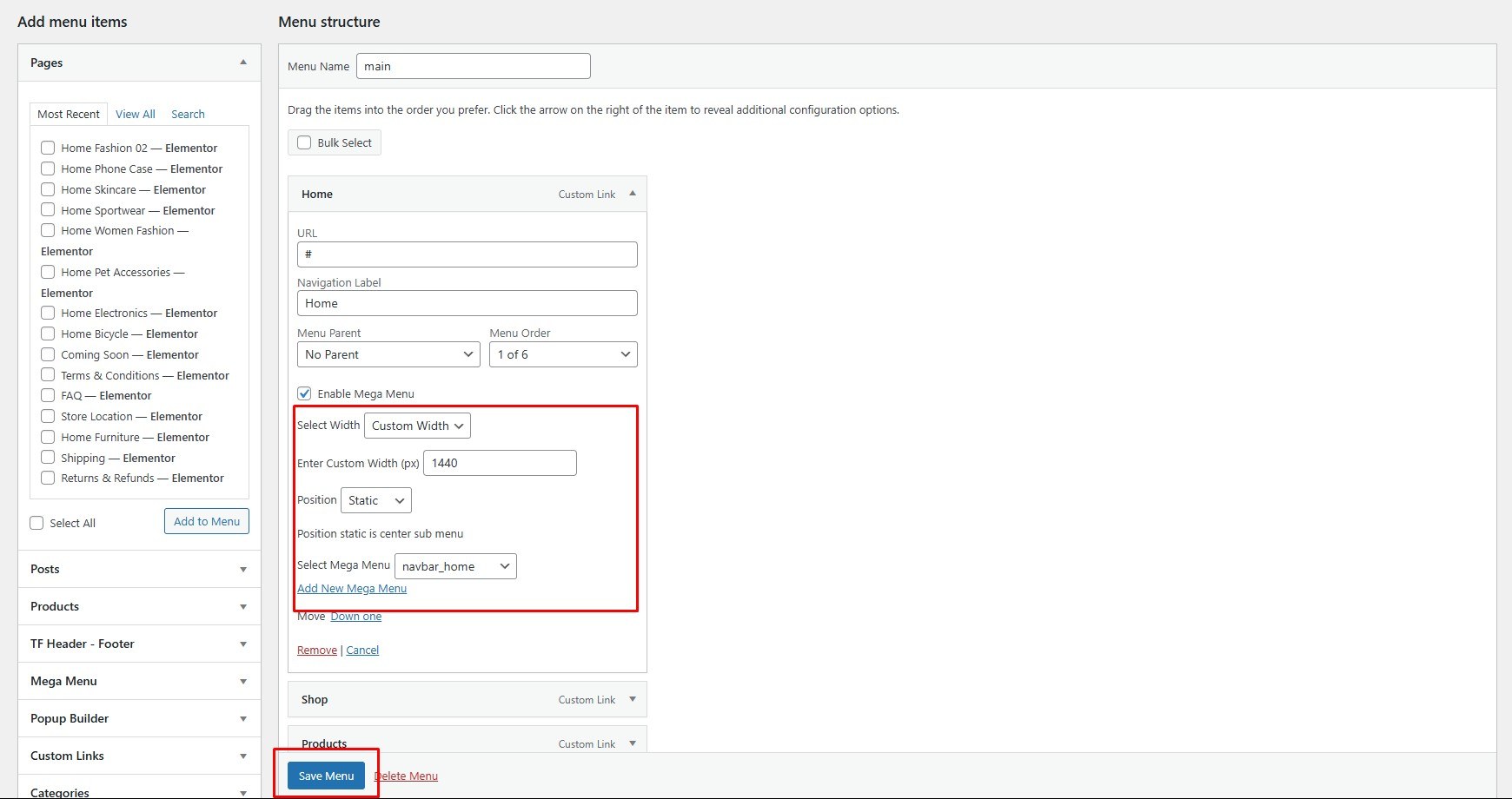
Step 5: Don’t forget to click Save Changes.
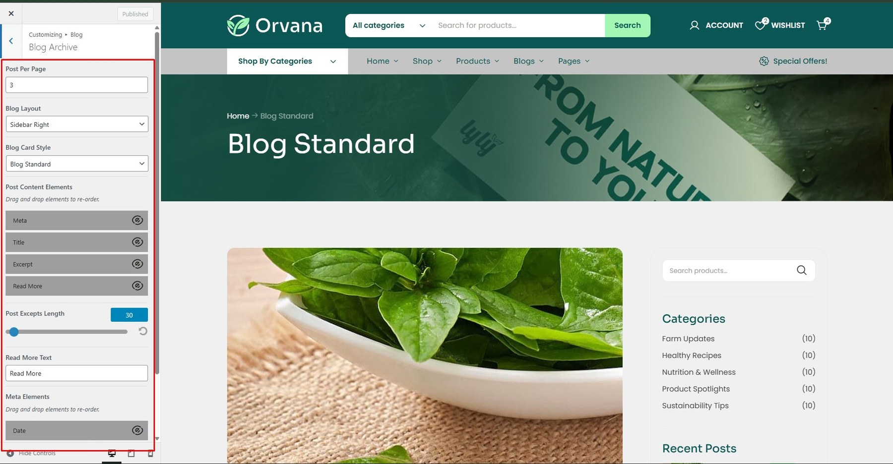
To Customize Post you go to: Dashboard -> Appearance -> Customize -> Content
- Blog archive

- Sidebar Position: Select sidebar position on the posts page (No Sidebar/Left/Right)
- Blog Layout: Select layout style for List (List/Grid)
- Post Grid Columns: Choose to display the number of columns of the article
- List Sidebar: In the dropdown box, select the sidebar you want to display on posts page
- Post Content Elements: Drag and drop elements to re-order.
- Post Excepts Length: This option is only available when you turn on “Auto Post Excepts”. It uses to limit the content length which is shown on posts page
- Social Share: Enable or disable Social Share
- Read More Text: You can modify the text of Read more button here
- Meta Elements: Drag and drop elements to re-order.
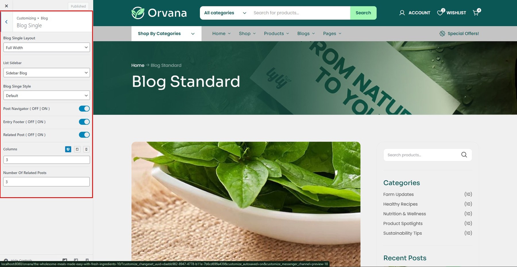
- Blog Single
- Post Navigator: Enabled Post Navigator or not
- Related Posts: Enabled Related Posts or not
- Related Posts Style: Choose Related Posts Style (Blog List or Blog Grid)
- Columns Of Related Posts: Choose 2 Columns, 3 Columns, 4 Columns
- Number Of Related Posts: Number Of Related Posts
NOTE: To use all widgets of Themesflat Addons, select the page you want to edit or create a new page, then choose Edit with Elementor > Elementor > Themesflat Addons.
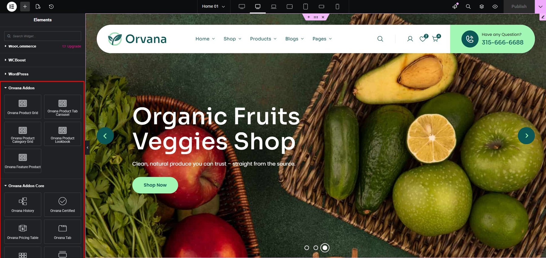
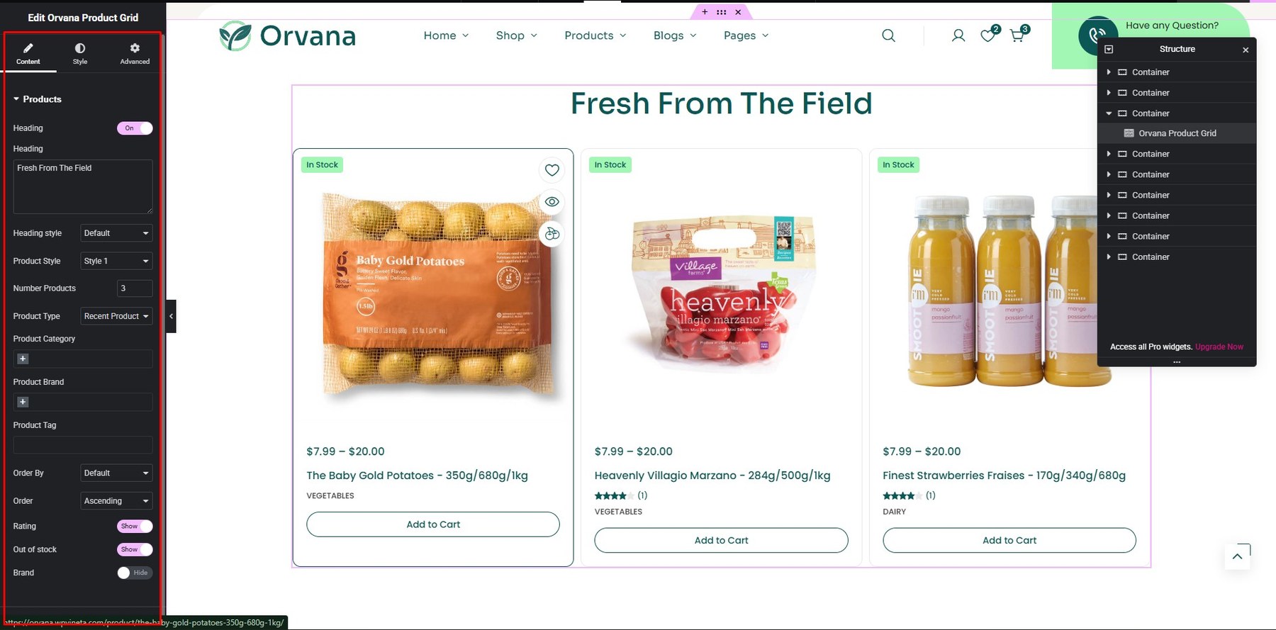
- Product Grid
You can build it using the theme’s Addons.

You can customize it in the Content and Style sections.

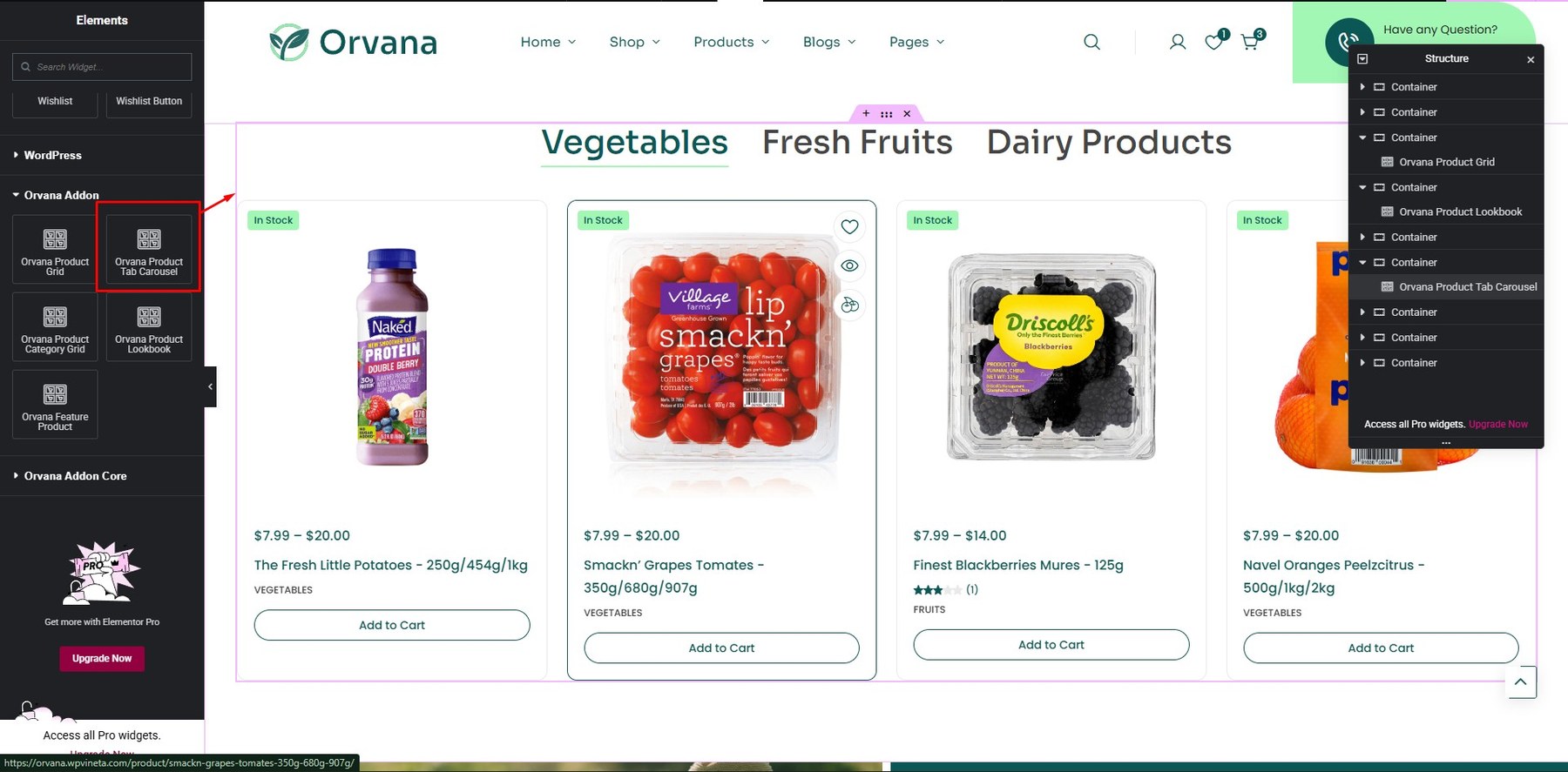
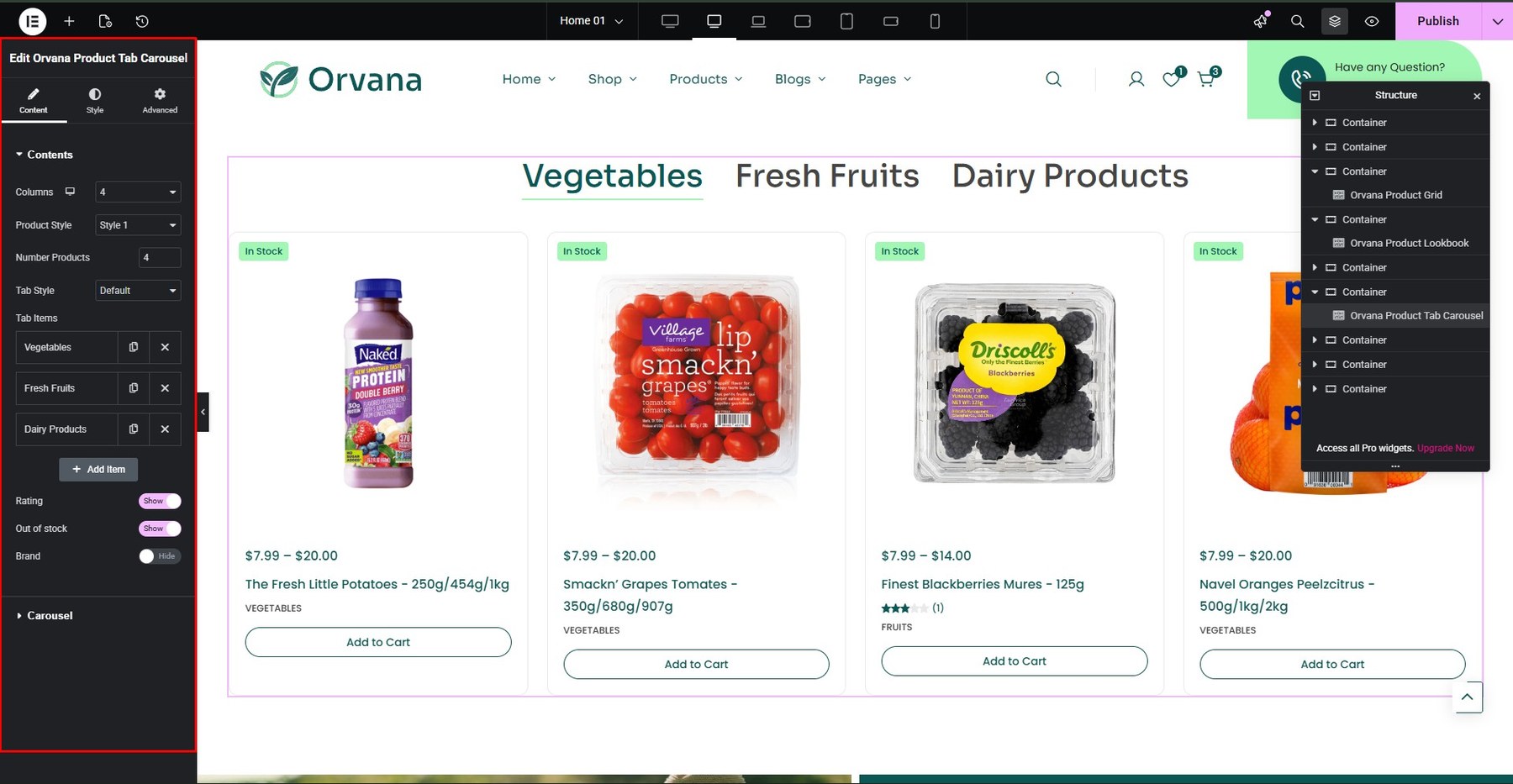
- Product Tab Carousel
You can build it using the theme’s Addons.

You can customize it in the Content and Style sections.

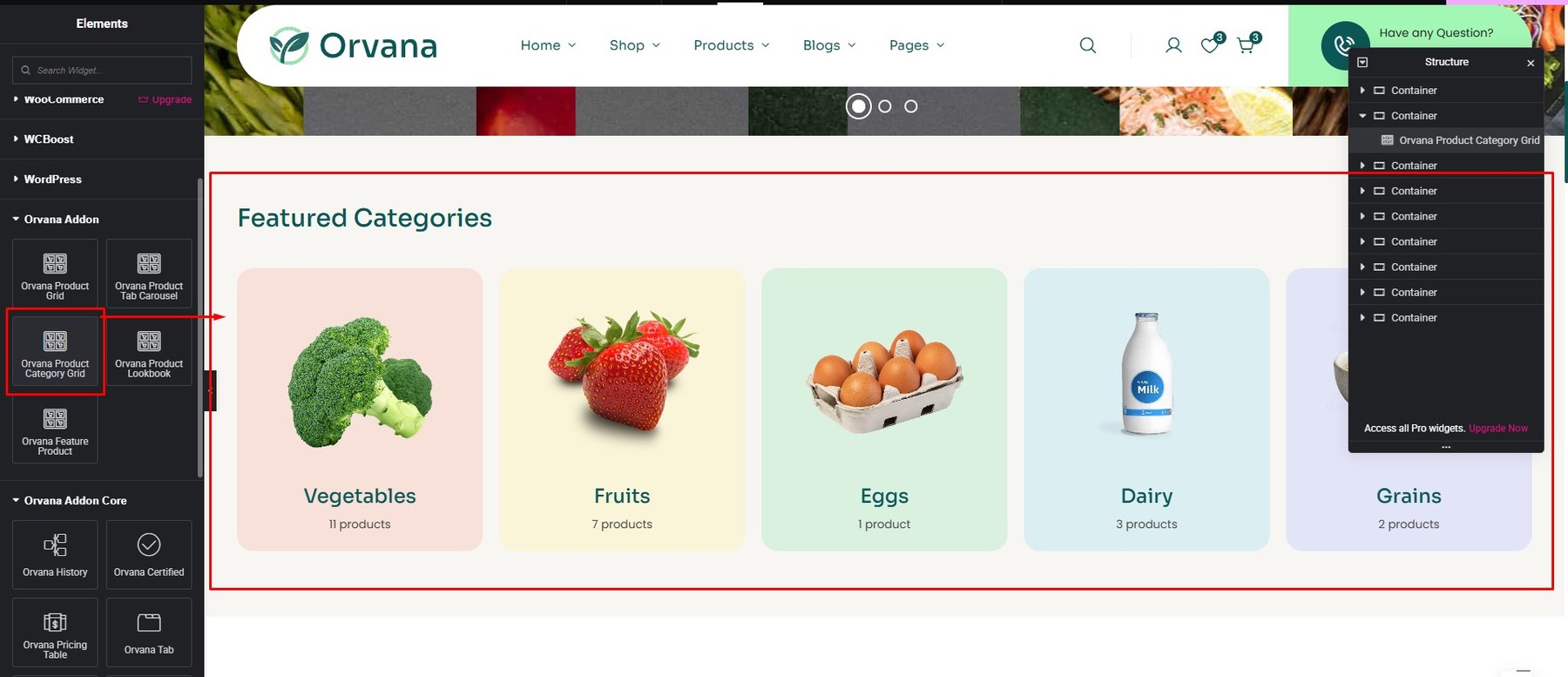
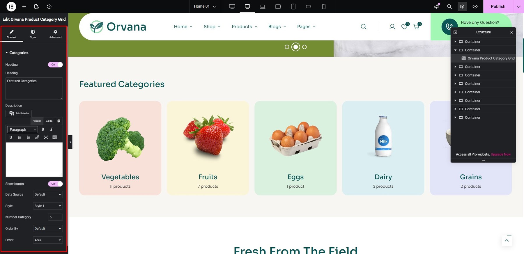
- Product Category Grid
You can build it using the theme’s Addons.

You can customize it in the Content and Style sections.

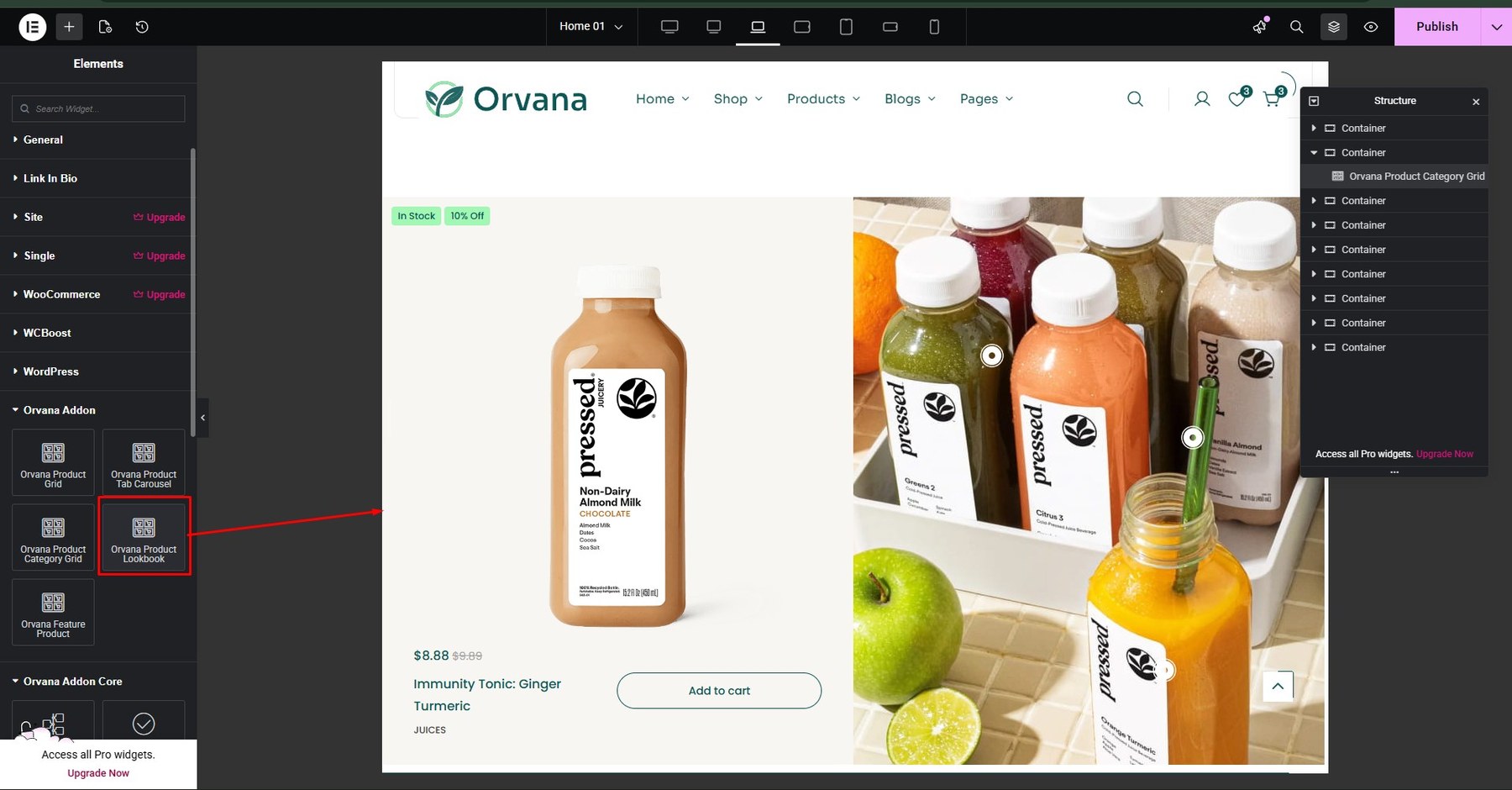
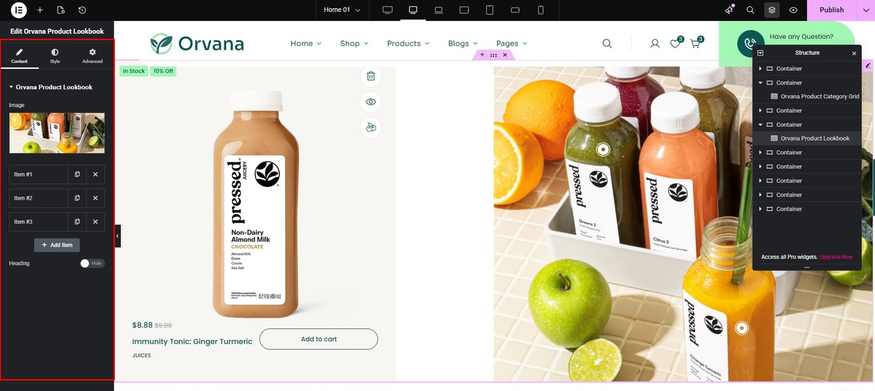
- Product Lookbook
You can build it using the theme’s Addons.
You can customize it in the Content and Style sections.

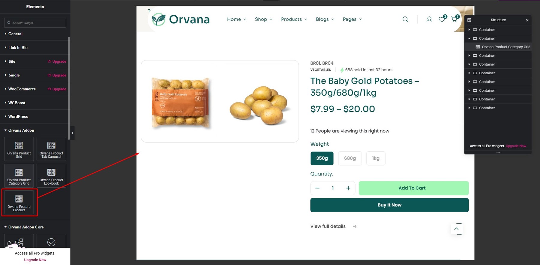
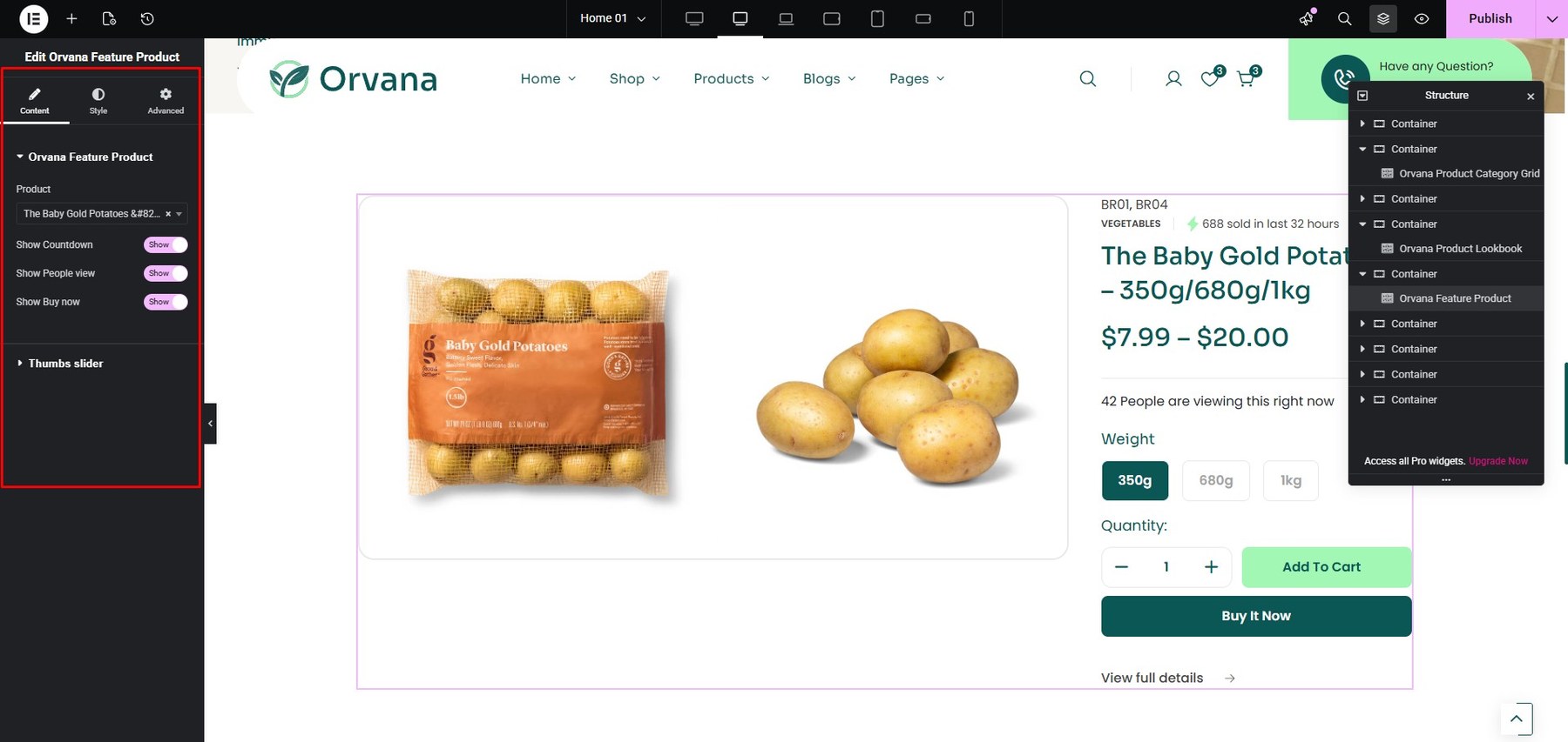
- Product Featured
You can build it using the theme’s Addons.

You can customize it in the Content and Style sections.

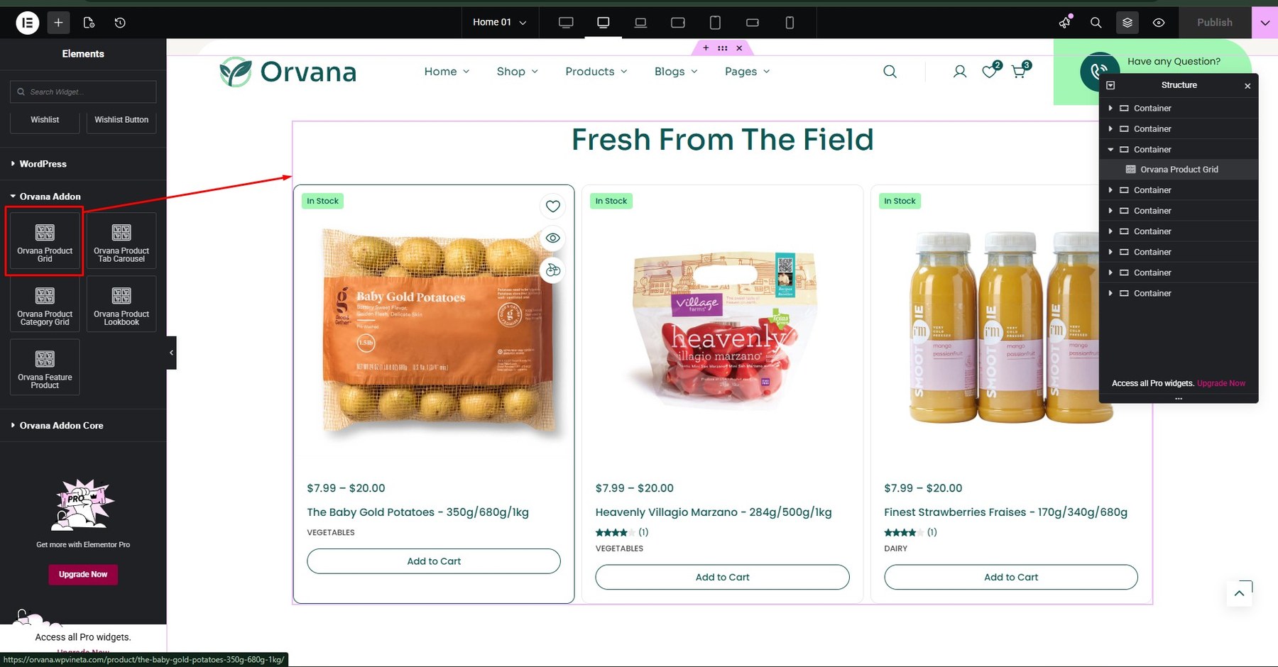
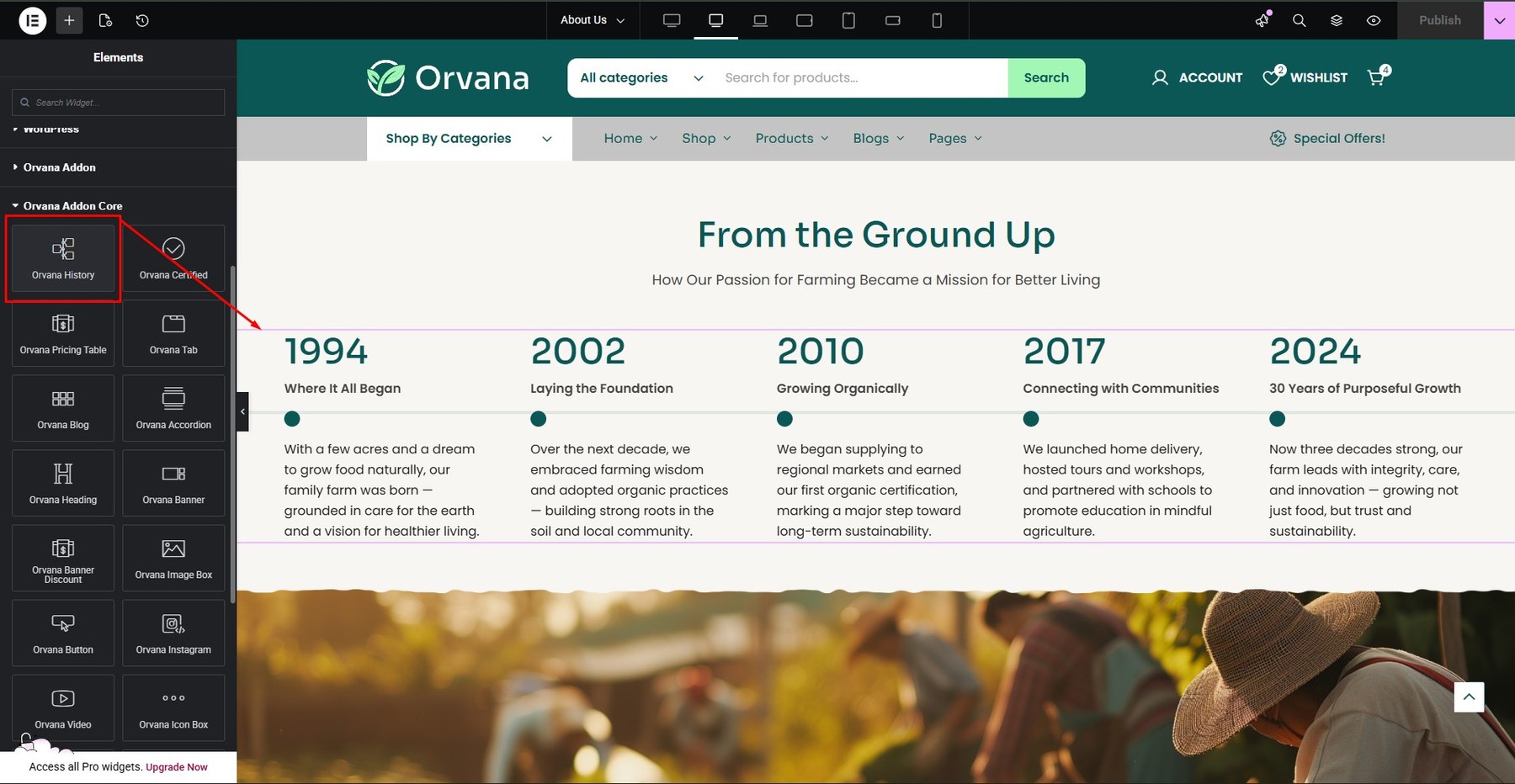
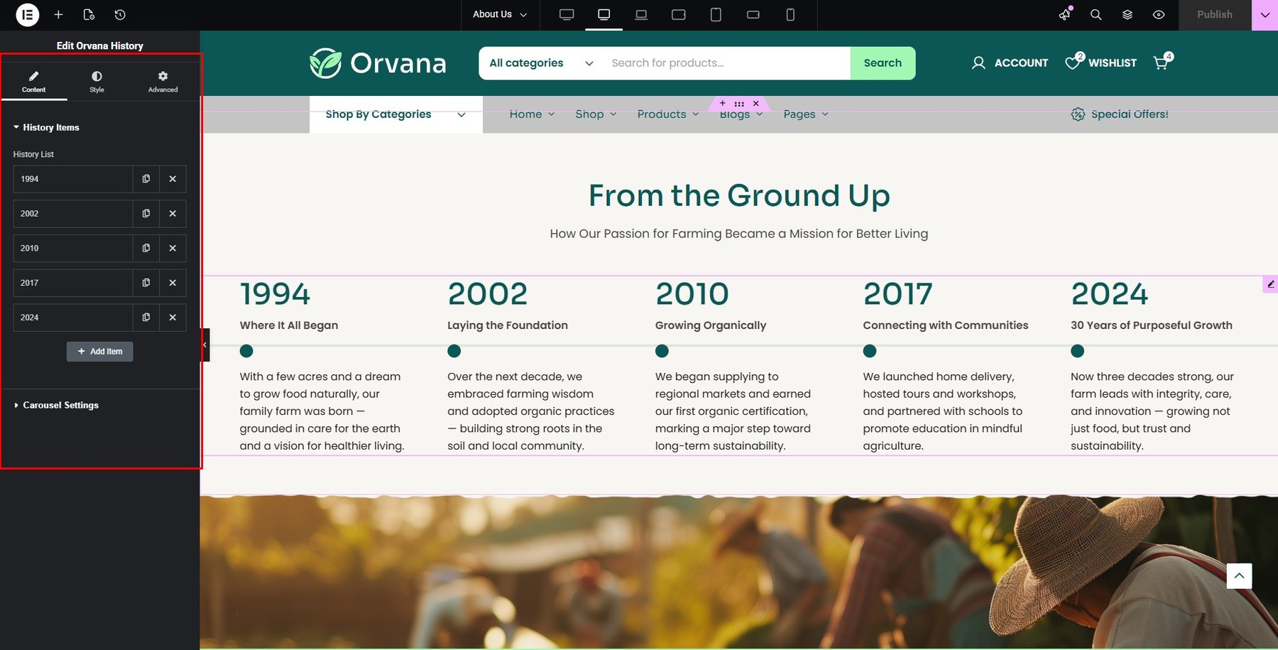
- History
You can build it using the theme’s Addons Core.
You can customize it in the Content and Style sections.

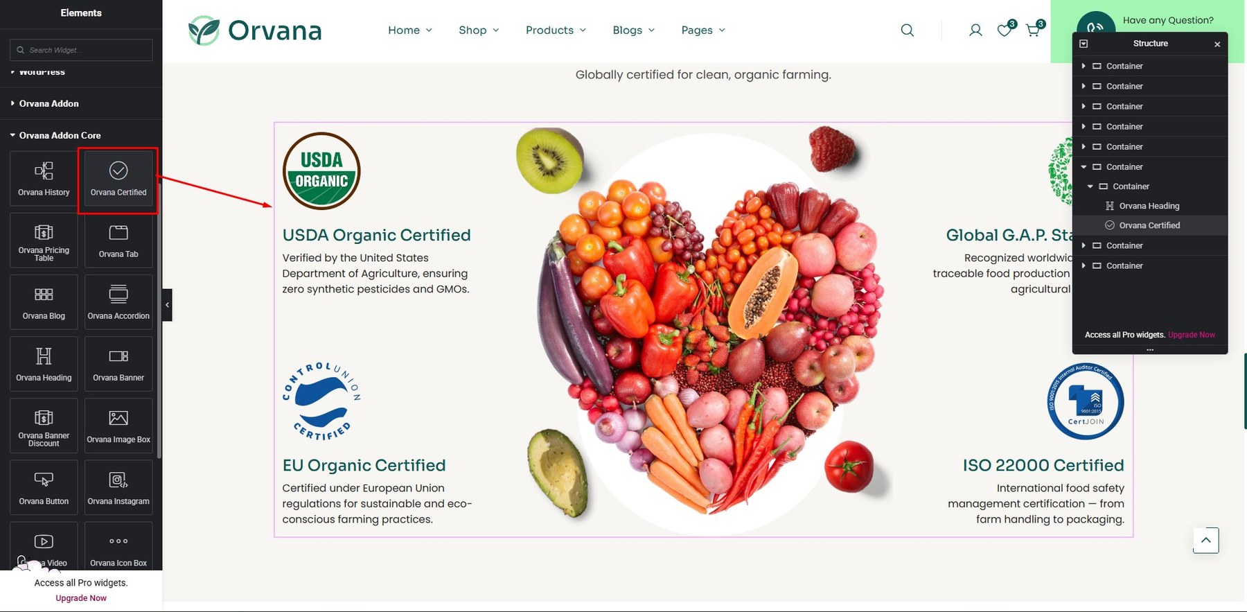
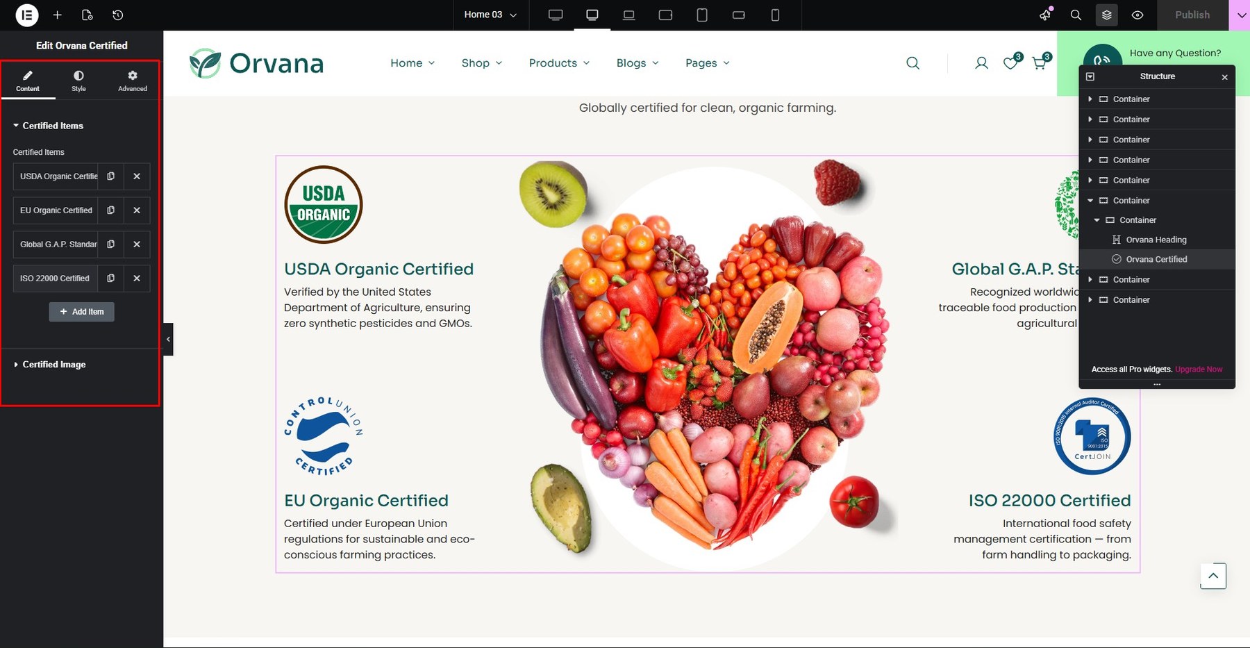
- Certified
You can build it using the theme’s Addons Core.

You can customize it in the Content and Style sections.
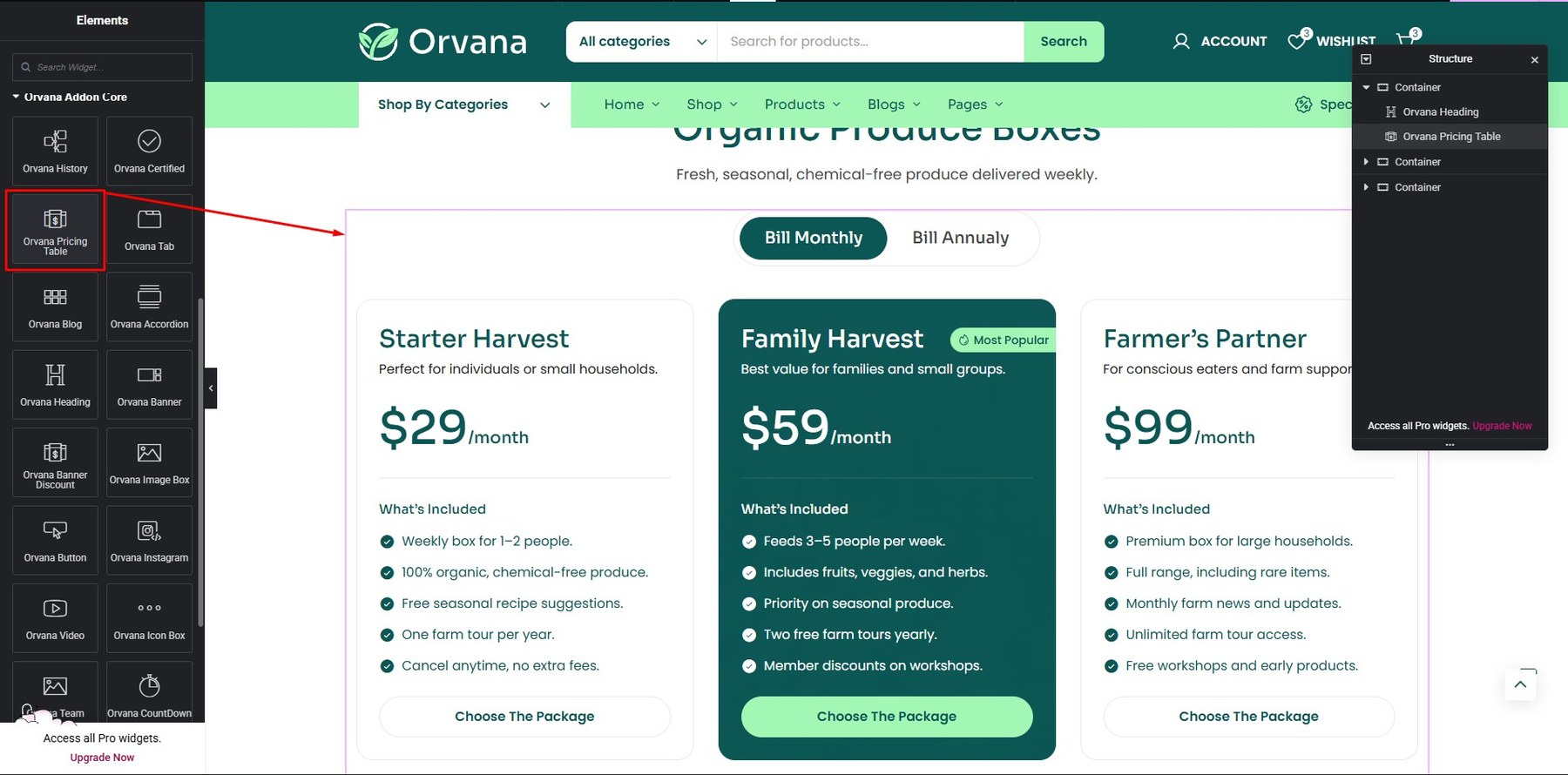
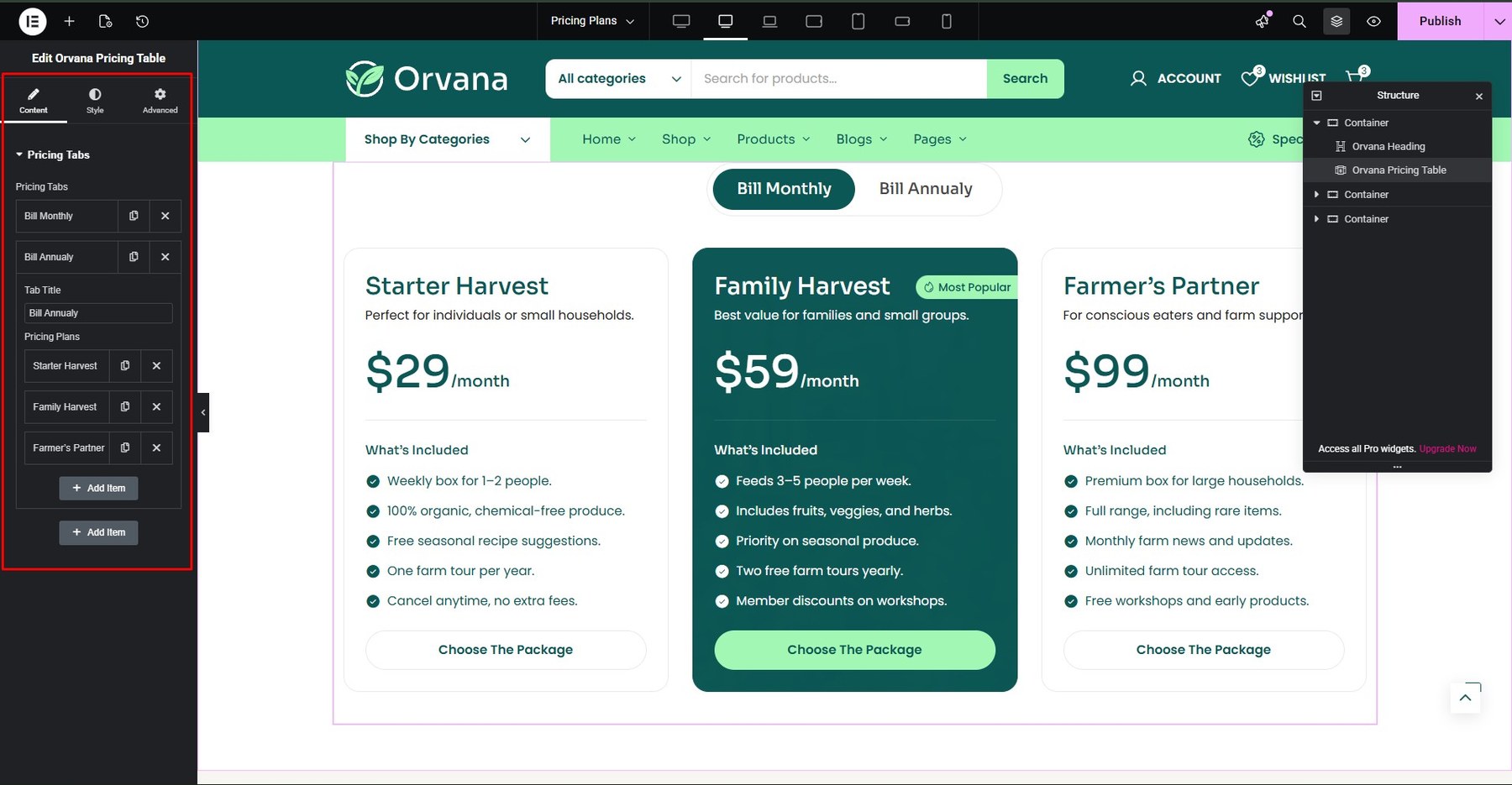
- Pricing Table
You build it at Addons Core

You can customize at Content and Style

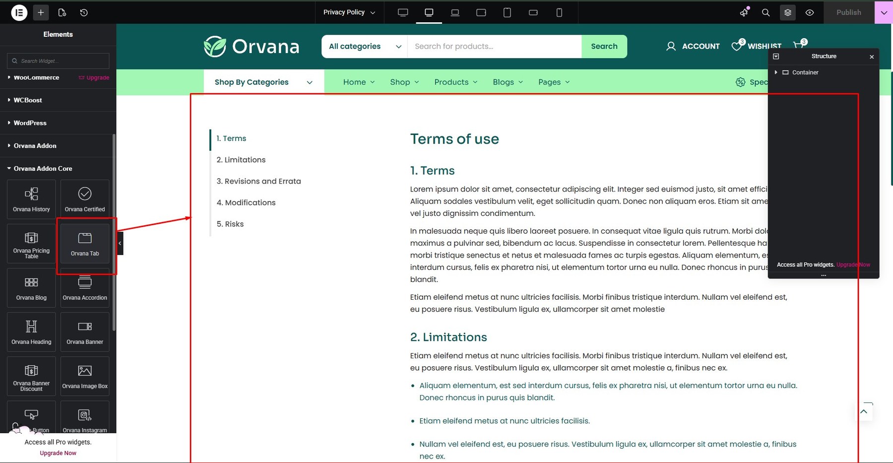
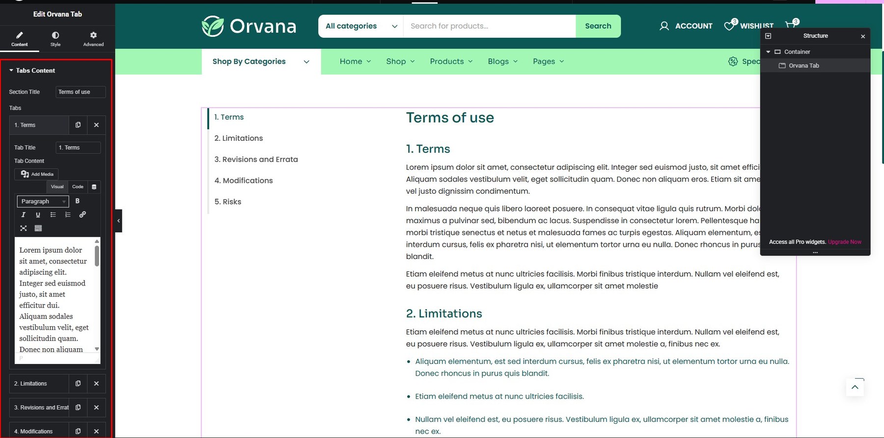
- Tab
You build it at Addons Core
You can customize at Content and Style

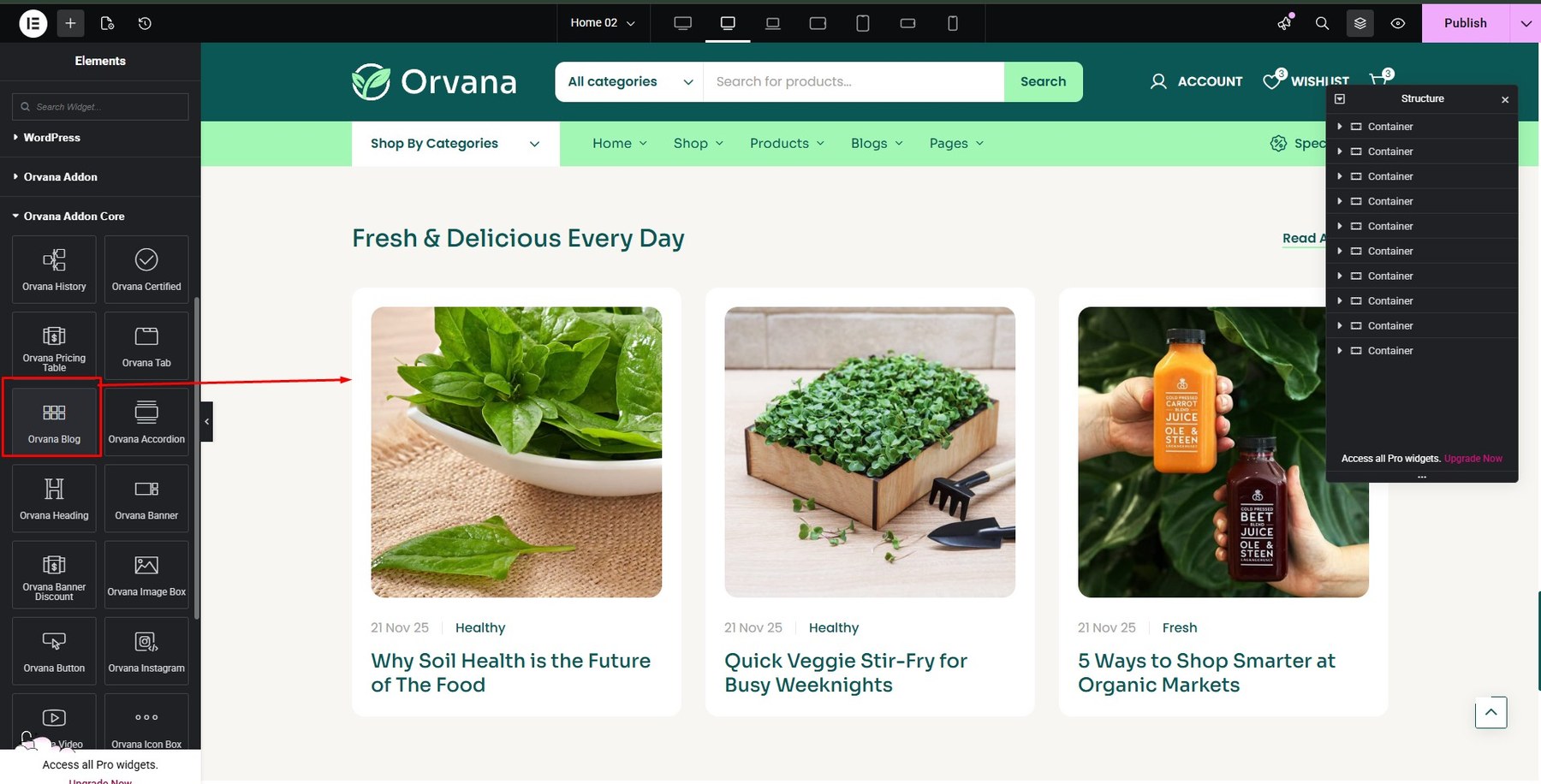
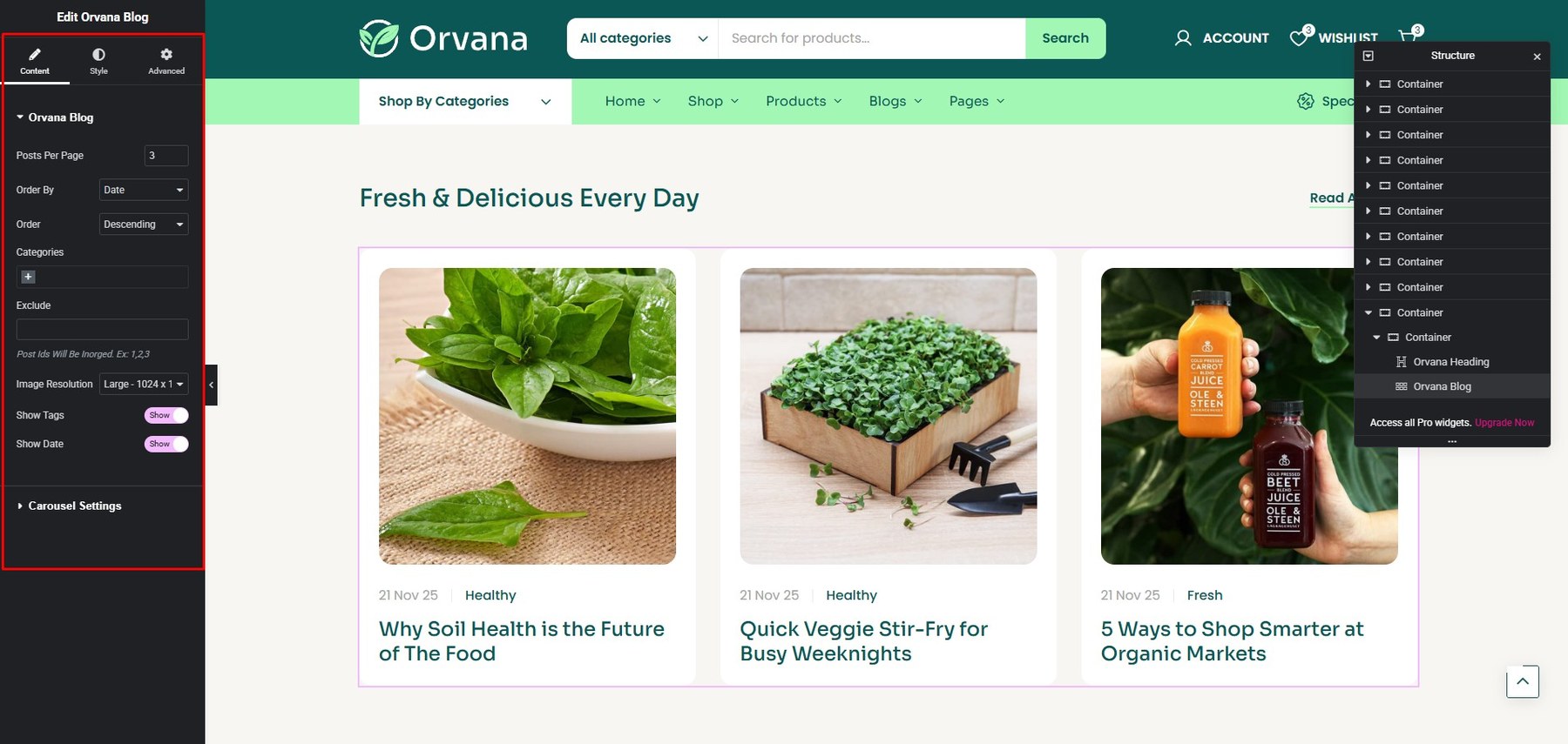
- Blog
You build it at Addons Core

You can customize at Content and Style

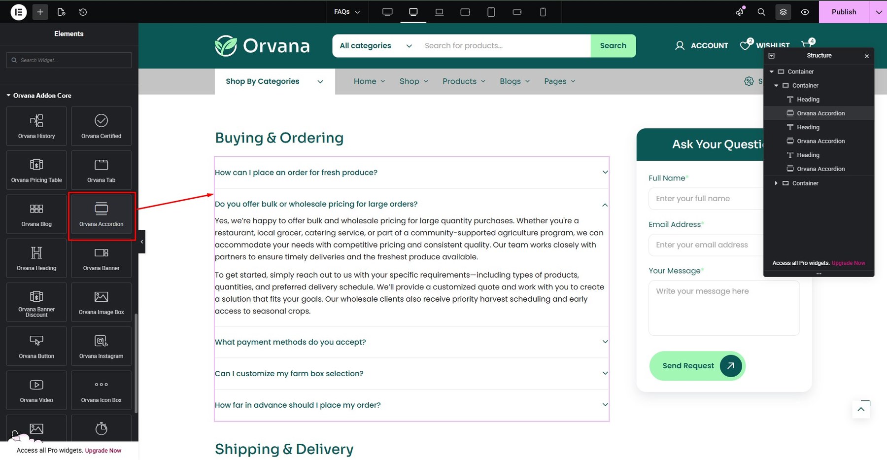
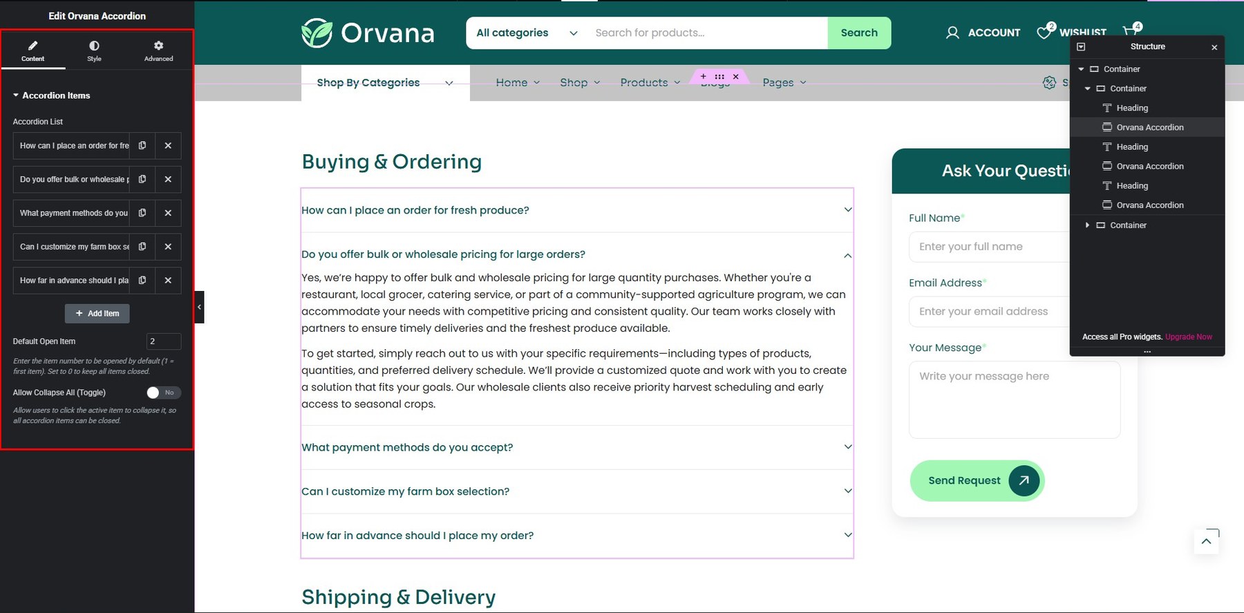
- Accordion
You build it at Addons Core
You can customize at Content and Style
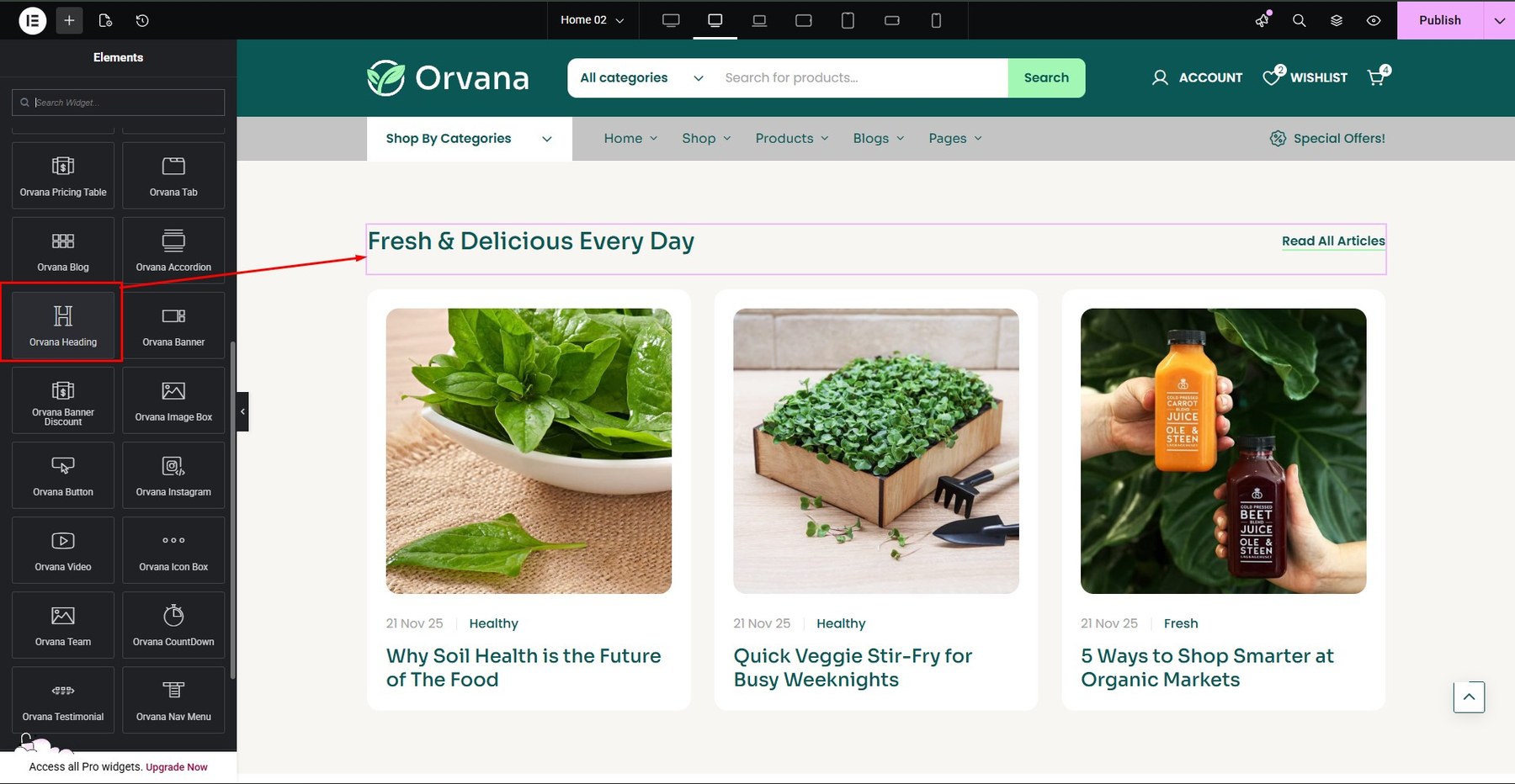
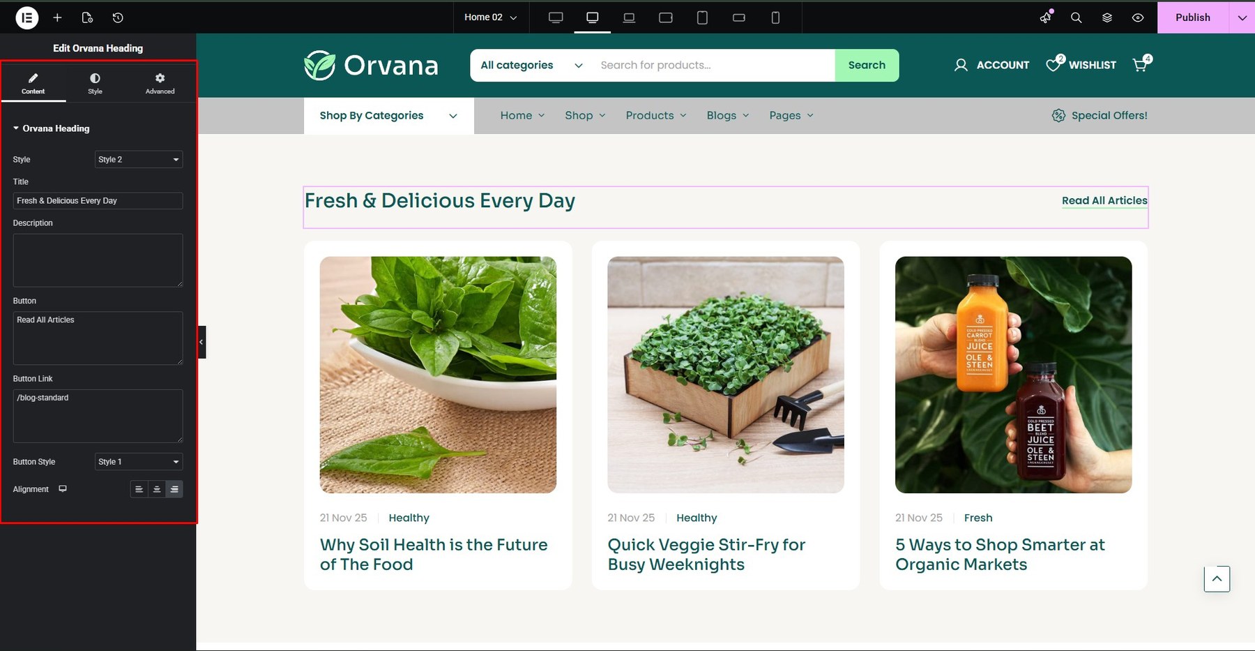
- Heading
You build it at Addons Core
You can customize at Content and Style
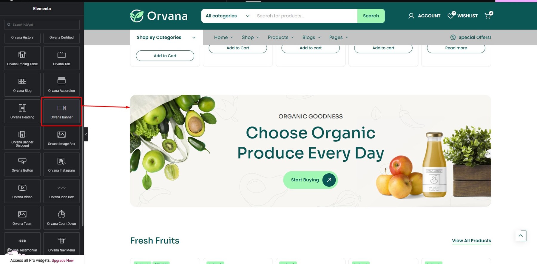
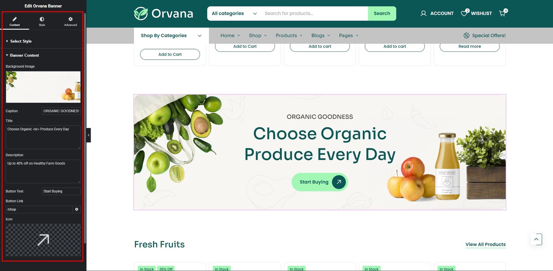
- Banner
You build it at Addons Core

You can customize at Content and Style
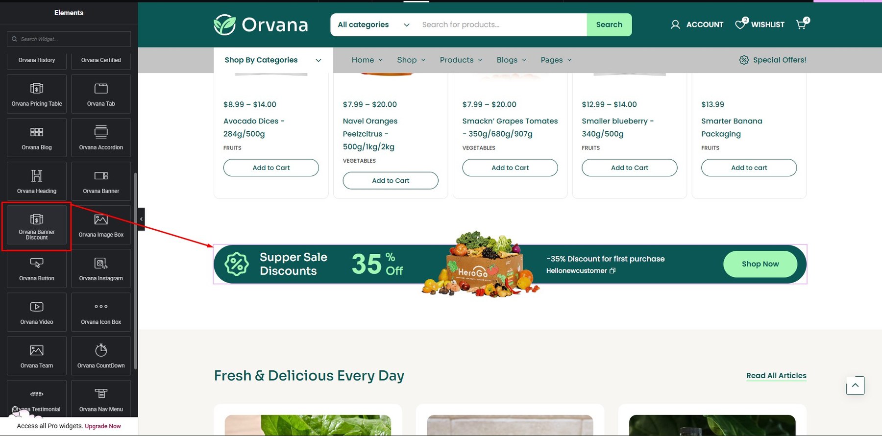
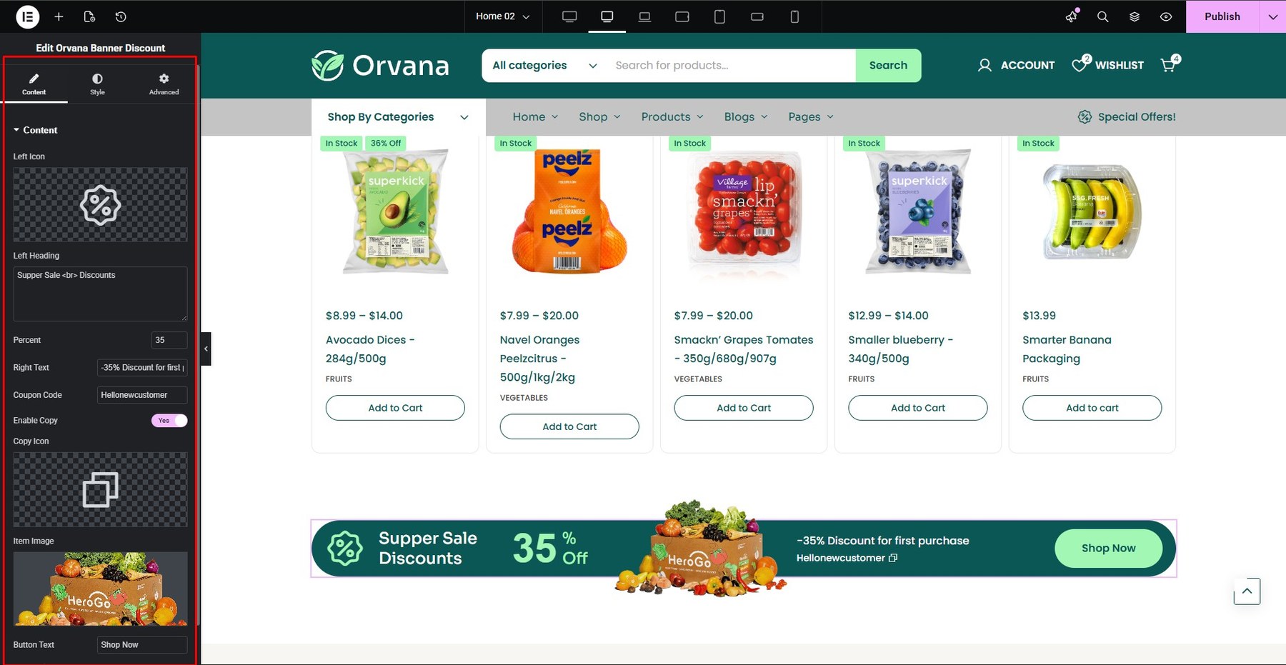
- Banner Discounts
You build it at Addons Core
You can customize at Content and Style
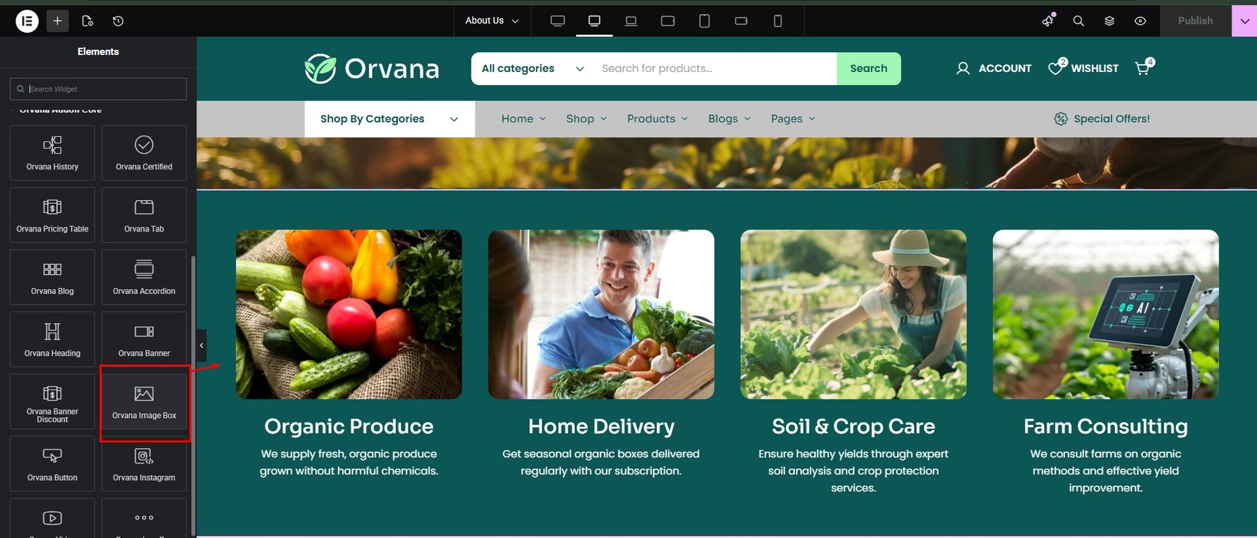
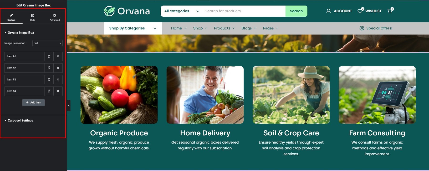
- Image Box
You build it at Addons Core

You can customize at Content and Style

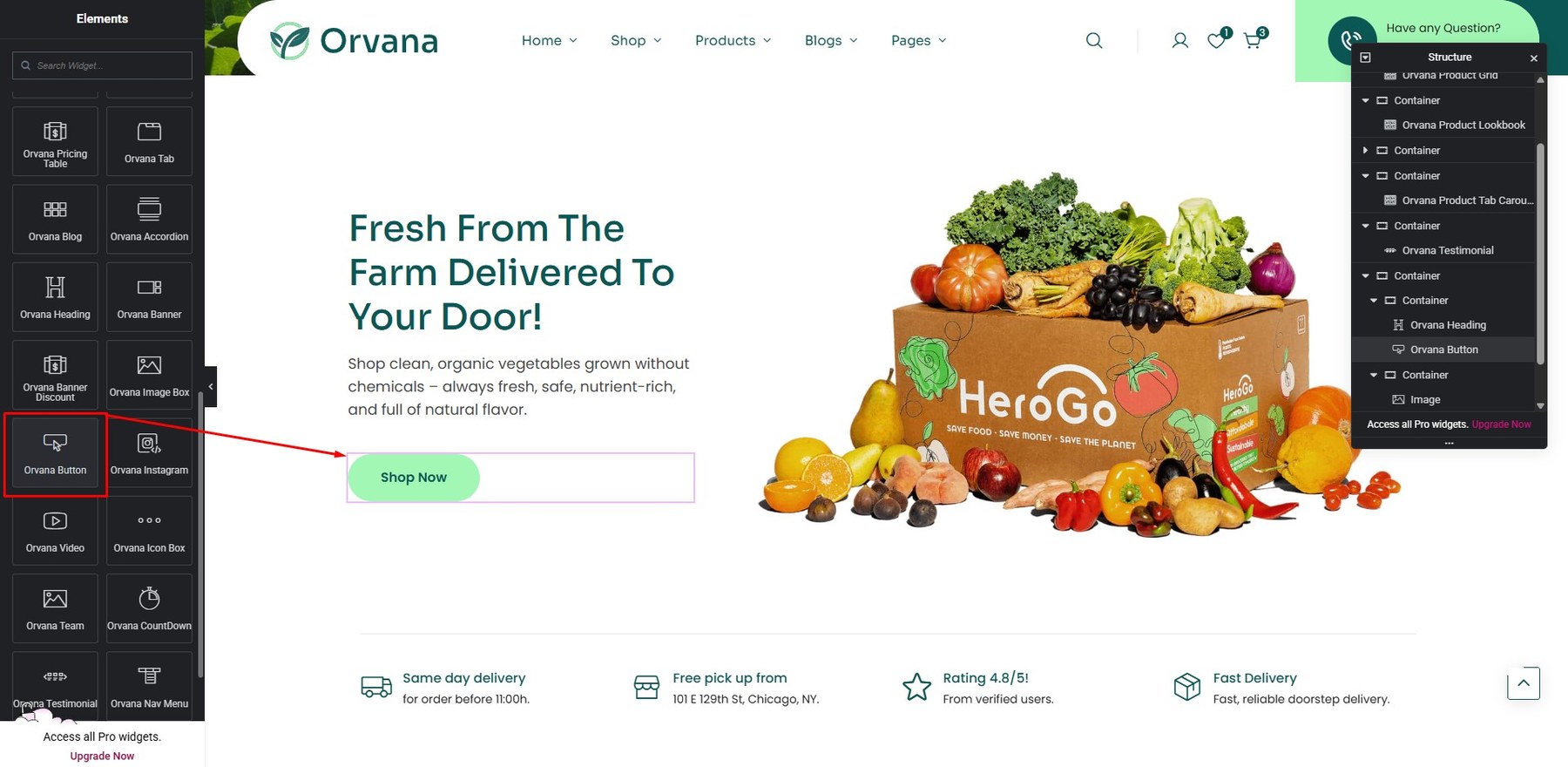
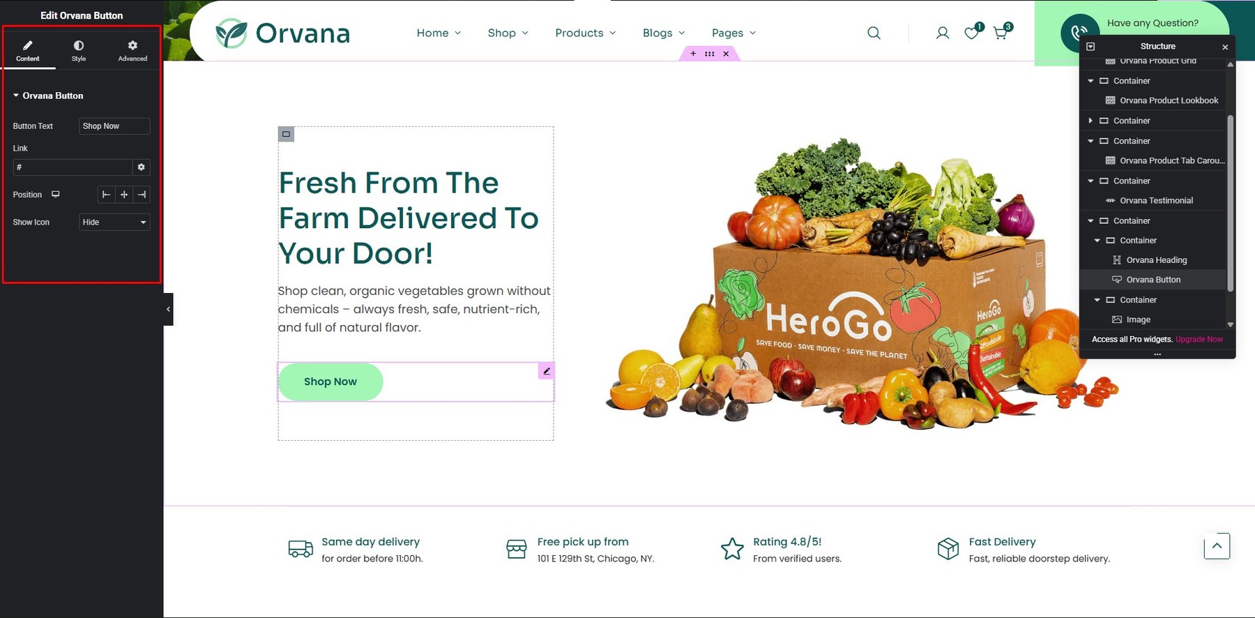
- Button
You build it at Addons Core
You can customize at Content and Style

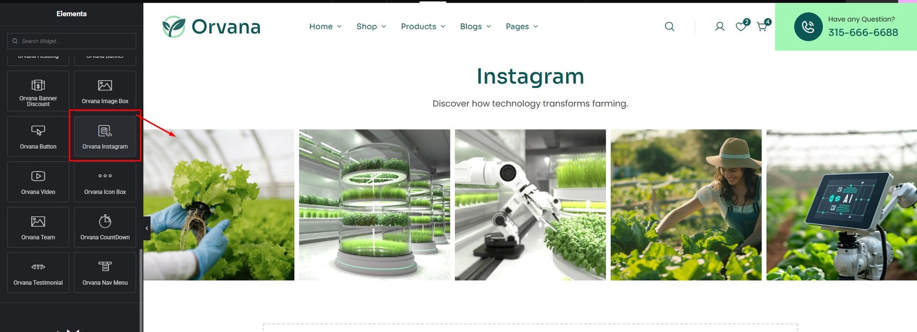
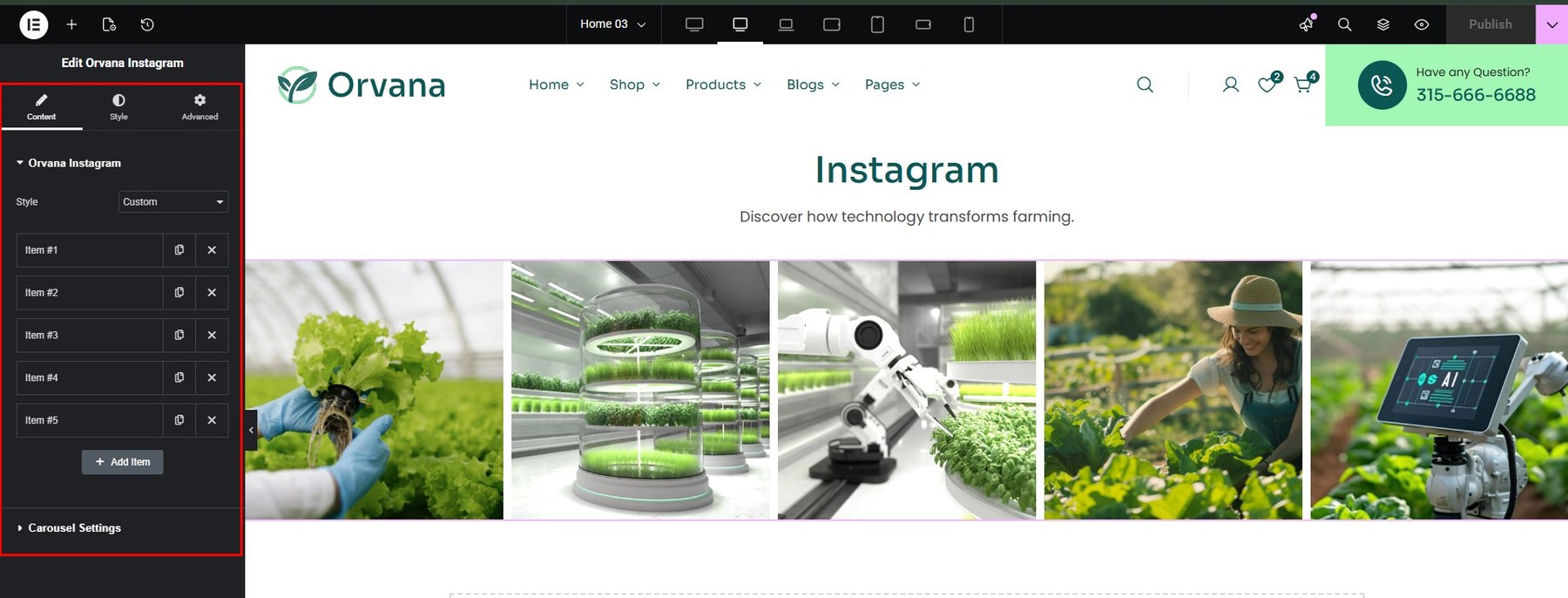
- Instagram
You build it at Addons Core

You can customize at Content and Style

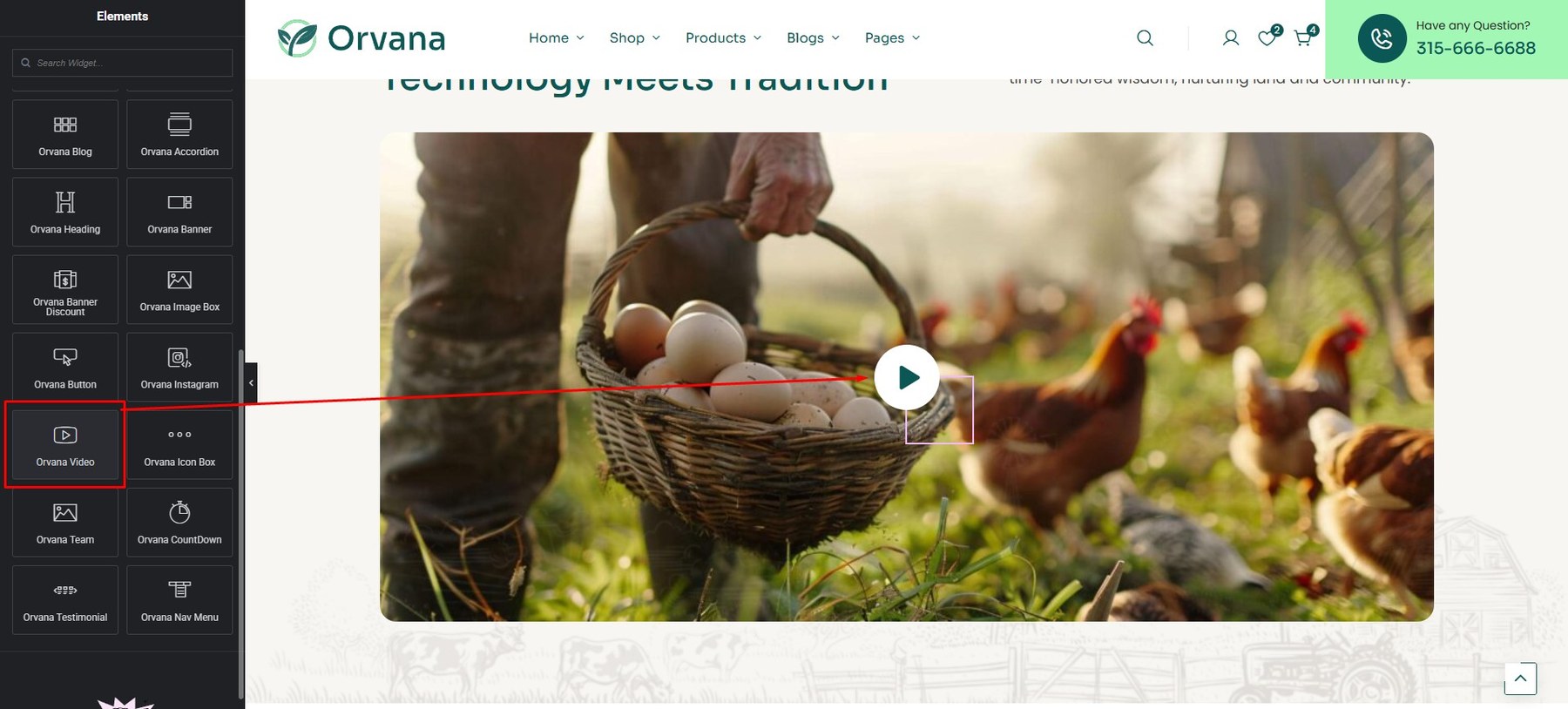
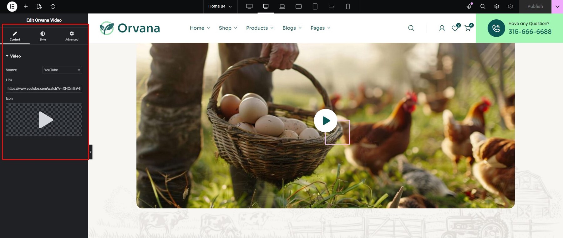
- Video
You build it at Addons Core

You can customize at Content and Style

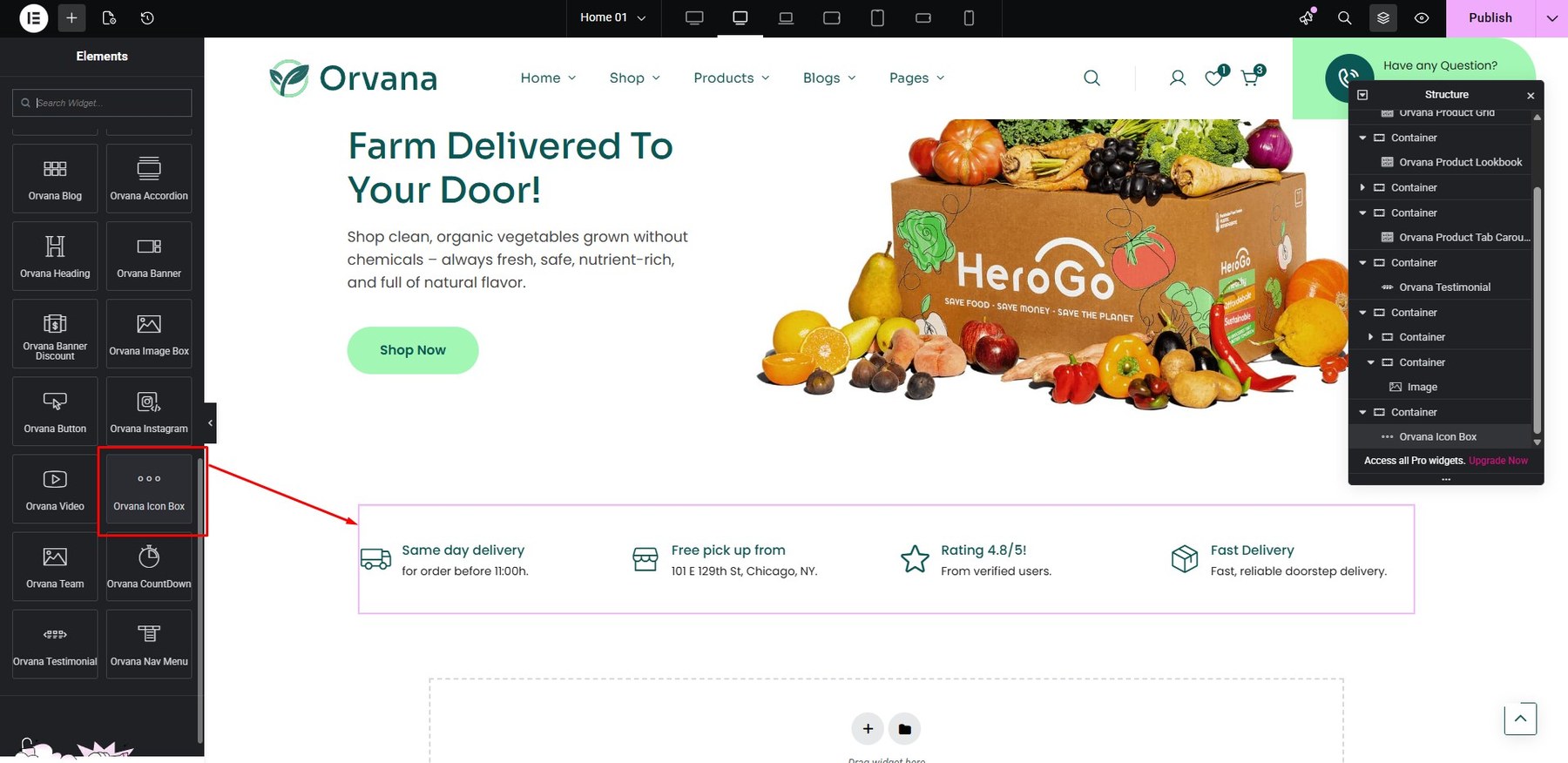
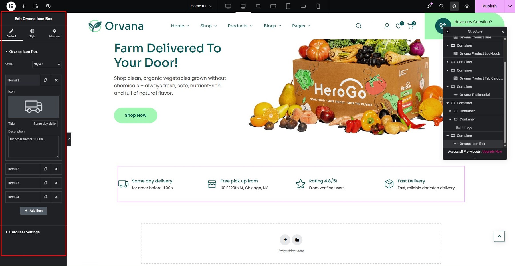
- Icon Box
You build it at Addons Core

You can customize at Content and Style
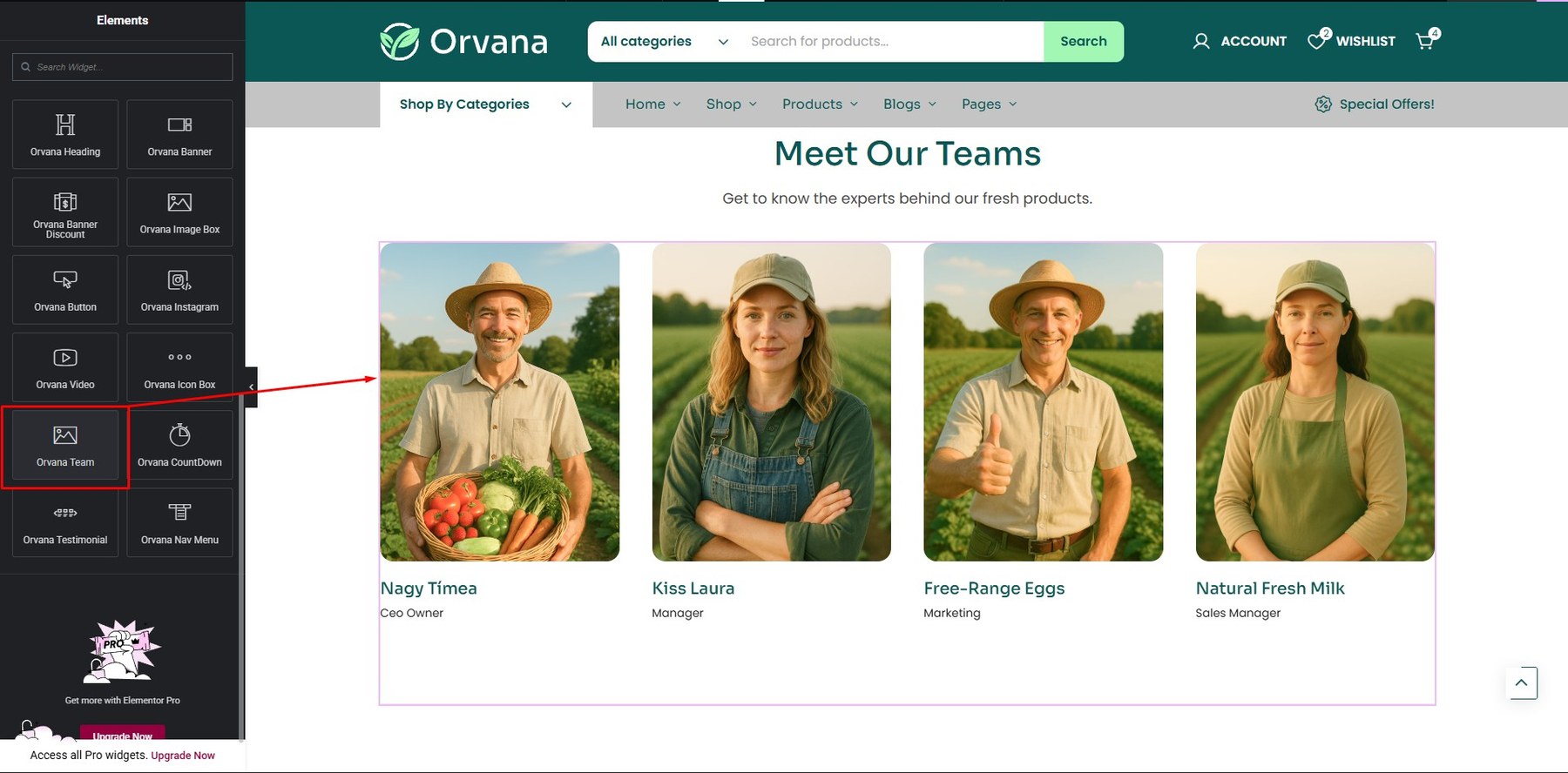
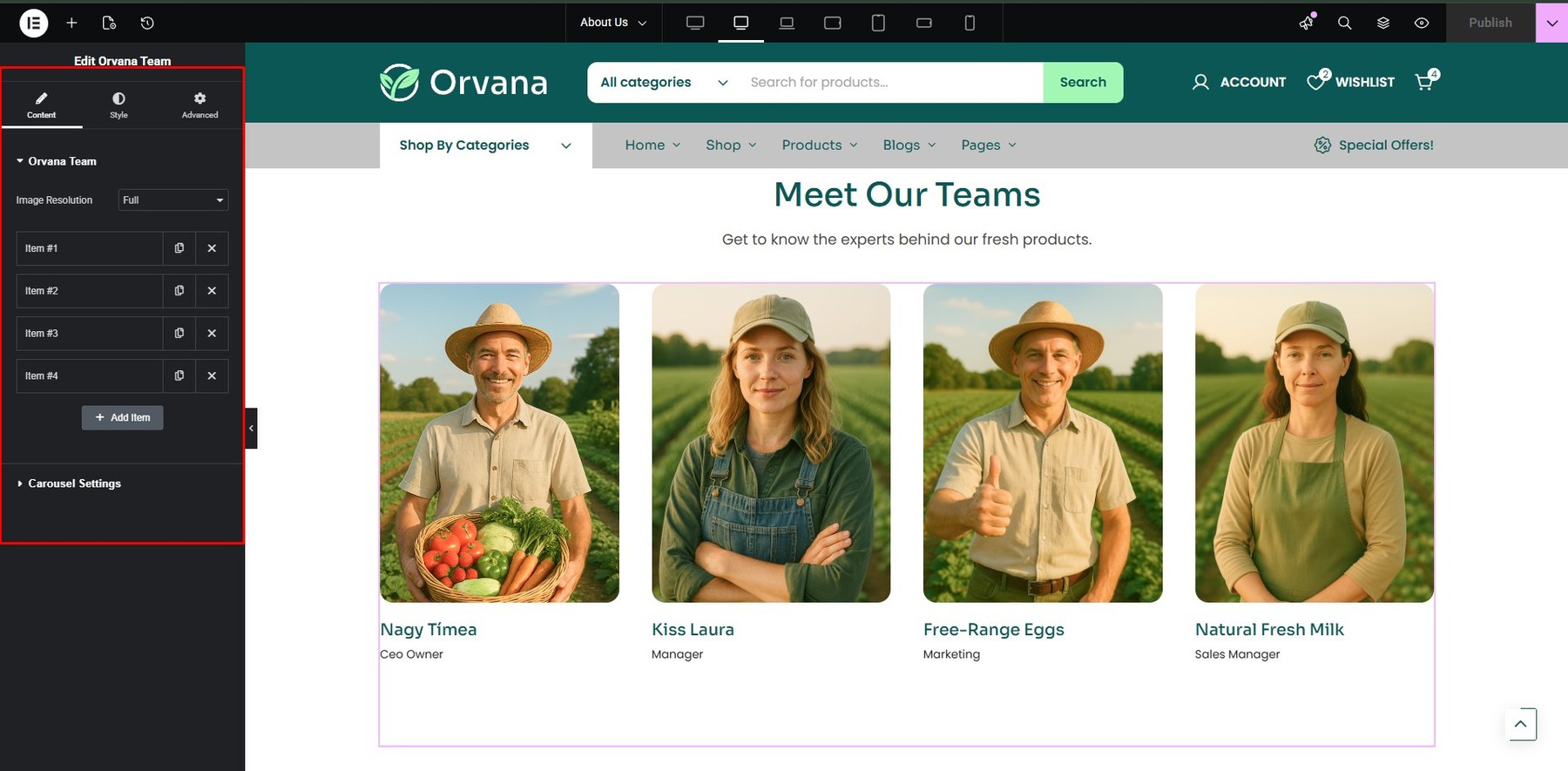
- Team
You build it at Addons Core

You can customize at Content and Style
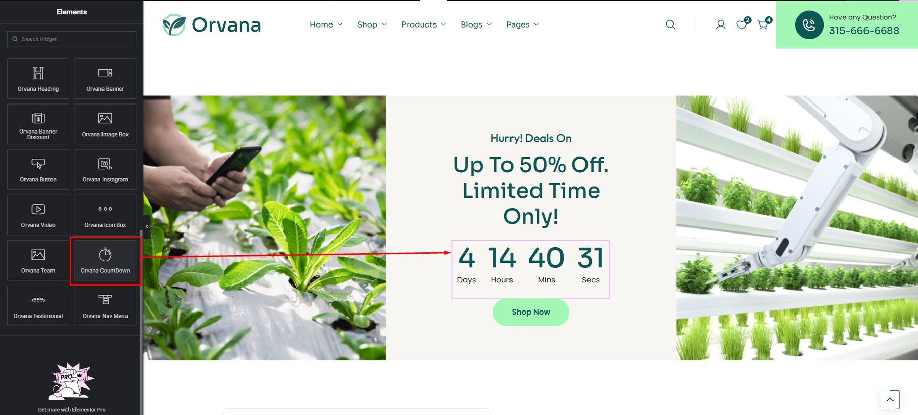
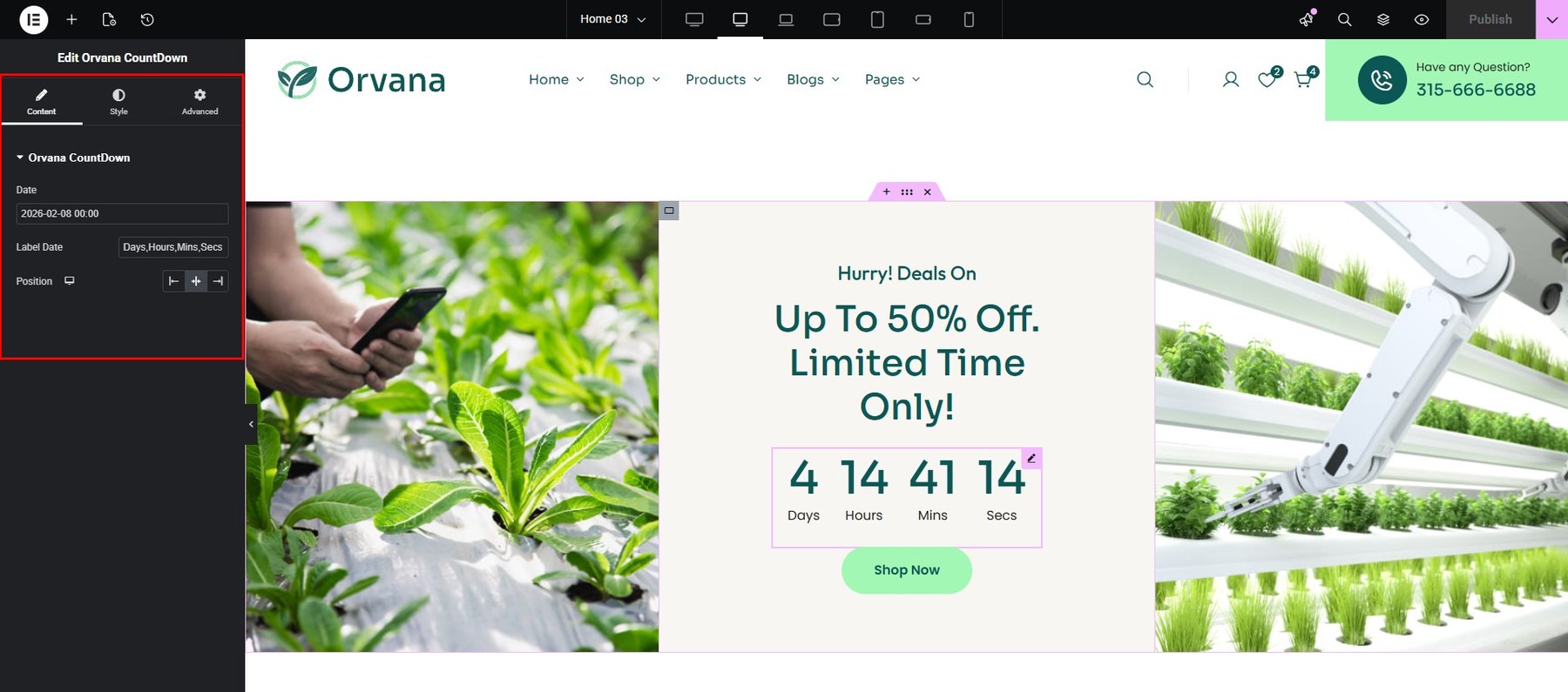
- Countdown
You build it at Addons Core
You can customize at Content and Style

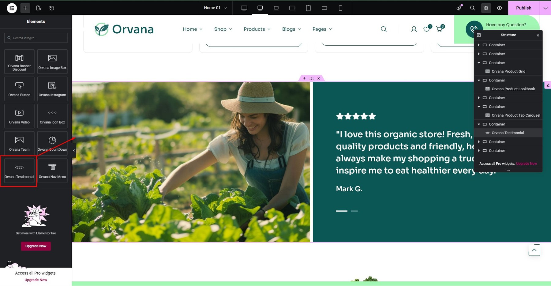
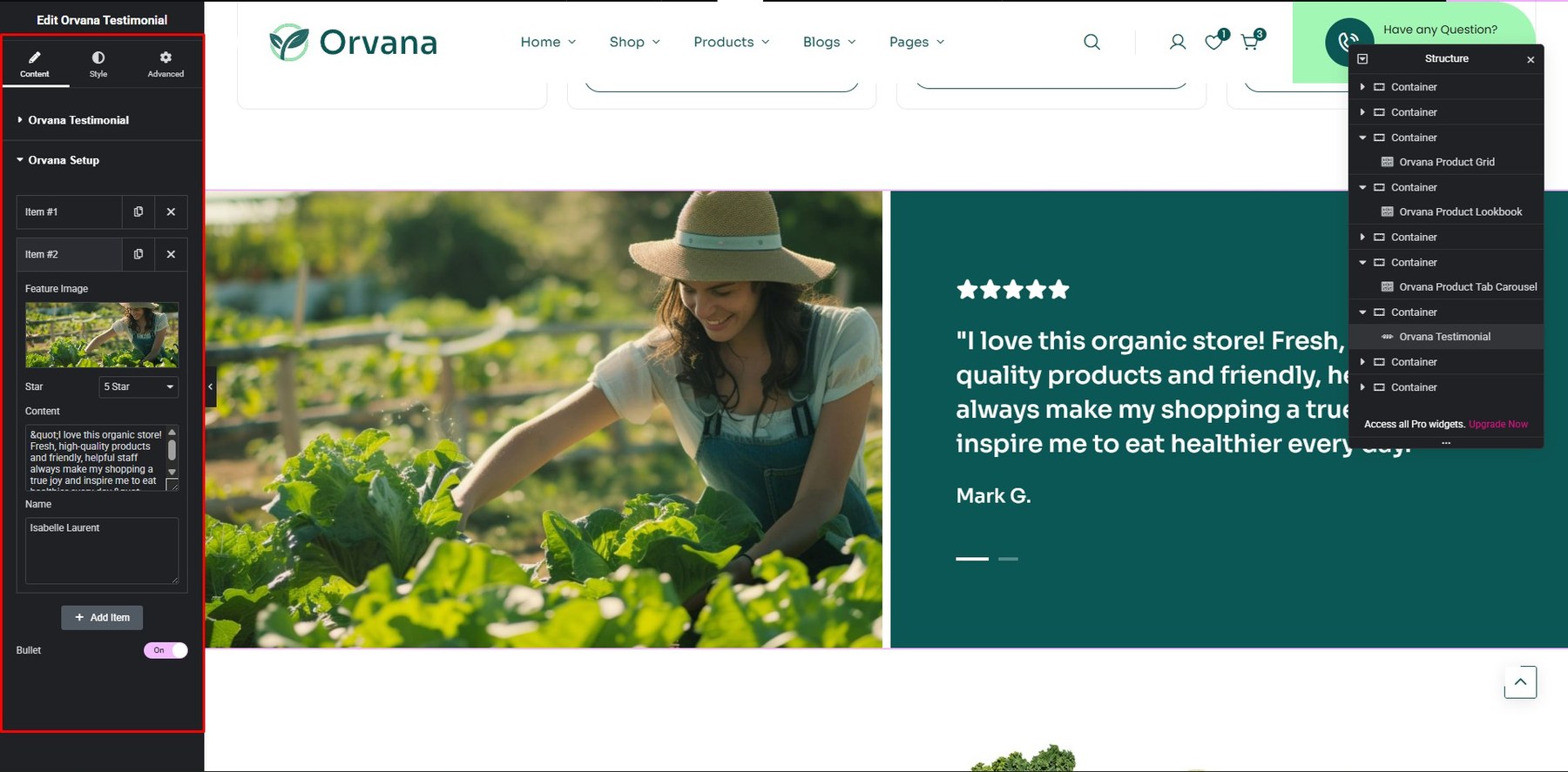
- Testimonial
You build it at Addons Core

You can customize at Content and Style
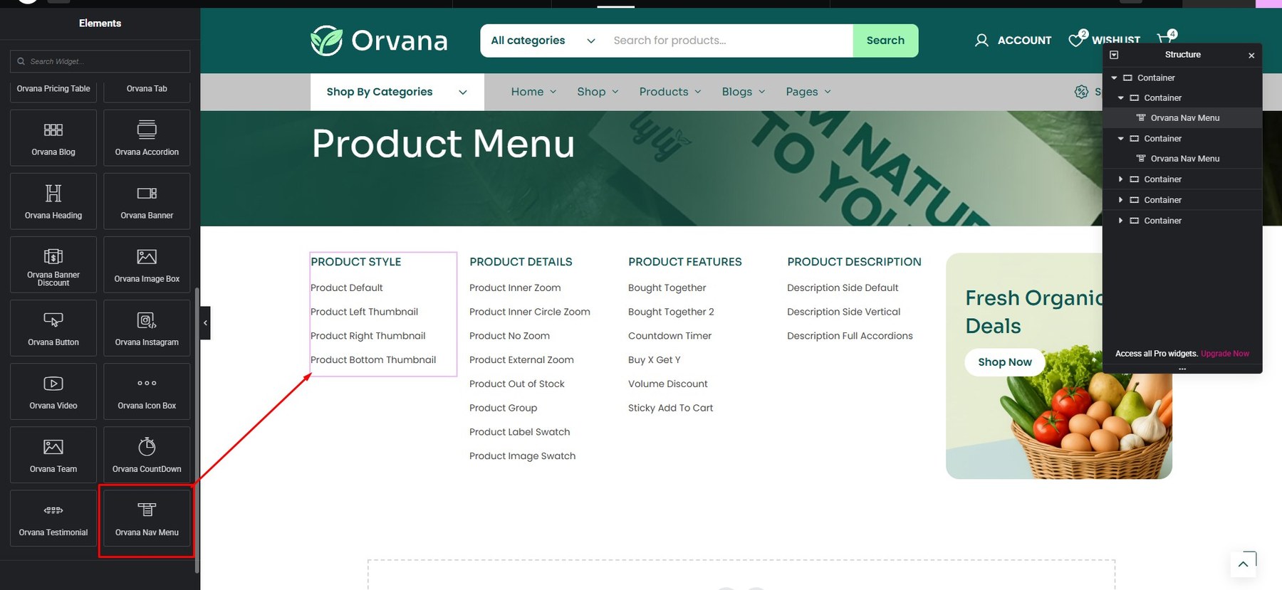
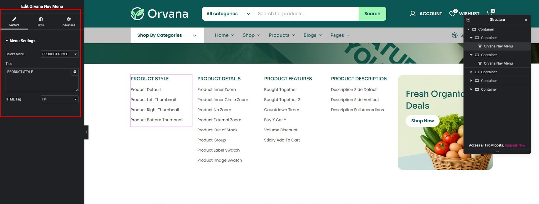
- Nav Menu
You build it at Addons Core

You can customize at Content and Style

There are many more widgets for you to choose, everything is so simple when you just need drag and drop. Wish you have a great website!